Light yellow gradient
This tailwind example is contributed by Mohit Prajapati, on 25-Aug-2022. Component is made with Tailwind CSS v3.

Author Mohit Prajapati
Related Examples
-
 3 years ago13.2k
 -
 3 years ago12.4k
 -
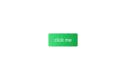 Gradient Flip-Text Button with Hover Animation
This stylish button features a dynamic gradient background that shifts from a calm green gradient by default to a vibrant purple-pink-red gradient on hover. The button also includes an interactive text flip effect, where the text seamlessly transitions on hover, creating a visually appealing and modern UI element. Perfect for adding flair to your websites or applications while maintaining functionality and responsiveness.
1 year ago1.5k -
 Profile Card with Transparent
Dynamic Background: Darker gradient background for better contrast Floating colored blobs for visual interest Profile Image Glow: Added a gradient glow effect behind the profile picture Smoother hover transition Typography Improvements: Larger, bolder name text Subtle hover underline animation for the name Better spacing and hierarchy
8 months ago1k -
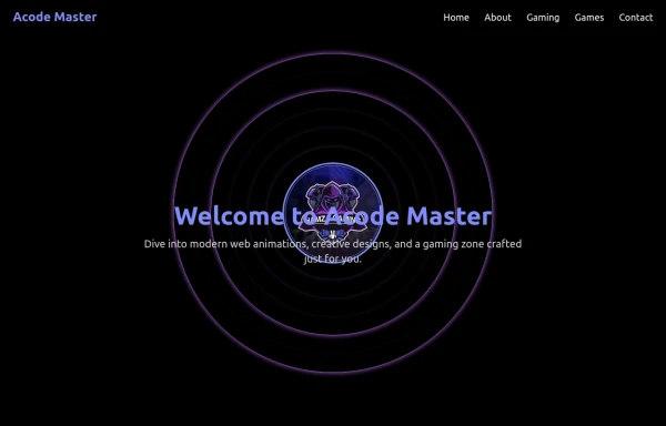 AcodeMaster GameZone – Play Your Favorite Games Online
AcodeMaster GameZone is a modern gaming website where you can discover, explore, and play exciting games anytime, anywhere. Designed with smooth animations and a stylish dark theme using Tailwind CSS, it offers a fast and fun experience for every gamer.
9 months ago1.1k -
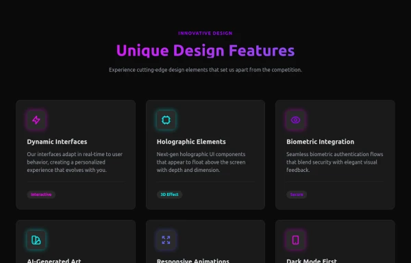 Attractive Feature Section
With Gradient Color 6 Features
8 months ago909 -
 Gradient progress bar
A progress bar with gradient
10 months ago578 -
 3 years ago12.1k
 -
 2 years ago10.2k
 -
 3 months ago280
 -
Pixel Blast
Pixel Blast
5 months ago831 -
 11 months ago1.4k


Explore components by Tags
Didn't find component you were looking for?
Search from 3000+ components