Avatar with Gradient Shadow
This tailwind example is contributed by Prajwal Hallale, on 04-May-2023. Component is made with Tailwind CSS v3. It is responsive.

Author Prajwal Hallale
Related Examples
-
Glowing gradient border
on hover glow border
3 years ago24.9k -
Profile Card
Show more details on hover
2 years ago14.6k -
 3 years ago12.3k
 -
 2 years ago8k
 -
 2 years ago8k
 -
 3 years ago11.1k
 -
 Clean AI Chat UI with Tailwind CSS – ChatGPT-Style Interface
A polished and responsive AI chat interface built using modern Web Components and Tailwind CSS. This UI replicates the smooth, minimal experience of ChatGPT with a clean layout, floating input bar, animated scrollable message feed, and mock AI responses. Ideal for SaaS dashboards, AI assistants, or frontend prototypes. Designed with professional spacing, accessible colors, and reusable components. Key features: Responsive layout with mobile support Floating input bar with auto-expanding textarea Tailwind-powered message bubbles with clear sender roles Modern dark theme with subtle gradients and shadows Easily extendable to real AI APIs (e.g., OpenAI)
9 months ago1.9k -
 3 years ago11.7k
 -
 Overlapped icons showcase
Al pasar el cursor sobre el ícono apilado, se revela el ícono completo. Hovering over the stacked icon unveils the complete icon.
1 year ago2.4k -
 3 years ago9.5k
 -
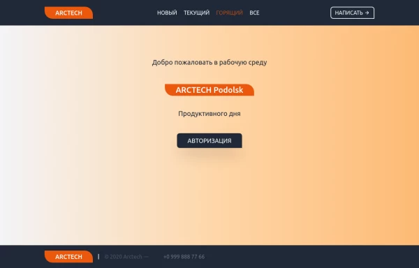 Home page
Home page для ПО, страница для входа в приложение.
1 year ago1.3k -
 Meet the Team Section with Team Member Cards
Meet the Team Section with Team Member Cards
1 year ago4.4k


Explore components by Tags
Didn't find component you were looking for?
Search from 3000+ components