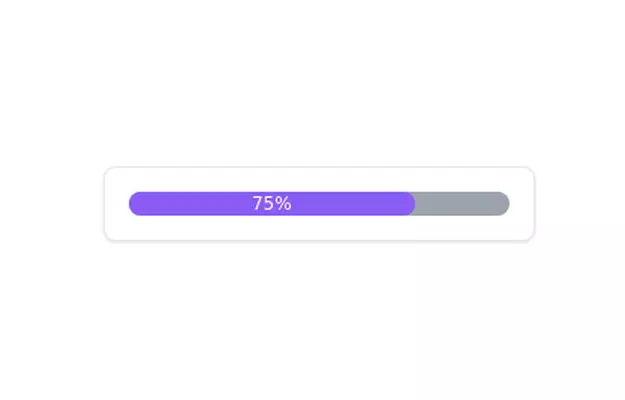
Gradient progress bar
A progress bar with gradient
This tailwind example is contributed by Dujardin Emmanuel, on 22-Apr-2025. Component is made with Tailwind CSS v3. It is responsive.

Author Dujardin Emmanuel
Related Examples
-
 3 years ago13.2k
 -
 Acode master
Acode master(=>good work for Acode master)
9 months ago879 -
 loader
loader
3 weeks ago31 -
 1 year ago2.4k
 -
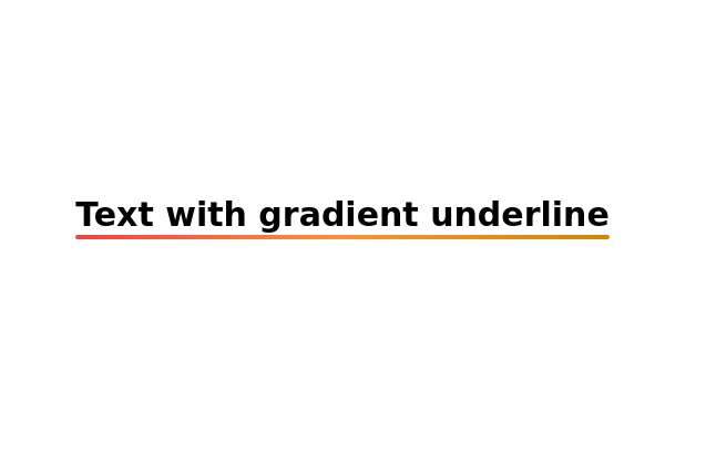 Text with gradient underline
Gradient Underline Text. Decorate your text with a gradient underline for a modern touch.
2 years ago11k -
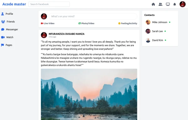 SocialSphere: A Full-Stack Social Media Platform
SocialSphere is a full-stack social media platform inspired by Facebook, built using HTML CSS
9 months ago977 -
 Modern Responsive Footer with Tailwind CSS
This sleek and modern responsive footer is built using HTML and Tailwind CSS. It features three sections: brand information, useful links, and social media icons. The footer includes smooth hover effects, subtle fade-in animations, and a fully responsive design that adapts seamlessly to different screen sizes. Perfect for websites looking for a professional and stylish footer section.
1 year ago2.1k -
 Progress Bar
Simple Progress bar
3 years ago10.6k -
 Dash.OS: Drag & Drop Dashboard Widget System
A fully interactive, freeform dashboard builder for the browser. Drop in widgets, drag them anywhere, resize to fit, and your layout is automatically remembered. Ships with a live Chart.js revenue chart, KPI stats, a task tracker, and a notifications feed, all in a single zero-dependency HTML file with dark/light mode built in.
1 week ago134 -
 2 years ago8.1k
 -
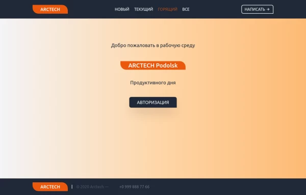 Home page
Home page для ПО, страница для входа в приложение.
1 year ago1.4k -
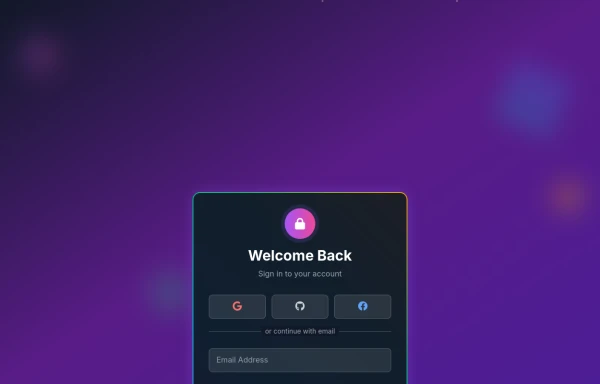 Amazing 3D Login and Registiration Aniamation Form
create a stunning 3D animated background with floating geometric shapes, particle effects, and interactive elements using React, Three.js, and Tailwind CSS. This will be fully responsive and visually captivating.
9 months ago1.1k


Explore components by Tags
Didn't find component you were looking for?
Search from 3000+ components