- Home
-
Dark mode with Tailwind CSS and alpinjs
Dark mode with Tailwind CSS and alpinjs
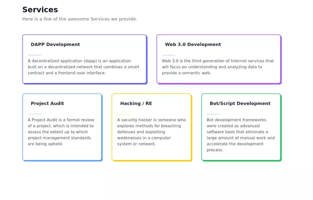
This tailwind example is contributed by Michael Andreuzza, on 27-Apr-2024. Component is made with Tailwind CSS v3. It is responsive. It supports dark mode. similar terms for this example are Services,Why choose us,Roadmap, Changelog
Author Michael Andreuzza
Related Examples
-
beautifull feature section
We create a Advance animated feature section using tailwindcss and custom css
1 year ago2.9k -
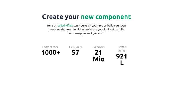
Facts
A simple facts overview
1 year ago2.1k -
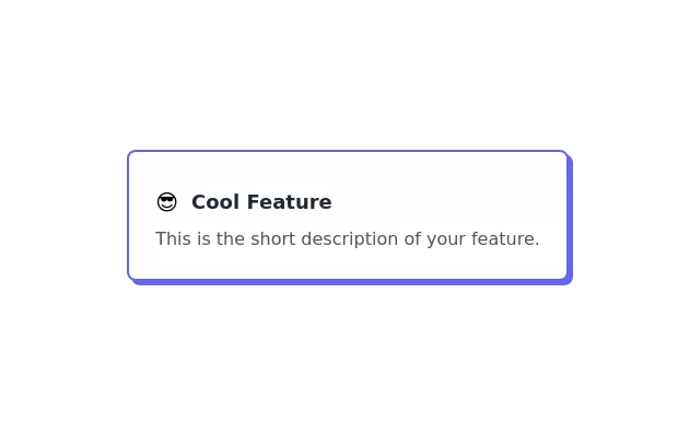
Feature Card
Elevated card
3 years ago10.6k -
3 years ago17.4k
-
Feature Showcase
The feature showcase's responsive grid can also be used as testimonial cards.
3 years ago25.8k -
Modern E-commerce Product Card with TailwindCSS
This product card is designed for e-commerce platforms using TailwindCSS. It features a discount badge, product image carousel, quick view and quick order buttons, ratings, product name, brand details, dynamic pricing with a strike-through original price, and a prominent add-to-cart button. The clean and professional layout is perfect for showcasing products on online stores.
1 year ago2.3k -
Product feature section
Showcase product features with an image
2 years ago14.2k -
3 years ago13.8k
-
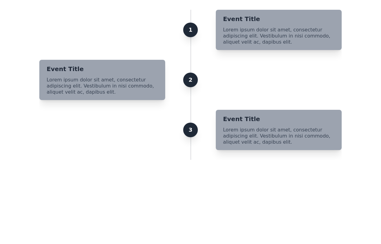
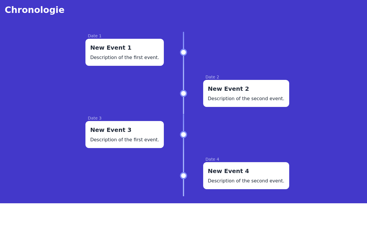
Event Timeline
Timeline component for tracking the progression of events over time. It features alternating card sections
2 years ago12.1k -
Feature Showcase
Showcase Features of your product
3 years ago11.5k -
3 years ago15.6k
-
Timeline
timeline with journey
1 year ago1.2k
Explore components by Tags
Didn't find component you were looking for?
Search from 3000+ components

