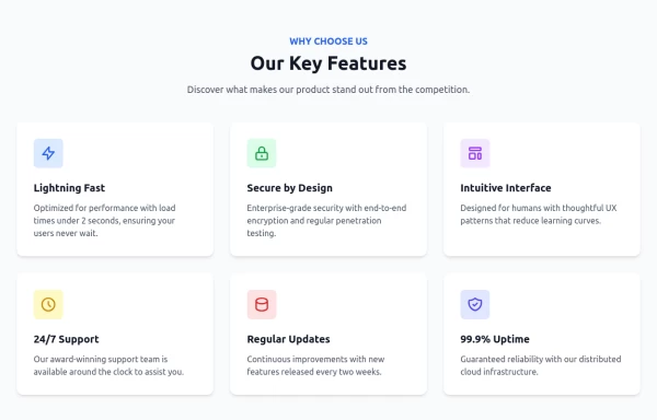
Key Features
Showcase Key Features of your app
This tailwind example is contributed by Anonymous, on 25-Jun-2024. Component is made with Tailwind v3.4. It is responsive. similar terms for this example are Services,Why choose us

Related Examples
-
 Modern E-commerce Product Card with TailwindCSS
This product card is designed for e-commerce platforms using TailwindCSS. It features a discount badge, product image carousel, quick view and quick order buttons, ratings, product name, brand details, dynamic pricing with a strike-through original price, and a prominent add-to-cart button. The clean and professional layout is perfect for showcasing products on online stores.
-
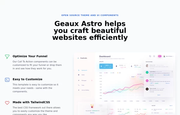 Feature Section
A section that allows you to share features about your product and an example of your product
2.8k -
-

-

-
 Video Player
Youtube Video Player
1.2k -
-
 Work Showcase Cards
Highlight your top projects or products with these cards, featuring images and brief descriptions. This example has a subtle hover effect.
13.4k -
 Facts
Large fact counters with the "centered" title, a quarter overstand to the right site. Die JS-Line set the titles, so you only have to change the text -- and or modify the counters- or the titles background-color. [VIEW-NOTICE] If you change the from XS over MD to XL ... right-click here into the showcase and click "reload frame" or test it on you own site directly.
2.2k -
 Animated Feature Grid Component with Tailwind CSS
Animated feature grid component built with Tailwind CSS. Features smooth hover animations, gradient cards, dark mode support, and responsive design. Perfect for showcasing product features.
1.2k -
-
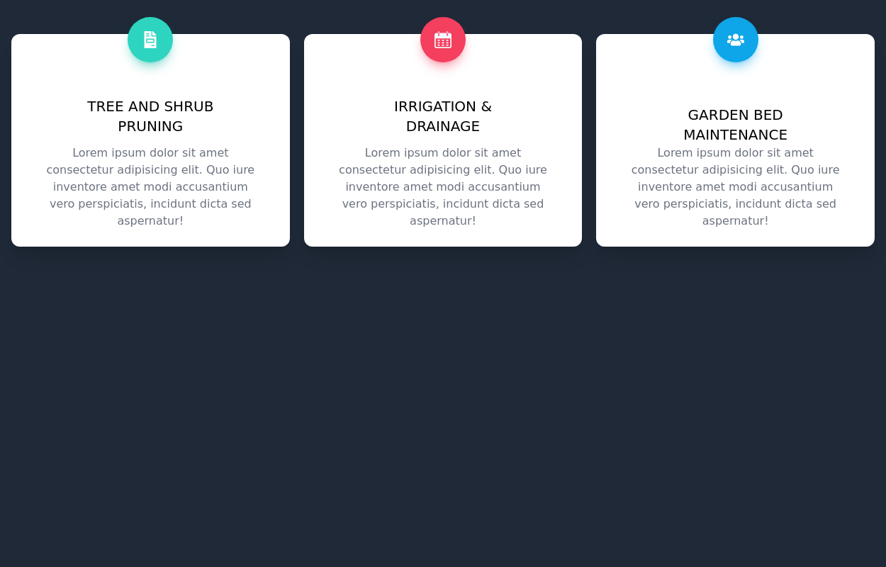
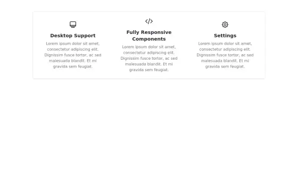 Responsive Features Section
It's a Handy Ready to Use Responsive Features or Services Component with Dark Mode
6.1k








Browse by topic
Explore components by Tags
Jump straight to the UI pattern you need.
Can't find it?
Didn't find the component you were looking for?
Search across 3,000+ community-built components and grab the code in seconds.