A clock with Tailwind CSS
This tailwind example is contributed by Michael Andreuzza, on 27-Apr-2024. Component is made with Tailwind CSS v3. It is responsive. similar terms for this example are simulation,copy,dummy,miniature,like

Author Michael Andreuzza
Related Examples
-
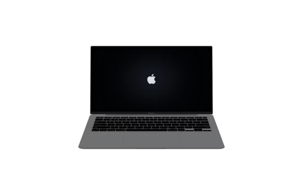 Macbook Air 13" Mockup
A gorgeous component that can be used for landing pages, hero statements and more. Interested in our UI library? Check out the discord link in my bio.
1 year ago2.4k -
 5 months ago371
 -
 3 years ago9.4k
 -
 Mobile device mockup (iPhone 14 pro)
Smartphone (with dynamic island notch) mockup in tailwind
3 years ago10.1k -
 Modern Dark Footer with Overlapping Gradient CTA
A comprehensive, dark-themed website footer component built with HTML and Tailwind CSS. It features a visually distinct overlapping section with a colorful gradient background containing a prominent call-to-action (CTA) block. The main footer area utilizes a multi-column grid layout for organized navigation links, a newsletter signup form, and social media icons. A final bottom bar includes legal links and copyright information. The design is responsive and adapts its layout for different screen sizes.
10 months ago1.1k -
 2 years ago10.9k
 -
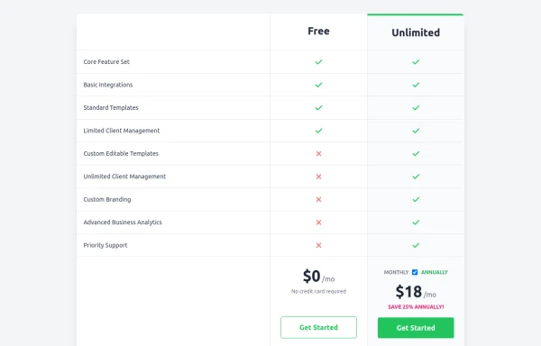 Comparison Pricing Table Component
A responsive pricing table built with HTML and Tailwind CSS, comparing two plans (Free and Unlimited) with a clear feature checklist. Includes distinct styling for the premium plan and a toggle for monthly/annual pricing display.
10 months ago1.4k -
 Atlas AI Analyst Workspace
A premium, document-centric AI chat interface that moves beyond standard bubbles into a professional "editor" layout. Designed for power users, it features a floating glassmorphic command bar, a dedicated "Memory & Context" sidebar with interactive widgets, and rich data visualization blocks. The aesthetic combines a deep charcoal base with luxury bronze/orange accents, making it ideal for high-end SaaS tools, financial analysis dashboards, or enterprise AI assistants.
1 month ago93 -
 Mobile device mockup
Smartphone (with punch hole notch) mockup in tailwind
2 years ago9.3k -
 1 year ago1.1k
 -
 3 months ago178
 -
 1 year ago1.7k


Explore components by Tags
Didn't find component you were looking for?
Search from 3000+ components