- Home
-
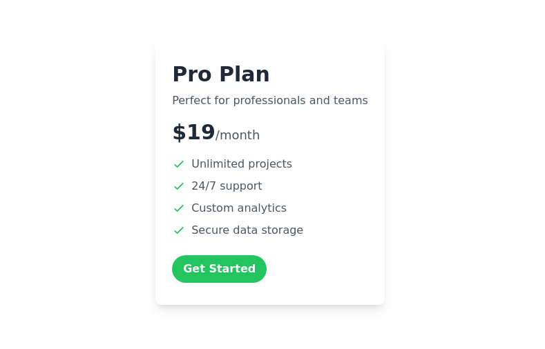
Horizontal Pricing Card
This tailwind example is contributed by Mereani Waqa, on 15-Nov-2023. Component is made with Tailwind CSS v3. It is responsive. similar terms for this example are Service rates, Subscription plans

Author Mereani Waqa
Related Examples
-
2 years ago10.3k
-
Pricing comparison table
Showcase different pricing tiers or plans for a product or service.
1 year ago12.8k -
Pricing card
basic pricing card with single price
1 year ago10.1k -
Responsive 3-Tier Pricing Card Section
A clean and responsive pricing table component featuring three distinct tiers (e.g., Basic, Standard, Premium) presented in a card layout. Built with HTML and Tailwind CSS, it stacks vertically on small screens and transitions to a side-by-side view on medium screens (md breakpoint - 768px) and up. Each plan card includes a placeholder icon, title, description, price details, a call-to-action button, and a bulleted list of features with checkmarks. The generic content makes it easy to adapt for various websites or applications needing a clear pricing comparison structure.
2 weeks ago24 -
Pricing Plan Selector
radio buttons for selecting a pricing plan
1 year ago9.1k -
1 month ago78
-
Simple pricing card
minimal pricing card
1 year ago7.9k -
2 years ago8.5k
-
2 years ago11.5k
-
3 pricing cards
Showcase your pricing structure effectively
1 year ago2.9k -
Modern E-commerce Product Card with TailwindCSS
This product card is designed for e-commerce platforms using TailwindCSS. It features a discount badge, product image carousel, quick view and quick order buttons, ratings, product name, brand details, dynamic pricing with a strike-through original price, and a prominent add-to-cart button. The clean and professional layout is perfect for showcasing products on online stores.
2 months ago810 -
Interactive Pricing Table
This modern pricing component features a visually appealing, responsive layout with smooth hover effects, making it ideal for showcasing different plans and subscription tiers. Design and Features: ✅ Elegant Gradient Backgrounds • Each pricing card has a unique gradient overlay, transitioning from soft gray, blue, or indigo to white, enhancing contrast and visual appeal. • The rounded-2xl design ensures a polished and smooth aesthetic. ✅ Interactive Hover Effects • Cards have a subtle hover shadow enhancement, making them pop on interaction (hover:shadow-[0_0px_25px_0px_rgba(0,0,0,0.2)]). • Slight floating effect (hover:translate-y-[-5px]) gives the illusion of elevation on hover. ✅ Pricing & Plan Details • Each card presents a plan title, a short subtitle, and a bold price display (text-3xl font-extrabold text-indigo-500). • Supports free, subscription-based, and enterprise-tier pricing, ensuring flexibility for different business models. ✅ Call-to-Action Buttons • Each plan features a highly visible CTA button (bg-indigo-700 text-white rounded-md). • The buttons change color on hover (hover:bg-indigo-500) and expand slightly, encouraging user interaction. ✅ Animated Background Icons • A large, transparent icon (text-[500px] text-gray-100) dynamically moves on hover (group-hover:-translate-y-8 group-hover:-translate-x-8), adding depth and a premium feel. This pricing component is perfect for SaaS platforms, digital subscriptions, and service offerings, ensuring a modern, sleek, and engaging user experience. 🚀
3 months ago650
Explore components by Tags
Didn't find component you were looking for?
Search from 2100+ components