Safari browser mockup (dark)
This tailwind example is contributed by Leon Bachmann, on 29-Nov-2022. Component is made with Tailwind v3.4. similar terms for this example are simulation,copy,dummy,miniature,like

Related Examples
-
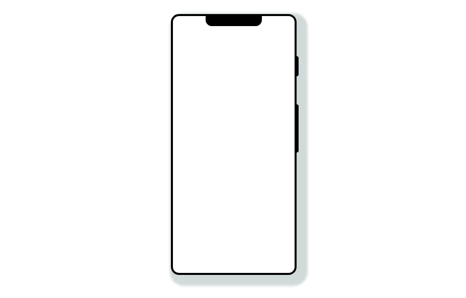 Mobile device mockup
Smartphone (with notch) mockup in tailwind
10.9k -

-

-

-
 Mobile device mockup
Smartphone (with punch hole notch) mockup in tailwind
9.4k -

-

-
 DailyDev Card
Card -based card used in the Dailydev Card, this is created to be modified to taste of each user
2.4k -
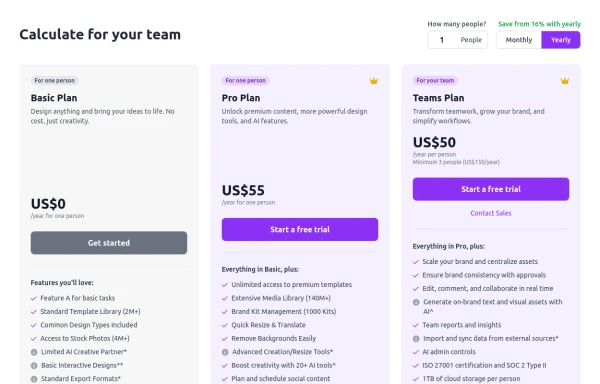 Configurable 3-Tier Responsive Pricing Table
A modern, responsive pricing table component inspired by SaaS layouts, built with HTML and Tailwind CSS. Features three distinct pricing tiers displayed in cards, stacking vertically on smaller screens and transitioning to a 3-column grid on large screens (lg breakpoint). Includes interactive top controls for selecting the number of users and toggling between monthly/yearly billing cycles. Each card uses placeholder content for icons, titles, descriptions, features (with checkmarks/info icons), and distinct call-to-action buttons, making it easily adaptable. Styled with subtle background colors and clear typography for excellent readability.
1.6k -

-
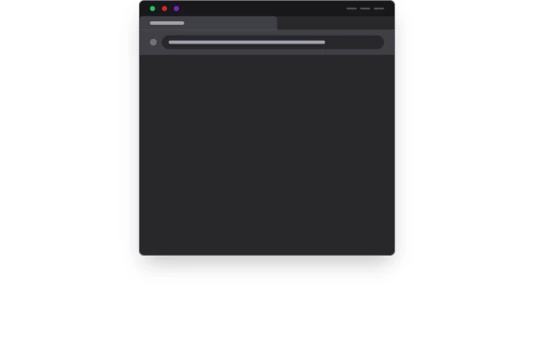 Website Mockup
An Onyx Component. This can be used for landing pages / other website mockup purposes. It's clean design will fit with most SAAS projects.
2.4k -






Browse by topic
Explore components by Tags
Jump straight to the UI pattern you need.
Can't find it?
Didn't find the component you were looking for?
Search across 3,000+ community-built components and grab the code in seconds.