Responsive flexbox layout using Tailwind CSS
This tailwind example is contributed by Leif99, on 12-Feb-2023. Component is made with Tailwind CSS v3. It is responsive.

Author Leif99
Related Examples
-
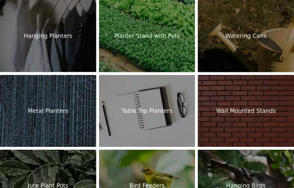 Image Grid
The layout is designed to showcase various categories or items using images and descriptive text. Each grid item features a high-quality image and a centered text overlay with a semi-transparent background
2 years ago14.5k -
 Tailwind image gallery
Responsive grid with evenly spaced image cards. Each card has a title label at the bottom, and there's a subtle hover effect for interactive engagement.
3 years ago61.1k -
 Responsive products grid
Responsive product card grid using tailwind CSS.
3 years ago44.9k -
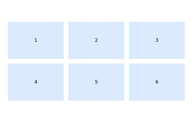
 Images grid
Responsive image grid with tailwindcss.
3 years ago19.2k -
 Responsive Card Grid
Tailwind CSS responsive grid for feature listing. The cards have a teal background, rounded corners, and a concise display of feature titles, descriptions, and a "Learn More" link.
3 years ago52.2k -
 3 years ago13k
 -
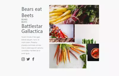 bears/beats/battlestar gallactica
bears beats battlestar gallactica
2 years ago9.7k -
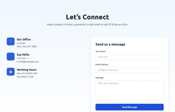 Modern Contact Section with Responsive Grid and Glassmorphic Form
A clean, professional contact section with a dual-column layout featuring contact details and a sleek glassmorphism-inspired form. Fully responsive with Tailwind CSS, supporting both light and dark modes.
7 months ago673 -
 1 year ago2.8k
 -
 2 years ago22.3k
 -
 3 years ago13.3k
 -
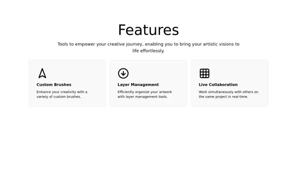
 Animated Feature Grid Component with Tailwind CSS
Animated feature grid component built with Tailwind CSS. Features smooth hover animations, gradient cards, dark mode support, and responsive design. Perfect for showcasing product features.
2 months ago410


Explore components by Tags
Didn't find component you were looking for?
Search from 3000+ components