Responsive grid layout
This tailwind example is contributed by datnguyen.frontend.dev, on 27-Aug-2024. Component is made with Tailwind CSS v3. It is responsive.

Author datnguyen.frontend.dev
Related Examples
-
 2 years ago12.1k
 -
 Feature Section
A section that allows you to share features about your product and an example of your product
1 year ago2.3k -
 Feature overview cards
The component is designed to be responsive, featuring a title, a brief description, and a set of cards presenting key metrics.
1 year ago5.3k -
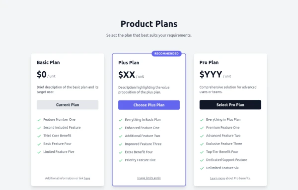 Responsive Multi-Tier Pricing Table Component
flexible and responsive 3-tier pricing table component built with HTML and Tailwind CSS. Features distinct visual styles for different plans (e.g., highlighting a recommended option), adapts to various screen sizes, and supports both light and dark color schemes. Uses generic placeholders for easy adaptation to any product or service.
8 months ago1.3k -
 Book Showcase Grid
Responsive Book Catalog Display with buy now CTA buttons
1 year ago561 -
 profile page
profile page
11 months ago1.8k -
 8 months ago558
 -
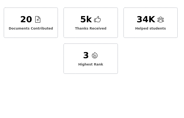 Info cards grid with icons
Evenly-sized cards for showing various stats on the user/admin dashboard.
2 years ago7.9k -
 masonary grids effect for cards using columns
As part of the redesign I was trying to think of ways to lay out testimonials from students, which may have varying length/content, I stumbled onto the idea of using a masonry layout (think bricks, think Pinterest).
9 months ago1.3k -
 3 years ago11k
 -
 Responsive products grid
Responsive product card grid using tailwind CSS.
3 years ago44.4k -
 2 months ago66


Explore components by Tags
Didn't find component you were looking for?
Search from 3000+ components