Maintenance page
This tailwind example is contributed by Faye, on 12-Dec-2024. Component is made with Tailwind CSS v3. It is responsive. It supports dark mode. similar terms for this example are upcoming, Pre-launch page, Teaser page, Under construction page, Placeholder page, Sneak peek page,Launch page

Author Faye
Related Examples
-
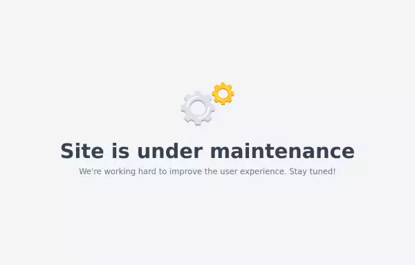 Maintenance page template
The site is under maintenance placeholder page
2 years ago10.5k -
 Clean AI Chat UI with Tailwind CSS – ChatGPT-Style Interface
A polished and responsive AI chat interface built using modern Web Components and Tailwind CSS. This UI replicates the smooth, minimal experience of ChatGPT with a clean layout, floating input bar, animated scrollable message feed, and mock AI responses. Ideal for SaaS dashboards, AI assistants, or frontend prototypes. Designed with professional spacing, accessible colors, and reusable components. Key features: Responsive layout with mobile support Floating input bar with auto-expanding textarea Tailwind-powered message bubbles with clear sender roles Modern dark theme with subtle gradients and shadows Easily extendable to real AI APIs (e.g., OpenAI)
8 months ago1.8k -
 7 months ago1.4k
 -
 Basic Terms of Service Page
Basic Terms of Service Page setup for light and dark mode. Repeat the sections to add as many as you need.
1 year ago3.4k -
 Password Generator
This is a simple and responsive Password Generator built with HTML, Vanilla JavaScript, and Tailwind CSS. It allows users to create secure passwords by selecting custom options such as length, uppercase letters, lowercase letters, numbers, and symbols. Ideal for developers or users looking for a fast and customizable password tool.
6 months ago527 -
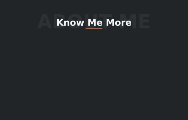 Text Overlay Effect
This is a text overlay effect, featuring a subtle background title and a prominent foreground heading. This design enhances visual interest while maintaining a clean, modern aesthetic.
1 year ago1.6k -
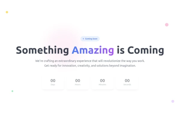 Coming Soon Countdown Section – Animated & Responsive
A beautifully designed "Coming Soon" landing section built with Tailwind CSS and Alpine.js, perfect for startups, SaaS platforms, and product launches. This component features a live countdown timer, smooth fade-in animations, and floating gradient effects for a futuristic, engaging look. The layout adapts seamlessly to all screen sizes and supports dark mode, creating a professional pre-launch experience that builds anticipation and excitement. ✨ Key Features ⏳ Dynamic countdown timer (days, hours, minutes, seconds) 🎨 Animated gradient orbs for a vibrant background effect 🌙 Dark mode support included 💨 Smooth entrance animations using Alpine.js 📱 Fully responsive design for all devices 🔗 Social media icons to keep your audience connected 💡 Perfect for: Coming Soon or Under Construction pages Product and SaaS pre-launch sites Portfolio or agency landing pages Event or app launch countdowns
3 months ago622 -
 Attractive Feature Section
With Gradient Color 6 Features
6 months ago825 -
 To-Do List with Tailwind CSS
A simple and responsive to-do list built with HTML, JavaScript, and Tailwind CSS. Features task addition, completion, and deletion. Perfect for beginner projects or component demos.
7 months ago956 -
 Custom Audio Player
🎧 Custom Audio Player (HTML, Tailwind CSS & Alpine.js) A modern, responsive custom audio player built with Tailwind CSS and Alpine.js, designed for a smooth user experience and elegant visuals in both light and dark mode. ✨ Features: 🎵 Play, pause, and mute/unmute controls 📈 Interactive progress bar with seek functionality 🔊 Dynamic volume slider with live preview 🖼️ Album art and track details display ⌨️ Keyboard support — toggle play/pause with the spacebar 🌓 Fully responsive and dark-mode compatible This player uses minimal JavaScript, relying on Alpine.js for reactivity, and can be easily customized or integrated into any web project. Perfect for portfolios, podcasts, or music web apps.
3 months ago570 -
Pixel Blast
Pixel Blast
4 months ago769 -
 YouTube Community Post UI Mockup
A static HTML and Tailwind CSS component mimicking the user interface of a YouTube Community Post. This mockup features the channel header (avatar, name, verified badge, timestamp), post content (text and optional media), engagement actions (Like, Dislike, Comment, Share with counts), and the 'Add a comment' section. It's designed to be responsive, supports YouTube's light and dark themes via custom styling, and uses accurate iconography.
9 months ago961


Explore components by Tags
Didn't find component you were looking for?
Search from 3000+ components