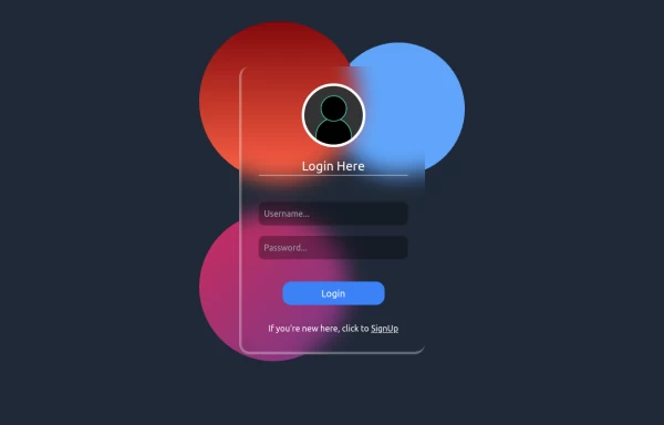
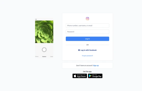
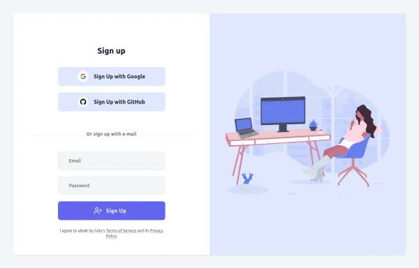
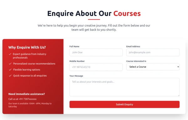
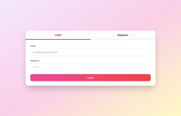
OTP Verification Page

A responsive and interactive OTP verification page built with Tailwind CSS. The page features a gradient background, hover effects, and animations to enhance user experience. It includes input fields for the OTP, a resend OTP link, and a verify button. The design is optimized for both light and dark modes.

This tailwind example is contributed by Abhiraj, on 26-Jan-2025. Component is made with Tailwind v3.4. It is responsive. It supports dark mode. similar terms for this example are Register, Sign in

Tailwind v3.4 Supports dark mode Responsive 3.8k 6

Related Examples

  • Interactive Multi-Method Donation Section

    Overview: A high-trust, conversion-oriented fundraising section styled in the project's signature Navy Blue theme. It provides users with flexible payment options, ranging from one-click fixed amounts to manual bank transfers and cryptocurrency donations. Key Features: Smart Amount Logic: Includes a JavaScript-powered selector where users can choose a preset amount ($10, $25, $50) or type a custom value. The interface automatically toggles states (deselecting buttons when typing, and vice-versa) to prevent user error. Payment Methods: Quick Card/Checkout: Primary call-to-action column. Bank Transfer: A clean card displaying account details with a "Copy to Clipboard" utility. Crypto (Bitcoin): A specialized dark-themed card featuring a placeholder QR code and wallet address copying functionality. Trust Signals: Includes security iconography (lock, shield) and reassuring copy to boost donor confidence. Visual Hierarchy: Uses a 7/5 grid split to prioritize the immediate donation action while keeping manual payment methods accessible but secondary. Tech Stack: Framework: Tailwind CSS. Icons: Ionicons. Scripting: Vanilla JavaScript (for amount toggling and clipboard copying functions). Fonts: DM Serif Display (Headings) + Inter (Body). Usage: Ideal for the "Support Us" page or a dedicated campaign landing page. The script tag included at the bottom handles all the interactivity (button selection and text copying) without needing external libraries.

    1.2k
  • Login

    Login Creen office

    1.6k
  • Portfolio

    This responsive portfolio with dark mode support includes: 1. Fully responsive design that works on both desktop and mobile devices 2. Dark mode toggle with system preference detection and local storage persistence 3. Indigo-800 and Blue-900 color scheme for primary colors in light and dark modes 4. Beautiful animations and effects: 1. Fade-in and slide-up animations for sections using Intersection Observer 2. Hover effects on projects and buttons 3. Smooth scrolling for navigation 5. Mobile-friendly navigation with a toggle menu 6. Sections for About, Projects, and Contact 7. A contact form with styled inputs 8. Social media links in the footer 9. Accessibility considerations (proper heading structure, color contrast, focus styles, ARIA labels) Key features: - The color scheme uses Indigo-800 for light mode and orange-400 for dark mode as primary colors - Dark mode toggle in the header with a sun/moon icon - Sections fade in and slide up as they enter the viewport - Project cards have a hover effect with scaling and increased shadow - The contact form has animated focus states - Social media icons change color on hover - The layout is responsive, with a hamburger menu for mobile screens - Smooth scrolling behavior for navigation links - Dark mode preference is saved in local storage and syncs with system preference This implementation provides a visually appealing, accessible, and functional responsive portfolio with dark mode support, using HTML, Tailwind CSS, and vanilla JavaScript for the

    3.9k
  • Login

    Login form, responsive, no dark-mode for white backgrounds, elegant for any platform

    5.2k
  • login

    login

    1.4k
  • Pinterest-Style Masonry Gallery

    A Pinterest-inspired masonry gallery featuring images of different heights in a seamless multi-column layout.

    174
  • Linear infinite brand scrolling with hover effect

    Beautiful lineat brand scrolling partner with hover effect

    2.9k
  • Hero Section

    Modern Gradient Color Scheme - Uses a professional purple-to-teal gradient for visual appeal Animated Elements: Floating decorative circles with subtle animation Fade-in effect for the main illustration Pulsing status indicator Engaging Typography: Gradient text for key phrases Responsive font sizing Clean Poppins font family Social Proof Elements: Client avatars Star ratings Trust indicators ("Trusted by 500+ businesses") Call-to-Action Buttons: Primary gradient button Secondary outlined button Hover effects and transitions Visual Hierarchy: Clear headline with emphasis on transformation Supporting subheading Balanced layout with image Performance Indicators: ROI badge Growth metric badge Responsive Design: Works on mobile and desktop Grid layout that adapts to screen size

    1.4k
  • background animation

    background animation

    701

Can't find it?

Didn't find the component you were looking for?

Search across 3,000+ community-built components and grab the code in seconds.