responsive home page
the best home page
This tailwind example is contributed by irahoza daniel, on 24-May-2025. Component is made with Tailwind CSS v3. It is responsive.

Author irahoza daniel
Related Examples
-
 8 months ago1.5k
 -
 3 years ago13.9k
 -
 YouTube Community Post UI Mockup
A static HTML and Tailwind CSS component mimicking the user interface of a YouTube Community Post. This mockup features the channel header (avatar, name, verified badge, timestamp), post content (text and optional media), engagement actions (Like, Dislike, Comment, Share with counts), and the 'Add a comment' section. It's designed to be responsive, supports YouTube's light and dark themes via custom styling, and uses accurate iconography.
10 months ago1.1k -
 1 year ago2.8k
 -
 1 year ago1.2k
 -
 Checkbox models
Tailwind Checkbox models
10 months ago1.1k -
 Elegant Dock
Useful Tailwind classes for constructing a basic Dock (usually used on mobile).
10 months ago942 -
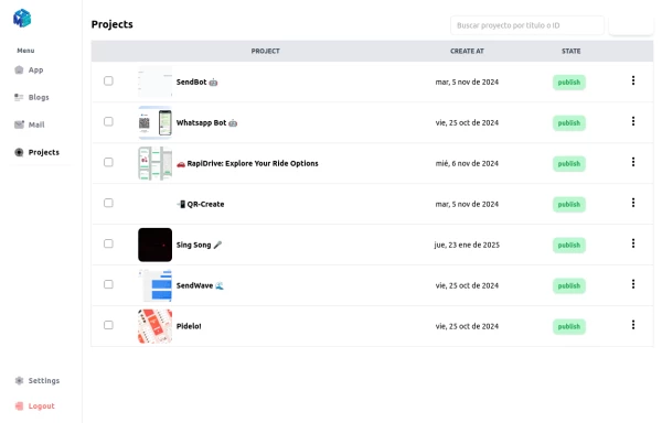 Table Content
Dashboard Table Content, with Sidebar Reusable for any window
1 year ago2.4k -
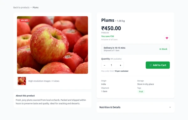 Product Details Page
This section will show all the information about a selected product, including its title, description, price, images, and specifications.
6 months ago1.1k -
 Free SEO Audit & Analysis Tool
Instant SEO analysis of your website. Check 50+ ranking factors including on-page SEO, technical issues, and mobile performance.
3 months ago433 -
 8 months ago534
 -
 9 months ago1.5k


Explore components by Tags
Didn't find component you were looking for?
Search from 3000+ components