templete
templete
This tailwind example is contributed by Uwera Dorcas, on 05-Jun-2025. Component is made with Tailwind CSS v3. It is responsive. It supports dark mode.

Author Uwera Dorcas
Related Examples
-
 Get in Touch – Let's Connect! Responsive Contact Section Using TailwindCSS
Need a website, have a project idea, or just want to say hello? Feel free to reach out! My Contact Section is built with Tailwind CSS, ensuring a clean, responsive, and user-friendly experience. Drop me a message, and let's create something amazing together!
11 months ago1.5k -
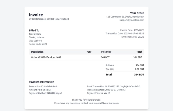 Invoice
Invoice
11 months ago1k -
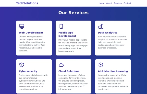 Services
This Services page design includes: 1. Responsive layout using Tailwind CSS grid system 2. Indigo-800 and Blue-900 color scheme 3. Dark mode support 4. Header with navigation 5. Six service cards with icons, titles, and descriptions 6. Footer with copyright information 7. Subtle animations and transitions 8. Accessibility considerations (proper heading structure, color contrast) Key features: - The background uses a gradient from Indigo-800 to Blue-900 - The header and footer have a white background in light mode and dark gray in dark mode - Service cards have a white background in light mode and dark gray in dark mode - Text colors are adjusted for readability in both light and dark modes - Icons use the Indigo-800 color (Indigo-400 in dark mode) for consistency - Each service card has a hover effect that scales it up slightly - Service cards fade in with a staggered delay for a smooth entrance - Dark mode is automatically applied based on system preferences - The design is fully responsive, adjusting from 1 to 3 columns based on screen size This design provides a clean, professional look for a services page while incorporating the requested color scheme and maintaining good usability across different devices and color modes.
1 year ago2.6k -
 HTMLCODE
123
9 months ago469 -
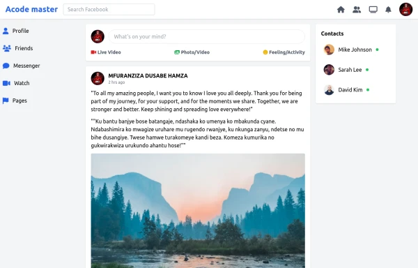 SocialSphere: A Full-Stack Social Media Platform
SocialSphere is a full-stack social media platform inspired by Facebook, built using HTML CSS
10 months ago979 -
 1 year ago4k
 -
 10 months ago1.5k
 -
 ForK blocks animations
ForK blocks animations
1 year ago1.8k -
 8 months ago1.2k
 -
 Card KPI
Targetas
4 months ago495 -
 cards
cardscards with background animation
1 year ago3.2k -
 Interactive Multi-Method Donation Section
Overview: A high-trust, conversion-oriented fundraising section styled in the project's signature Navy Blue theme. It provides users with flexible payment options, ranging from one-click fixed amounts to manual bank transfers and cryptocurrency donations. Key Features: Smart Amount Logic: Includes a JavaScript-powered selector where users can choose a preset amount ($10, $25, $50) or type a custom value. The interface automatically toggles states (deselecting buttons when typing, and vice-versa) to prevent user error. Payment Methods: Quick Card/Checkout: Primary call-to-action column. Bank Transfer: A clean card displaying account details with a "Copy to Clipboard" utility. Crypto (Bitcoin): A specialized dark-themed card featuring a placeholder QR code and wallet address copying functionality. Trust Signals: Includes security iconography (lock, shield) and reassuring copy to boost donor confidence. Visual Hierarchy: Uses a 7/5 grid split to prioritize the immediate donation action while keeping manual payment methods accessible but secondary. Tech Stack: Framework: Tailwind CSS. Icons: Ionicons. Scripting: Vanilla JavaScript (for amount toggling and clipboard copying functions). Fonts: DM Serif Display (Headings) + Inter (Body). Usage: Ideal for the "Support Us" page or a dedicated campaign landing page. The script tag included at the bottom handles all the interactivity (button selection and text copying) without needing external libraries.
4 months ago548


Explore components by Tags
Didn't find component you were looking for?
Search from 3000+ components