Services
This Services page design includes:
1. Responsive layout using Tailwind CSS grid system
2. Indigo-800 and Blue-900 color scheme
3. Dark mode support
4. Header with navigation
5. Six service cards with icons, titles, and descriptions
6. Footer with copyright information
7. Subtle animations and transitions
8. Accessibility considerations (proper heading structure, color contrast)
Key features:
- The background uses a gradient from Indigo-800 to Blue-900
- The header and footer have a white background in light mode and dark gray in dark mode
- Service cards have a white background in light mode and dark gray in dark mode
- Text colors are adjusted for readability in both light and dark modes
- Icons use the Indigo-800 color (Indigo-400 in dark mode) for consistency
- Each service card has a hover effect that scales it up slightly
- Service cards fade in with a staggered delay for a smooth entrance
- Dark mode is automatically applied based on system preferences
- The design is fully responsive, adjusting from 1 to 3 columns based on screen size
This design provides a clean, professional look for a services page while incorporating the requested color scheme and maintaining good usability across different devices and color modes.
This tailwind example is contributed by nejaa badr, on 31-Oct-2024. Component is made with Tailwind CSS v3. It is responsive.

Author nejaa badr
Related Examples
-
 7 months ago449
 -
 2 years ago9.9k
 -
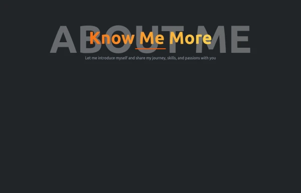
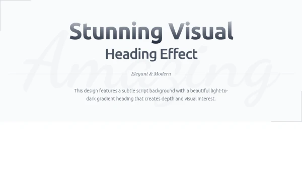 Heading
Subtle Script Background - Large, very light script font in the background ("Amazing") Light-to-Dark Gradient Heading - Main heading fades from light gray to dark gray Layered Typography - Secondary heading in medium weight for contrast Elegant Divider - With centered italic text Minimalist Border Accents - Thin borders in corners for sophistication Responsive Design - Scales beautifully on all devices
7 months ago635 -
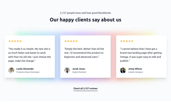
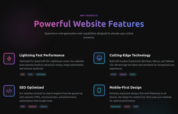 Powerful Website Features
Open Layout Design: No traditional boxes - content flows naturally Gradient Accents: Vibrant color gradients for visual interest Animated Icons: Subtle floating animations on feature icons Hover Effects: Soft glow backgrounds appear on hover Tag System: Color-coded tags for each feature's attributes Dark Theme: Sophisticated dark background with perfect contrast
6 months ago1.1k -
 7 months ago504
 -
 7 months ago792
 -
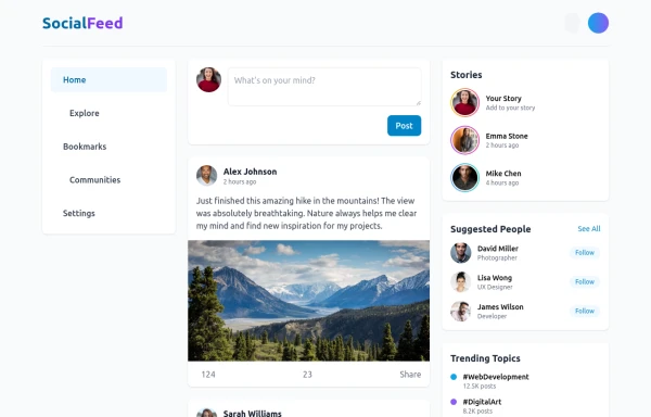 Feeds
FeedsThis is a responsive social media feed interface built with Tailwind CSS that features a clean, modern design with excellent color contrast and visual hierarchy. Here's a detailed breakdown of its components and layout:
8 months ago821 -
 3 years ago12.5k
 -
 Forgot password?
you can change password an time
7 months ago563 -
 Atlas AI Analyst Workspace
A premium, document-centric AI chat interface that moves beyond standard bubbles into a professional "editor" layout. Designed for power users, it features a floating glassmorphic command bar, a dedicated "Memory & Context" sidebar with interactive widgets, and rich data visualization blocks. The aesthetic combines a deep charcoal base with luxury bronze/orange accents, making it ideal for high-end SaaS tools, financial analysis dashboards, or enterprise AI assistants.
3 weeks ago32 -
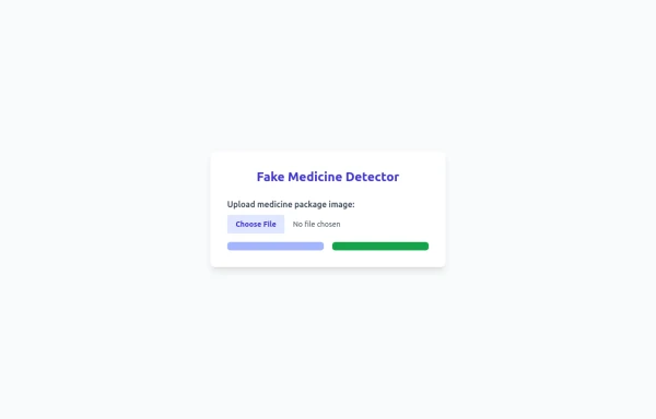 Fake Medicine Detector
Fake Medicine Detector
8 months ago552 -
 Card blog
Targeta para blog
2 months ago140


Explore components by Tags
Didn't find component you were looking for?
Search from 3000+ components