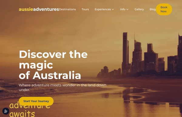
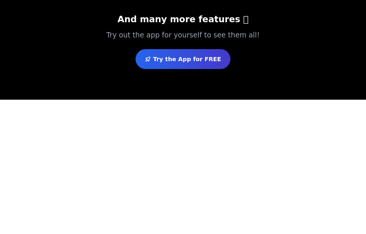
CTA section with light beam from bottom effect
It also has support for dark mode
This tailwind example is contributed by Pixel Perfect, on 18-Jul-2024. Component is made with Tailwind CSS v3. It is responsive. It supports dark mode. similar terms for this example are CTA,banner

Author Pixel Perfect
Related Examples
-
 11 months ago2.3k
 -
 Animated Gradient Button Component
Button component with smooth hover effects and glass-morphism design. Features expanding gradient animation, rotating icon, and responsive layout. Perfect for call-to-action buttons, landing pages, and web applications. Easy copy-paste Tailwind CSS code ready for integration.
5 months ago749 -
 CTA Call To Action
CTA stands for "Call to Action." It is a marketing term that refers to prompts that encourage users to take a specific action. CTAs are typically found in websites, advertisements, emails, and various marketing materials. The goal of a CTA is to guide users toward a desired action that supports business objectives, such as: 1. Encouraging Engagement: A CTA may prompt users to sign up for a newsletter, follow on social media, or download a resource. 2. Driving Conversion: It can lead users to make a purchase, book a service, or start a free trial. 3. Generating Leads: A CTA might encourage users to fill out a form, requesting more information or a consultation.
9 months ago850 -
 3 years ago10.1k
 -
 3 years ago10.9k
 -
 8 months ago865
 -
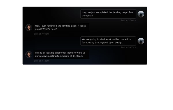 Chat Box for Marketing
An Onyx component. This chat box is great for SAAS landing pages where you want to mock customer interactions or expectations.
1 year ago2k -
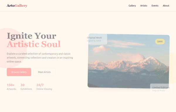 ArtoGallery
Explore a curated selection of contemporary and classic artwork, connecting collectors and creators in an inspiring online space.
9 months ago1.3k -
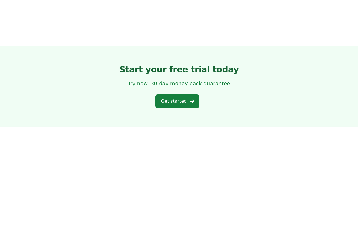
 Call to Action
CTA with Dark and Shadow colors
8 months ago1.2k -
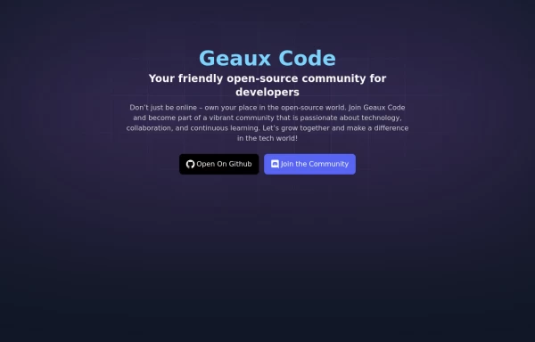 Geaux Code CTA Section
CTA with background patterns
1 year ago2k -
 Call to action
slightly tilted call to action section
3 years ago11.3k -
 3 years ago12k


Explore components by Tags
Didn't find component you were looking for?
Search from 3000+ components