animated nav
animated nav
This tailwind example is contributed by Bonimater, on 19-Jul-2025. Component is made with Tailwind CSS v3. It is responsive. similar terms for this example are CTA,banner

Author Bonimater
Related Examples
-
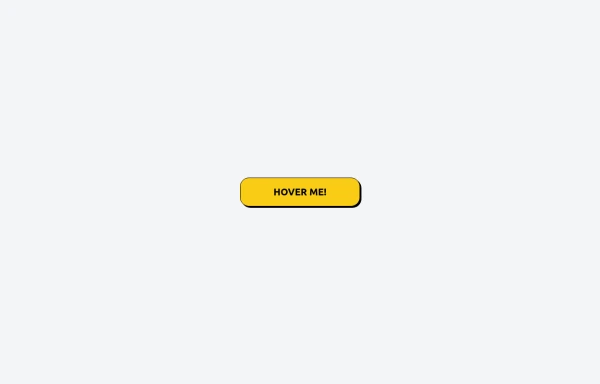
 Bubblegum Button
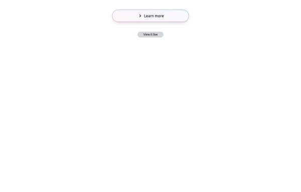
This interactive button component is designed with a sleek gradient background and smooth hover effects, making it an eye-catching call-to-action element for modern web interfaces. Styling and Features: ✅ Gradient Background & Rounded Shape • The button container has a subtle gradient overlay (bg-gradient-to-tr) that smoothly transitions from soft pink (from-pink-300) to light blue (to-blue-300), giving it a vibrant and modern look. • Wrapped in a rounded-full container for a pill-shaped aesthetic. ✅ Floating & Shadow Effects • The shadow-lg property creates a soft floating effect, enhancing depth and visibility. • Will-change-transform optimizes animations for a seamless hover experience. ✅ Interactive Hover Animations • On hover, the inner button scales up (hover:scale-105) and lifts slightly (hover:-translate-y-2), simulating a press-and-release motion. • The transition is smooth, with a 500ms animation (transition duration-500). ✅ Content & Icon • The “Learn more” label is paired with a right-arrow icon (svg) for clear visual guidance. • The icon and text are flex-aligned (items-center flex), ensuring a balanced and responsive layout. This button is ideal for call-to-action elements, product highlights, or download prompts, offering a modern, sleek, and engaging user experience. 🚀
10 months ago1.4k -
 2 years ago11.7k
 -
 3 years ago12.3k
 -
 Call-to-Action Card
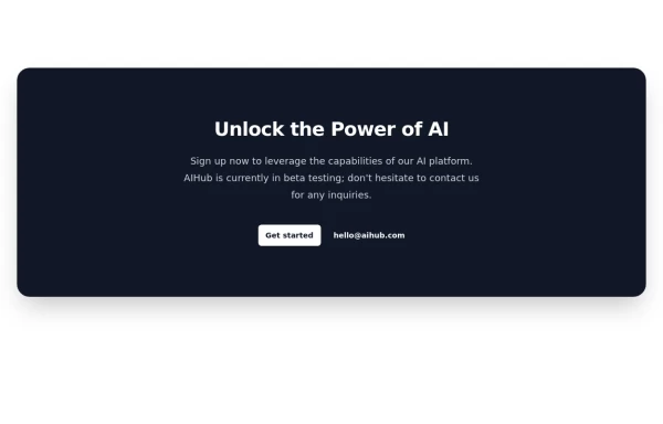
Early Access Signup Card
1 year ago1.9k -
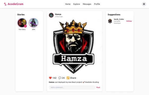 Acode master
Welcome to Hamza's official portfolio — a creative developer blending modern design with powerful code. Explore animations, projects, and innovations crafted with HTML, Tailwind CSS, and passion.
6 months ago541 -
 Hero Section
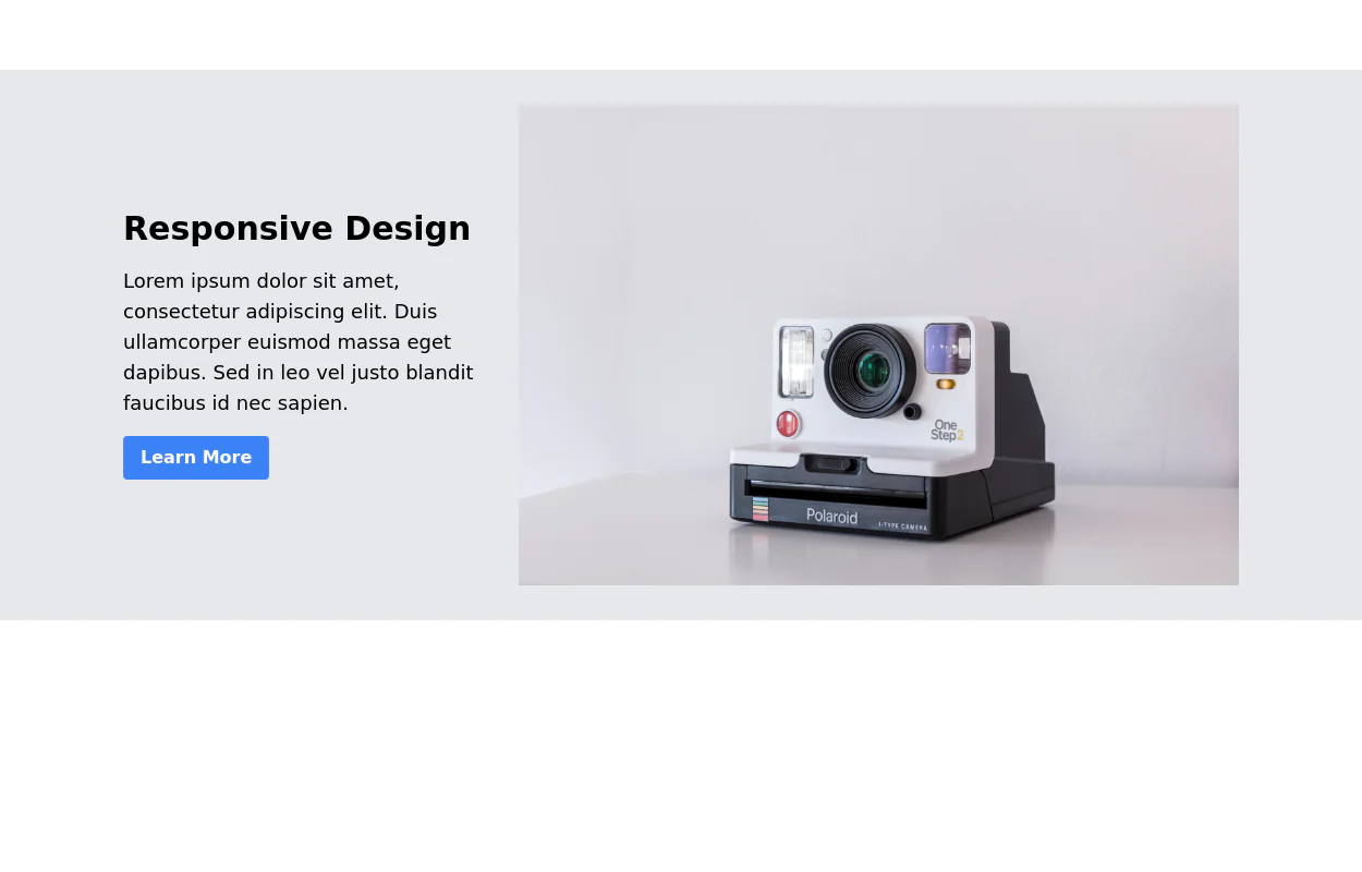
Responsive Hero Section for you Project Background Image: A stunning, high-quality Unsplash photo that creates a unique visual impact. Overlay: Semi-transparent black overlay with blur effect for readability and a modern aesthetic. Content Area: Centered with a gradient background overlay for contrast, bold headline, engaging subtext. Buttons: Vibrant gradient and clean border with smooth hover animations to draw attention. Responsive Design: Looks great on all screen sizes with adaptable padding and font sizes.
5 months ago1.2k -
 Centered footer with CTA
Use this Tailwind CSS footer compoent for simple footer with center aligned everything and with CTA buttons.
1 year ago1.8k -
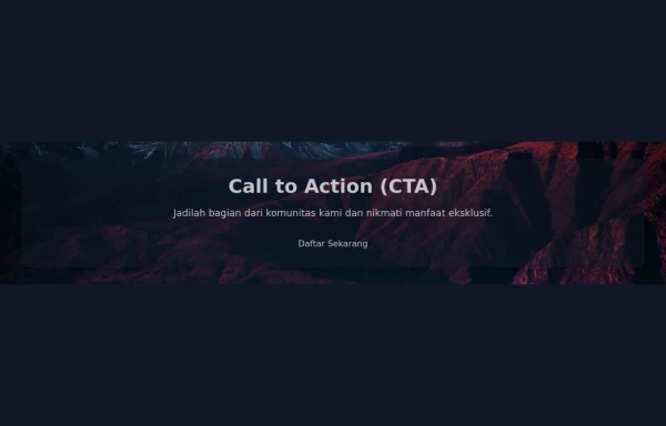 Call to Action (CTA with Background Image)
A Call to Action (CTA) is an essential element in marketing and web design that prompts users to take a specific desired action. When combined with a compelling background image, it can significantly enhance user engagement and conversion rates.
1 year ago2.7k -
 Tailwind CSS Button (Wavy Button)
The button uses Tailwind classes for size, background, border, border-radius, shadow, cursor, overflow, and transitions. The wave overlay is absolutely positioned at the bottom of the button, initially off-screen (top-full) and moves to the middle (top-1/2) on hover via the custom .wave class and keyframes. The font-poppins class isn’t a default Tailwind class. You should define it in your Tailwind configuration or replace it with font-sans if you haven't extended fonts.
5 months ago833 -
 The Future of Web Development
love my product
6 months ago787 -
 Call to Action section
CTA with clear message and big button
1 year ago4.5k -
 2 years ago9.7k


Explore components by Tags
Didn't find component you were looking for?
Search from 3000+ components