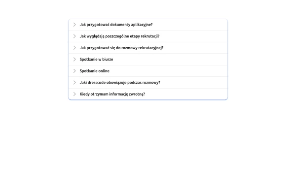
Native HTML Accordion
native html accordion summary details
This tailwind example is contributed by Cristian, on 09-May-2024. Component is made with Tailwind CSS v3. It is responsive. It supports dark mode. similar terms for this example is collapsible

Author Cristian
Related Examples
-
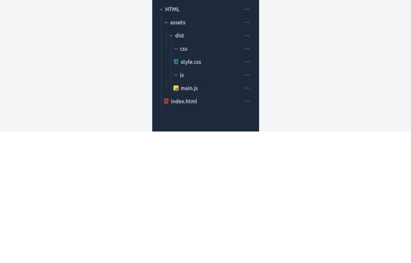 Expandable File Tree with Tailwind and Vanilla JS with tailwinds 4
A simple and responsive file tree component built with Tailwind CSS and vanilla JavaScript. Each folder can be expanded or collapsed with smooth transitions, including the root directory. This component is useful for project explorers, code editors, or file management UIs.
2 months ago224 -
 5 months ago341
 -
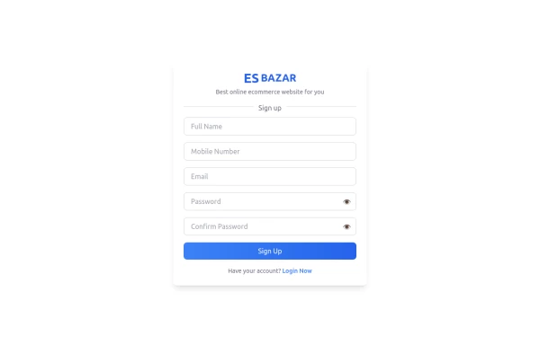 Responsive Sign-Up Form with TailwindCSS
Create a visually appealing and fully responsive sign-up form using TailwindCSS. This form includes input fields for full name, mobile number, email, password, and confirm password, along with a gradient sign-up button. Designed with simplicity and flexibility, it is perfect for modern web applications and easy to integrate into any project.
9 months ago1.3k -
 Recipe card
A modern and responsive Tailwind CSS recipe card with image, ingredients, and instructions. Supports dark mode and mobile view.
6 months ago821 -
 Pricing Plans
This plan offers access to all basic features, including unlimited projects and 24/7 support
5 months ago479 -
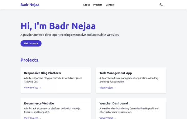 Portfolio
This responsive portfolio with dark mode support includes: 1. Fully responsive design that works on both desktop and mobile devices 2. Dark mode toggle with system preference detection and local storage persistence 3. Indigo-800 and Blue-900 color scheme for primary colors in light and dark modes 4. Beautiful animations and effects: 1. Fade-in and slide-up animations for sections using Intersection Observer 2. Hover effects on projects and buttons 3. Smooth scrolling for navigation 5. Mobile-friendly navigation with a toggle menu 6. Sections for About, Projects, and Contact 7. A contact form with styled inputs 8. Social media links in the footer 9. Accessibility considerations (proper heading structure, color contrast, focus styles, ARIA labels) Key features: - The color scheme uses Indigo-800 for light mode and orange-400 for dark mode as primary colors - Dark mode toggle in the header with a sun/moon icon - Sections fade in and slide up as they enter the viewport - Project cards have a hover effect with scaling and increased shadow - The contact form has animated focus states - Social media icons change color on hover - The layout is responsive, with a hamburger menu for mobile screens - Smooth scrolling behavior for navigation links - Dark mode preference is saved in local storage and syncs with system preference This implementation provides a visually appealing, accessible, and functional responsive portfolio with dark mode support, using HTML, Tailwind CSS, and vanilla JavaScript for the
1 year ago2.9k -
 Accordion
uses Flobite.js for interactivity
2 years ago14.7k -
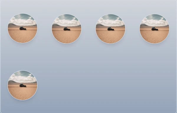
 AutoTrade
Browse thousands of quality used cars from trusted sellers. Great prices and easy financing options available
6 months ago443 -
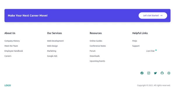 Clean & Responsive Footer Design with Tailwind CSS With CTA Button
modern and responsive footer built with Tailwind CSS to enhance website navigation, accessibility, and user experience. Featuring quick links, social media icons, copyright info, and a sleek layout, this SEO-friendly footer improves engagement and usability across all devices. Perfect for portfolios, business websites, and eCommerce stores!
8 months ago658 -
 10 months ago1.3k
 -
 10 months ago1.1k
 -
 Card blog
Targeta para blog
2 weeks ago53


Explore components by Tags
Didn't find component you were looking for?
Search from 3000+ components