Sponsors section with icon
This tailwind example is contributed by Sienna, on 13-Apr-2023. Component is made with Tailwind CSS v3. It is responsive.

Author Sienna
Related Examples
-
 Skill showcase section for resume / porfolio website
show skill progression
2 years ago14k -
background animation
background animation
2 years ago51k -
Typewriter effect
using javascript
3 years ago42.8k -
 3 years ago10.6k
 -
 Company Logos Showcase
Client showcase with icons
3 years ago12.8k -
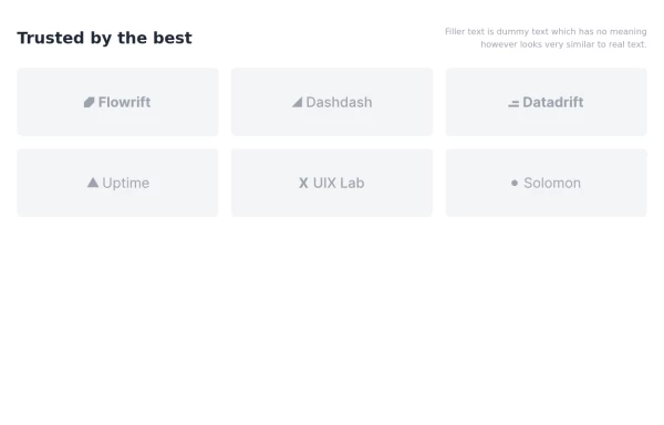
 Sponsors section
icon grid
3 years ago13.2k -
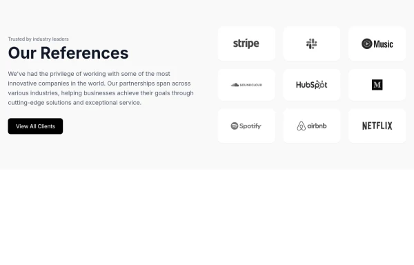
 Logo cloud of customers
Showcase your customers along with their logos.
1 year ago3.1k -
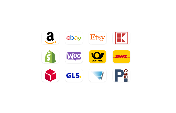 Company icons grid
responsive company icons showcase grid
3 years ago12.1k -
 Marquee Slider of Client Logos – Smooth Scrolling Brand Showcase
Enhance your website's credibility with a sleek marquee slider displaying client logos. This continuously scrolling slider provides a dynamic and engaging way to showcase your trusted partnerships, ensuring a professional and visually appealing design. Perfect for businesses, portfolios, and service-based websites.
9 months ago565 -
 4 months ago331
 -
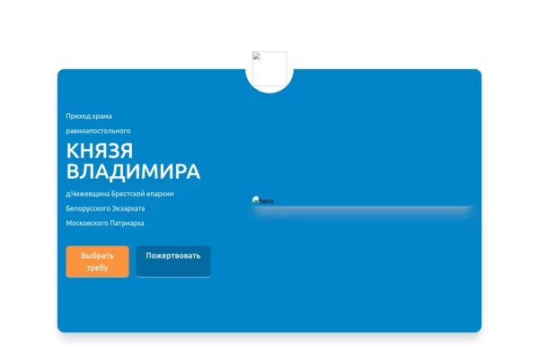 Home page 2
Отзывчивый логотип по центру. Интерактивные кнопки призыва к действию.
1 year ago918 -
 5 months ago529


Explore components by Tags
Didn't find component you were looking for?
Search from 3000+ components