InfoWindow Mapy rzemieślników Desktop
This tailwind example is contributed by Antoni Wierzba, on 23-May-2026. Component is made with Tailwind v3.4. It is responsive.

Related Examples
-
-
 The Life of a Singularity
 is the story of one powerful idea evolving into endless possibilities. It symbolizes innovation, intelligence, and the continuous pursuit of creating smarter, faster, and more connected experiences.
112 -

-
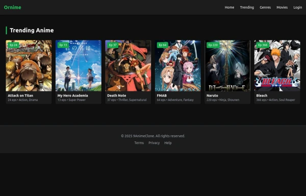 Solo leveling 2
Animation & movie field,videos,games.
1.2k -
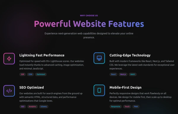 Powerful Website Features
Open Layout Design: No traditional boxes - content flows naturally Gradient Accents: Vibrant color gradients for visual interest Animated Icons: Subtle floating animations on feature icons Hover Effects: Soft glow backgrounds appear on hover Tag System: Color-coded tags for each feature's attributes Dark Theme: Sophisticated dark background with perfect contrast
1.9k -

-
 Hero Section with Tailwind CSS With Buttons
A modern, responsive Hero Section designed with Tailwind CSS to capture attention and drive engagement. Featuring a bold heading, compelling CTA buttons, and a high-quality image, this design enhances user experience and conversions. Ideal for landing pages, portfolios, and business websites, ensuring a strong first impression and higher interaction rates.
1.4k -
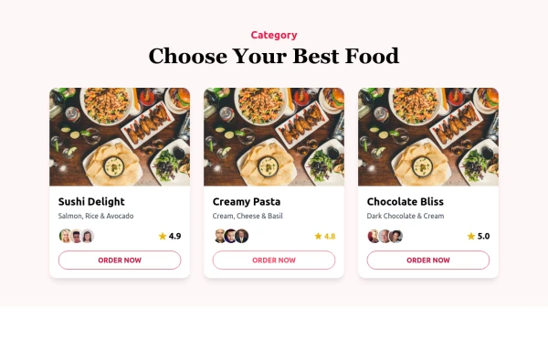 Food Ordering Dashboard
A responsive user interface for selecting and ordering your favorite meals. The dashboard allows users to browse food categories, view dish details, and place orders with ease.
-
 Login Form
Login Card Structure This code gives you a complete, self-contained login card. Here's what's included: Input Fields: Email and password fields with icons, labels, and placeholder text. The password field includes a "Forgot password?" link. Options & Actions: A "Remember me" checkbox and a prominent "Sign In" button with hover effects. Footer Links: A "Create one" link for new accounts and social login icons (Google and GitHub) for alternative sign-in methods.
190 -
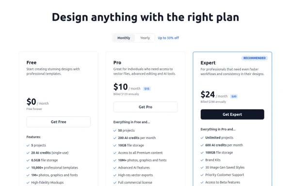 Modern Responsive Pricing Section with Toggle
A sleek, responsive pricing section built with HTML and Tailwind CSS, showcasing three distinct plans (e.g., Free, Pro, Expert) in a card layout. It features a clean monthly/yearly toggle switch with savings indication, highlights a recommended plan with distinct styling and a badge, and uses checkmarks for clear feature comparison. The layout stacks vertically on smaller screens and transitions to a 3-column grid on large screens (lg breakpoint). Includes generic content for easy adaptation and a final "Compare Plans" button.
1.8k -
 responsive home page
the best home page
1.9k










Browse by topic
Explore components by Tags
Jump straight to the UI pattern you need.
Can't find it?
Didn't find the component you were looking for?
Search across 3,000+ community-built components and grab the code in seconds.