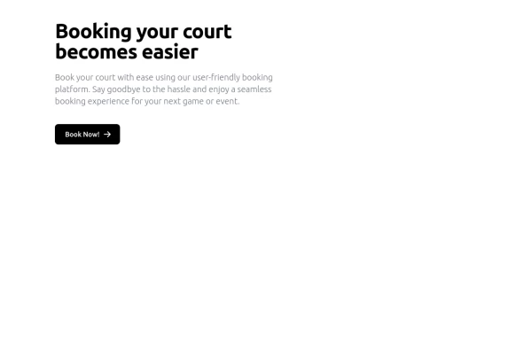
Hero Section with Tailwind CSS With Buttons
A modern, responsive Hero Section designed with Tailwind CSS to capture attention and drive engagement. Featuring a bold heading, compelling CTA buttons, and a high-quality image, this design enhances user experience and conversions. Ideal for landing pages, portfolios, and business websites, ensuring a strong first impression and higher interaction rates.
This tailwind example is contributed by Abdul Baset Bappy, on 26-Mar-2025. Component is made with Tailwind CSS v3. It is responsive. It supports dark mode.

Author Abdul Baset Bappy
Related Examples
-
 2 years ago6.7k
 -
 Simple Hero Section
Hero Section using Tailwind
1 year ago1.5k -
 Modern Responsive Footer with Tailwind CSS
This sleek and modern responsive footer is built using HTML and Tailwind CSS. It features three sections: brand information, useful links, and social media icons. The footer includes smooth hover effects, subtle fade-in animations, and a fully responsive design that adapts seamlessly to different screen sizes. Perfect for websites looking for a professional and stylish footer section.
1 year ago2.2k -
 DailyDev Card
Card -based card used in the Dailydev Card, this is created to be modified to taste of each user
1 year ago1.9k -
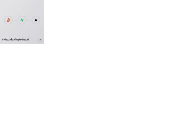 Animated bento box.
A Coastal UI component (coastalui.com). This can be used as part of a bento box, great for showing connectivity between context, could be used beyond just showing tech stacks.
1 year ago1.5k -
 Responsive Hero Section with Typewriter Effect
A modern hero section featuring a typewriter animation effect, social media links, and responsive design. Includes a user avatar placeholder and a clean dark gradient background. Built with Tailwind CSS and Font Awesome icons. Perfect for personal portfolio websites.
11 months ago692 -
 Clean AI Chat UI with Tailwind CSS – ChatGPT-Style Interface
A polished and responsive AI chat interface built using modern Web Components and Tailwind CSS. This UI replicates the smooth, minimal experience of ChatGPT with a clean layout, floating input bar, animated scrollable message feed, and mock AI responses. Ideal for SaaS dashboards, AI assistants, or frontend prototypes. Designed with professional spacing, accessible colors, and reusable components. Key features: Responsive layout with mobile support Floating input bar with auto-expanding textarea Tailwind-powered message bubbles with clear sender roles Modern dark theme with subtle gradients and shadows Easily extendable to real AI APIs (e.g., OpenAI)
10 months ago2k -
 3d Box
Let's build a 3d world empowered by Orgin Dreams.these are 3d objects
10 months ago835 -
 10 months ago1.5k
 -
 Life Tree
by salvator
10 months ago992 -
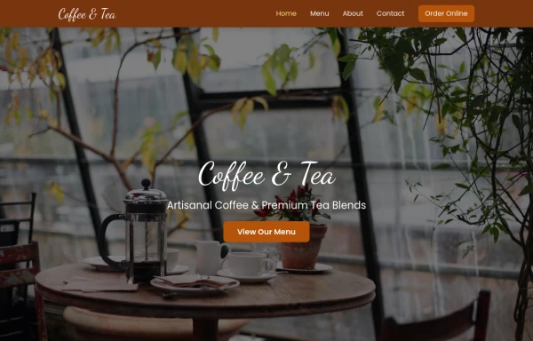 coffee
a beverage brewed from the roasted and ground seeds of the tropical evergreen coffee plant. Coffee is one of the three most popular beverages in the world (alongside water and tea), and it is one of the most profitable international commodities
10 months ago1.1k -
 A Code Master Academy
A Code Master Academy – Empowering the Next Generation of Tech Leaders in Rwanda 👨💻 I'm Acode Master, the founder of A Code Master Academy, a practical and inclusive coding school based in Rubavu, Rwanda. The academy is dedicated to transforming lives by equipping unemployed youth and passionate learners with job-ready skills in modern software development.
9 months ago1.2k


Explore components by Tags
Didn't find component you were looking for?
Search from 3000+ components