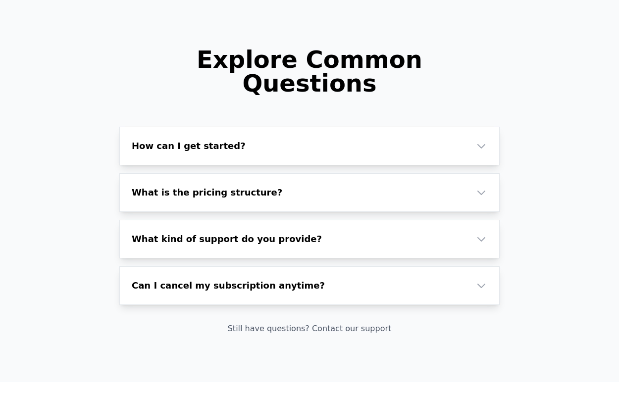
Simple Accordion with Alpine Js and Tailwind CSS
This tailwind example is contributed by Anonymous, on 28-Jul-2024. Component is made with Tailwind CSS v3. It is responsive. similar terms for this example is collapsible

Author Anonymous
Related Examples
-
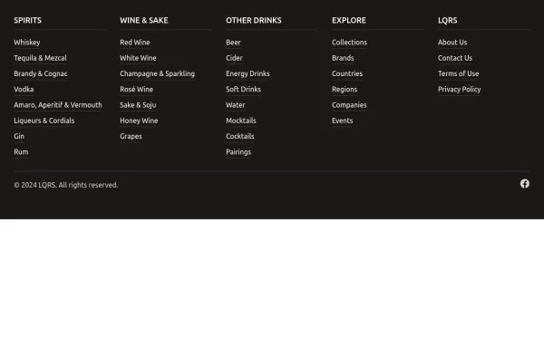 Footer with mobile accordion
A modern dark-themed footer component built with Tailwind CSS, featuring a responsive 5-column grid layout for desktop that transforms into an accordion menu on mobile devices. Perfect for beverage, e-commerce, or corporate websites, it includes organized navigation categories, hover effects on links, social media integration, and a clean copyright section - all styled with a professional stone-gray color scheme.
1 year ago1.5k -
3 years ago15.4k
-
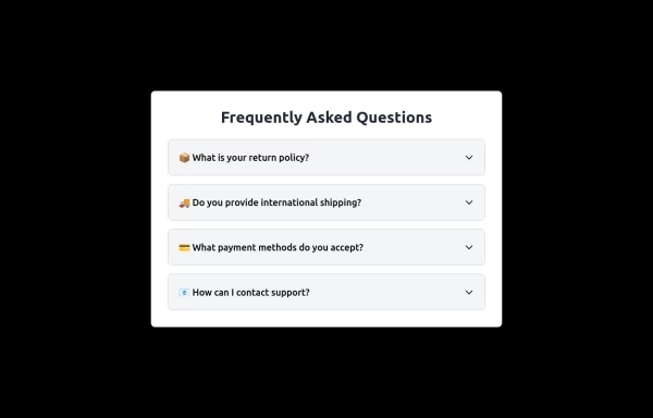 Frequently Asked Questions
A beautiful and modern accordion FAQ component using HTML & Tailwind CSS with smooth animations.
1 year ago1.7k -
 2 years ago9.2k
 -
 Accordion block
FAQ accordion component, featuring expandable sections with smooth transitions and a clean, modern design
1 year ago1.9k -
 bonimator dash board
bonimator dash board
7 months ago537 -
 HOT DOGS WEB SITE
it combine the hot dogs delivary
9 months ago719 -
 Stylish Mobile-First Navigation Bar Using Tailwind
This project showcases a sleek, fixed-top responsive navigation bar crafted with Tailwind CSS. Featuring a vibrant gradient background, a bold uppercase logo, and smooth pink hover effects, it adapts beautifully across devices. On desktop, the navigation links appear horizontally with ample spacing, while on mobile, a hamburger menu toggles a stylish dropdown with rounded corners and subtle shadows. The navbar’s semi-transparent backdrop with blur adds a modern glassmorphism touch, making it perfect for contemporary web designs.
10 months ago995 -
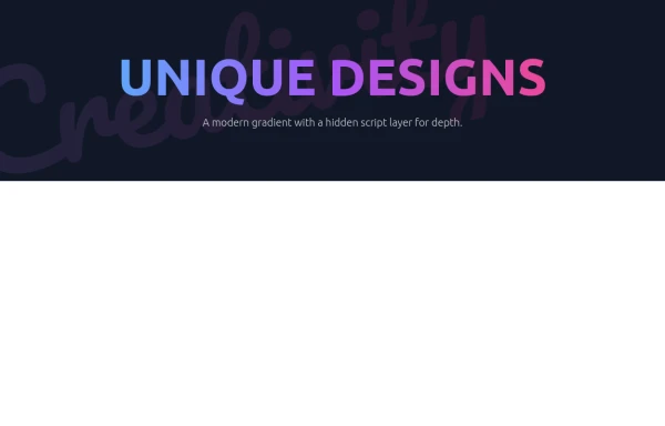 Modern Neon Gradient with Diagonal Script
(Purple/Blue/Pink Color Scheme)
9 months ago1.3k -
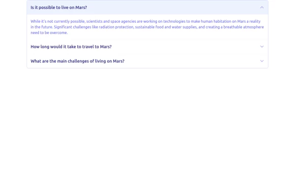
 FAQ Accordion Component
An interactive experience where users can click on questions to reveal or hide the corresponding answers.
2 years ago16.5k -
 Accordion
The Accordion is a responsive and reusable component designed to display collapsible content sections. It's perfect for FAQs, menu items, or any other grouped information. Each section can expand or collapse individually to show or hide content. Features: Mobile-friendly and fully responsive design. Smooth animation for opening and closing panels. Supports multiple or single panel expansion. Highly customizable with props for colors, fonts, and behavior (e.g., single/multiple open panels). Accessible with keyboard navigation and ARIA attributes.
1 year ago2k -
 Services
explore our awesome Services
1 year ago2.8k


Explore components by Tags
Didn't find component you were looking for?
Search from 3000+ components