HOT DOGS WEB SITE
it combine the hot dogs delivary
This tailwind example is contributed by bonheur dev, on 27-May-2025. Component is made with Tailwind CSS v3. It is responsive. similar terms for this example are Transitions,collapsible

Author bonheur dev
Related Examples
-
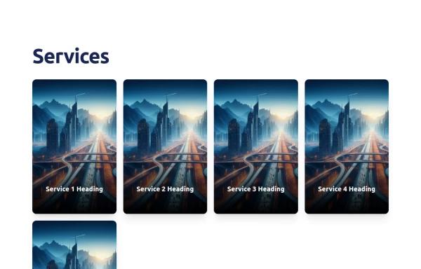 Dynamic Service Showcase with Interactive Flip Cards
This component presents a visually engaging service section featuring interactive flip cards. Each service card displays an image on the front and reveals details on the back when hovered over. The layout is responsive, ensuring seamless adaptability across various screen sizes. The hover effect adds a modern and engaging touch, enhancing user interaction.
11 months ago1.6k -
 Fireflies
Fireflies in the night sky. Based on anonymous/background-animation-2
10 months ago983 -
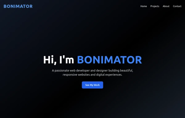 portifolio
upgraded portifolio
7 months ago775 -
 Hover effect card with background image
Beautiful card with background image, hover effect and gradient
1 year ago3.6k -
Animated Gradient Background
animates a gradient background with vibrant colors. Slowly changes colors.
2 years ago27.1k -
 Modern Responsive Footer with Tailwind CSS
This sleek and modern responsive footer is built using HTML and Tailwind CSS. It features three sections: brand information, useful links, and social media icons. The footer includes smooth hover effects, subtle fade-in animations, and a fully responsive design that adapts seamlessly to different screen sizes. Perfect for websites looking for a professional and stylish footer section.
1 year ago2.1k -
 Smooth Slide-in Animation for Text in Tailwind CSS
Learn how to create a smooth slide-in animation for text using Tailwind CSS. This guide covers defining custom animations in tailwind.config.js and applying them to elements for a modern and engaging UI effect. 🚀
11 months ago2k -
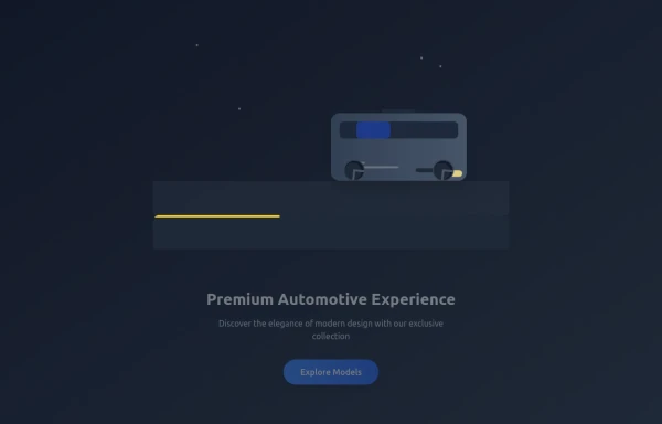
 Responsive 3D Car Delivery Animation Tutorial
Responsive 3D Car Delivery Animation Tutorial
9 months ago636 -
 Swipe card fully animative
@sufyandevs #sufyandevs #sufyandev #shanwebdev
4 months ago690 -
 3d car delivary
3d car delivary
9 months ago1.1k -
 1 year ago7k
 -
3 years ago15.4k


Explore components by Tags
Didn't find component you were looking for?
Search from 3000+ components