Accordion section
This tailwind example is contributed by Lyra Ravensong, on 26-Feb-2023. Component is made with Tailwind CSS v3. It is responsive. similar terms for this example is collapsible

Author Lyra Ravensong
Related Examples
-
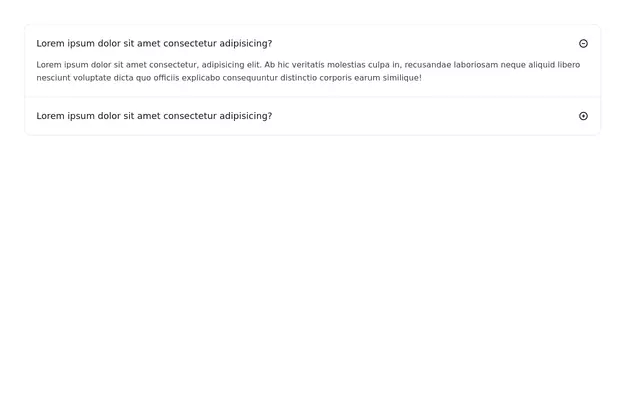
Accordion FAQ
FAQ Accordion section without using any javascript
3 years ago19.8k -
 Accordion
uses Flobite.js for interactivity
3 years ago15.4k -
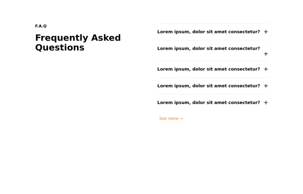
 FAQ section
An expanding frequently asked questions section made without using javascript.
3 years ago11.9k -
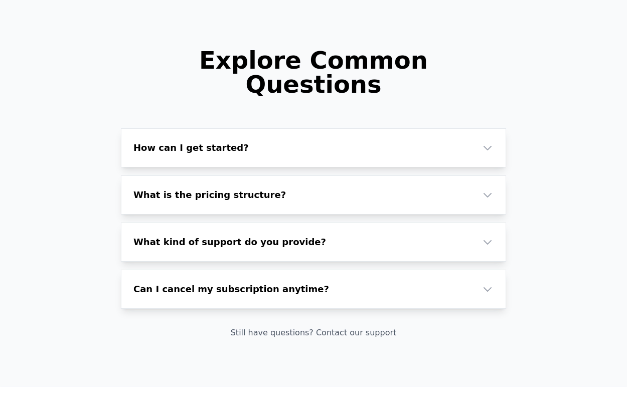 FAQ Accordion Component
An interactive experience where users can click on questions to reveal or hide the corresponding answers.
2 years ago16.5k -
 2 years ago9.2k
 -
 portifolio
upgraded portifolio
8 months ago779 -
 Why Everyone Around the World Loves Us
"Our platform is built to serve everyone, everywhere — with speed, security, and a human touch." "From cities to remote villages, our features connect the world through technology that truly cares." "Designed with the whole world in mind — fast, secure, and made for real people." "No matter who you are or where you're from, our tools are built to empower and inspire you." "We believe great technology should be accessible, safe, and helpful to all — and that's exactly what we offer."
10 months ago1.2k -
 Stylish Mobile-First Navigation Bar Using Tailwind
This project showcases a sleek, fixed-top responsive navigation bar crafted with Tailwind CSS. Featuring a vibrant gradient background, a bold uppercase logo, and smooth pink hover effects, it adapts beautifully across devices. On desktop, the navigation links appear horizontally with ample spacing, while on mobile, a hamburger menu toggles a stylish dropdown with rounded corners and subtle shadows. The navbar’s semi-transparent backdrop with blur adds a modern glassmorphism touch, making it perfect for contemporary web designs.
10 months ago995 -
 Native HTML Accordion
native html accordion summary details
1 year ago2.5k -
 FAQ.
FAQ.Super simple animated FAQ with tailwind group hoverable accordion open and close.
1 year ago2.4k -
 1 year ago5.6k
 -
 1 year ago2.9k


Explore components by Tags
Didn't find component you were looking for?
Search from 3000+ components