Accordion block
FAQ accordion component, featuring expandable sections with smooth transitions and a clean, modern design
This tailwind example is contributed by Maxim, on 13-Nov-2024. Component is made with Tailwind v3.4. It is responsive. It supports dark mode. similar terms for this example is collapsible

Related Examples
-
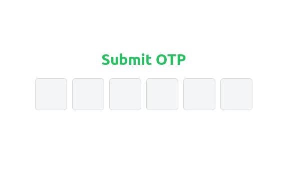 Elegant OTP Input Fields with TailwindCSS
A clean and responsive OTP input field component built with TailwindCSS. This design features six single-character input fields with smooth transitions, light gray borders, and backgrounds. On focus, the borders turn blue, creating a visually appealing and user-friendly experience. Perfect for authentication and verification forms.
2.2k -

-
 14.6k
14.6k -
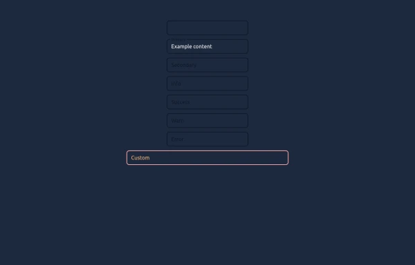 Elegant Textboxes
Useful Tailwind classes for creating several types of animated textboxes. Inspired by Google's floating label input fields.
1.2k -
 4.8k
4.8k -
Accordion FAQ
FAQ Accordion section without using any javascript
20.5k -
 Profile Form
Profile form for taking user inputs
15.4k -
 tailwind contact form
tailwind contact form
-
![Material 3 Radio Buttons [Light]](https://tailwindflex.com/storage/thumbnails/material-3-radio-buttons-light/canvas.min.webp?v=9) Material 3 Radio Buttons [Light]
Material 3 Radio Buttons [Light]Radio buttons that conform to Google's Material 3 design guidelines
1.1k -
Hover Button
Hover button then a overlay came from bottom to top
2.6k -
 Login
LoginLogin form, responsive, no dark-mode for white backgrounds, elegant for any platform
5.2k -







Browse by topic
Explore components by Tags
Jump straight to the UI pattern you need.
Can't find it?
Didn't find the component you were looking for?
Search across 3,000+ community-built components and grab the code in seconds.