Half filled circle with tailwind
This tailwind example is contributed by Alok, on 03-Jan-2023. Component is made with Tailwind CSS v3.

Author Alok
Related Examples
-
Upvote downvote buttons [alpine]
upvote and downvote buttons made as working version in alpine.js
2 years ago9.1k -
 Websites built to perform beautifully.
We design high-impact websites that convert and scale. From sleek interfaces to full stack experiences, we bring your brand to life online.
5 days ago6 -
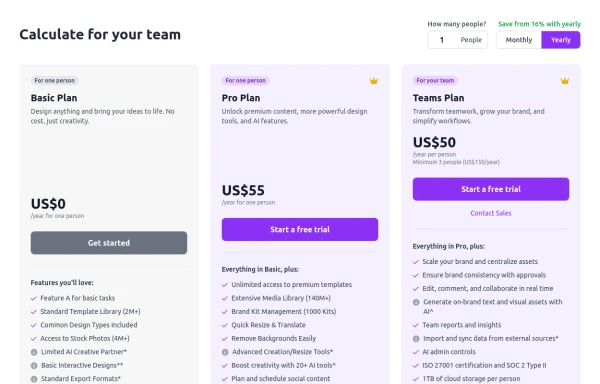 Configurable 3-Tier Responsive Pricing Table
A modern, responsive pricing table component inspired by SaaS layouts, built with HTML and Tailwind CSS. Features three distinct pricing tiers displayed in cards, stacking vertically on smaller screens and transitioning to a 3-column grid on large screens (lg breakpoint). Includes interactive top controls for selecting the number of users and toggling between monthly/yearly billing cycles. Each card uses placeholder content for icons, titles, descriptions, features (with checkmarks/info icons), and distinct call-to-action buttons, making it easily adaptable. Styled with subtle background colors and clear typography for excellent readability.
9 months ago717 -
 1 year ago1k
 -
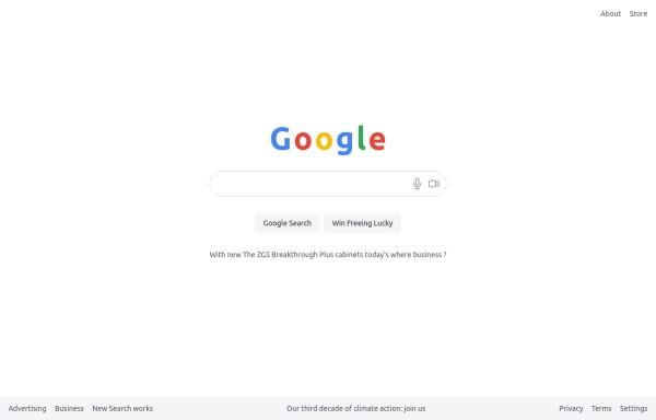 google clone page
This HTML page includes: The Google logo with the correct colors A search input field with microphone and camera icons "Google Search" and "Win Freeing Lucky" buttons The text "With new The ZGS Breakthrough Plus cabinets today's where business ?" Footer with all the links shown in the image: Advertising, Business, New Search works, Privacy, Terms, Settings The climate action text in the footer The layout is responsive and uses Tailwind CSS for styling. The colors match Google's brand colors, and the overall structure matches what's shown in the image.
9 months ago852 -
 DailyDev Card
Card -based card used in the Dailydev Card, this is created to be modified to taste of each user
1 year ago1.8k -
 Gradient Flip-Text Button with Hover Animation
This stylish button features a dynamic gradient background that shifts from a calm green gradient by default to a vibrant purple-pink-red gradient on hover. The button also includes an interactive text flip effect, where the text seamlessly transitions on hover, creating a visually appealing and modern UI element. Perfect for adding flair to your websites or applications while maintaining functionality and responsiveness.
1 year ago1.3k -
 Mobile app
I'll create a comprehensive collection of professional app components that you can use to build modern mobile and web applications.
8 months ago778 -
 Tailwind CSS Blog sharing buttons with blog details
Introducing our Blog Sharing Buttons with Blog Details component, designed to enhance the social sharing experience on your blog posts.
1 year ago2.1k -
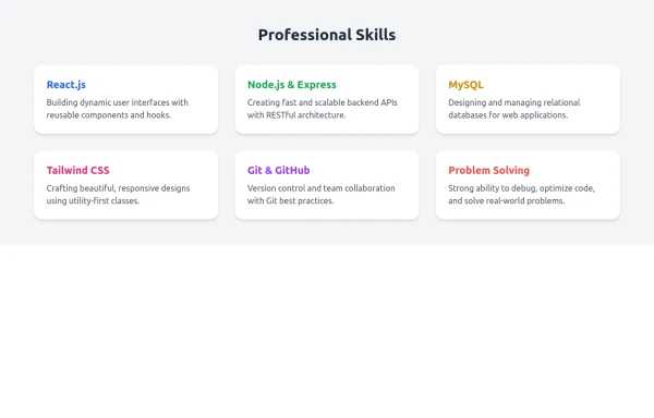 Skill Cards with Tailwind CSS
A responsive and modern card section designed with Tailwind CSS to showcase professional skills. Each card features a smooth fade-in animation and hover scaling effect for an engaging user experience. Ideal for portfolio websites, developer profiles, and personal branding pages. Fully customizable and mobile-friendly.
8 months ago760 -
 nft card
nft card
1 year ago1.8k -
 7 months ago1.4k


Explore components by Tags
Didn't find component you were looking for?
Search from 3000+ components