Coffee & Tea
Coffee: A brewed drink prepared from roasted seeds, called coffee beans, of the coffee plant. Tea: An agricultural product of the leaves, leaf buds, and internodes of various cultivars and sub-varieties of the Camellia sinensis plant, processed and cured using various methods.
This tailwind example is contributed by Augustin, on 22-May-2025. Component is made with Tailwind CSS v3. It is responsive.

Author Augustin
Related Examples
-
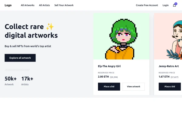
 Made a sinup form
Made a sinnup form
1 month ago184 -
 8 months ago1.3k
 -
 8 months ago533
 -
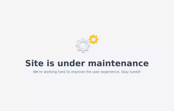 Maintenance page template
The site is under maintenance placeholder page
2 years ago10.6k -
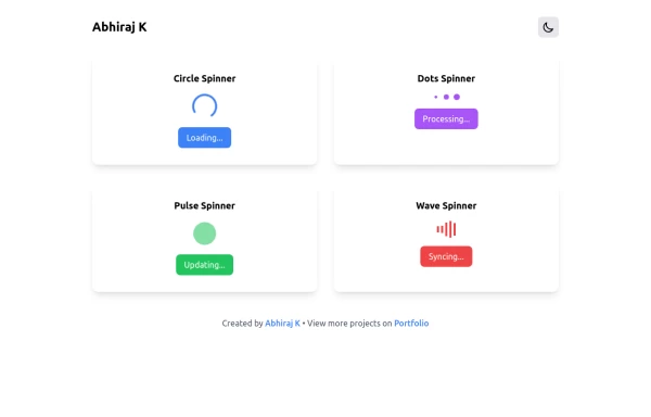 Spinner
The Spinner is a simple and visually appealing component that indicates ongoing processes like loading or data fetching. It's a great way to improve user engagement and reduce frustration during wait times. Different styles and animations (circular, dots, pulsating). Customizable size, color, and speed. Easy to integrate with loading states in any app. Lightweight and responsive.
1 year ago2.2k -
Typewriter effect
using javascript
3 years ago42.7k -
 1 year ago1.5k
 -
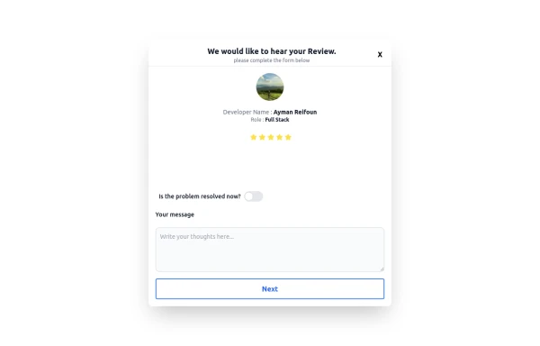 Review popup form with toggle and stars
Review popup form with toggle and stars
10 months ago901 -
 Testimonial Section
A responsive, SEO-friendly testimonial section for Ab Nahid Agency clients
8 months ago746 -
 Floating "Go to Top" Button with Tailwind CSS
🚀 Boost your website’s user experience with a sleek floating "Go to Top" button! This easy-to-implement solution uses Tailwind CSS for styling. ✔️ Smooth scroll to top ✔️ Clean and modern design ✔️ Responsive and animated effects Perfect for any website or portfolio! Add it today and make navigation effortless! 🔝💻
11 months ago896 -
 1 year ago2.1k
 -
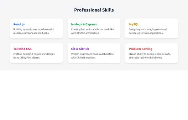 Skill Cards with Tailwind CSS
A responsive and modern card section designed with Tailwind CSS to showcase professional skills. Each card features a smooth fade-in animation and hover scaling effect for an engaging user experience. Ideal for portfolio websites, developer profiles, and personal branding pages. Fully customizable and mobile-friendly.
9 months ago775


Explore components by Tags
Didn't find component you were looking for?
Search from 3000+ components