visacardes
I'll create professional Visa card components with realistic styling and multiple card types
This tailwind example is contributed by Anonymous, on 22-May-2025. Component is made with Tailwind CSS v3. It is responsive.

Author Anonymous
Related Examples
-
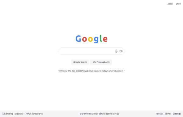 google clone page
This HTML page includes: The Google logo with the correct colors A search input field with microphone and camera icons "Google Search" and "Win Freeing Lucky" buttons The text "With new The ZGS Breakthrough Plus cabinets today's where business ?" Footer with all the links shown in the image: Advertising, Business, New Search works, Privacy, Terms, Settings The climate action text in the footer The layout is responsive and uses Tailwind CSS for styling. The colors match Google's brand colors, and the overall structure matches what's shown in the image.
9 months ago852 -
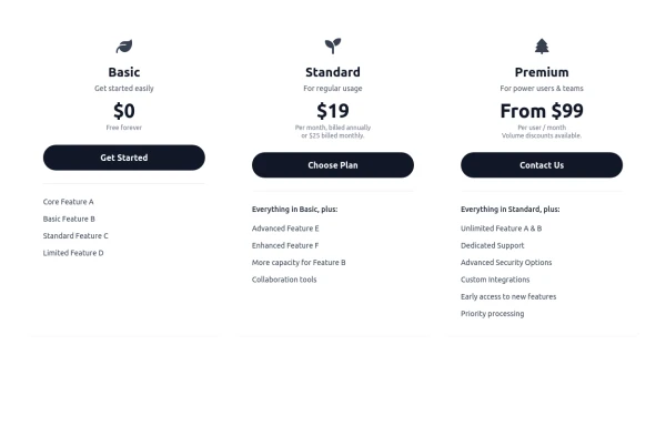 Responsive 3-Tier Pricing Card Section
A clean and responsive pricing table component featuring three distinct tiers (e.g., Basic, Standard, Premium) presented in a card layout. Built with HTML and Tailwind CSS, it stacks vertically on small screens and transitions to a side-by-side view on medium screens (md breakpoint - 768px) and up. Each plan card includes a placeholder icon, title, description, price details, a call-to-action button, and a bulleted list of features with checkmarks. The generic content makes it easy to adapt for various websites or applications needing a clear pricing comparison structure.
9 months ago607 -
 2 years ago12.3k
 -
 pile carde scroll
pile carde scroll
3 weeks ago19 -
 authentication form terminal
authentication form with zsh on mac terminal looks
1 year ago2.9k -
 Card blog
Targeta para blog
3 months ago209 -
 trusted by
1. Color Scheme: 1. Updated the background to a gradient from Indigo-800 to Blue-900 2. Changed text colors to use Indigo-800 and Blue-900 shades 3. Updated ring colors on avatar images to match the new scheme 2. Enhanced Design: 1. Added a containing card with white background (dark gray in dark mode) 2. Increased the size of avatar images for better visibility 3. Added a shadow effect to the card that changes color on hover 3. Responsiveness: 1. Maintained the responsive layout, stacking vertically on smaller screens 4. Animations and Interactions: 1. Added a fade-in animation for the entire component 2. Enhanced hover effects on avatar images (scale and z-index change) 3. Added a ring effect on hover for each avatar 5. Accessibility: 1. Maintained alt text for images 2. Ensured proper color contrast for text readability 6. Dark Mode: 1. Implemented dark mode support 2. Adjusted colors and ring effects for dark mode 7. Additional Enhancements: 1. Increased font sizes for better readability 2. Added font weight variations to emphasize important text 3. Improved spacing and alignment This updated component maintains the original functionality while incorporating the Indigo-800 and Blue-900 color scheme and adding enhanced visual effects and interactions.
1 year ago1.9k -
 To-Do List with Tailwind CSS
A simple and responsive to-do list built with HTML, JavaScript, and Tailwind CSS. Features task addition, completion, and deletion. Perfect for beginner projects or component demos.
7 months ago972 -
 Calculator
This calculator uses CSS although it can be passed directly to tailwind
1 year ago2.1k -
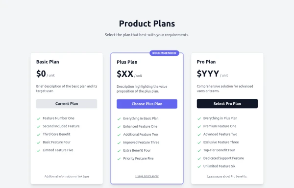 Responsive Multi-Tier Pricing Table Component
flexible and responsive 3-tier pricing table component built with HTML and Tailwind CSS. Features distinct visual styles for different plans (e.g., highlighting a recommended option), adapts to various screen sizes, and supports both light and dark color schemes. Uses generic placeholders for easy adaptation to any product or service.
9 months ago1.4k -
 Midnight Lava Lamp
Inspired by Steam's old "Big Picture" ambiance. Based on anonymous/background-animation-2
9 months ago1.1k -
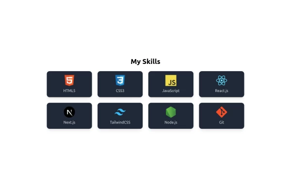 Skills Showcase, My Tech Stack and Expertise & Skills
🚀 Showcasing My Skills with TailwindCSS & Flexbox! I’ve designed a responsive and interactive Skills Section using Tailwind CSS and Flexbox. With smooth hover effects and a clean layout, this section highlights my expertise in: 🔹 Frontend Technologies – HTML, CSS, JavaScript, React, Next.js 🔹 Styling Frameworks – TailwindCSS 🔹 Backend & Tools – Node.js, Git
10 months ago1.3k


Explore components by Tags
Didn't find component you were looking for?
Search from 3000+ components