Terms of Service Page Template
This tailwind example is contributed by Anonymous, on 25-Dec-2024. Component is made with Tailwind CSS v3. It is responsive.

Author Anonymous
Related Examples
-
 chart
chartto chart on your family and
8 months ago549 -
 Clean AI Chat UI with Tailwind CSS – ChatGPT-Style Interface
A polished and responsive AI chat interface built using modern Web Components and Tailwind CSS. This UI replicates the smooth, minimal experience of ChatGPT with a clean layout, floating input bar, animated scrollable message feed, and mock AI responses. Ideal for SaaS dashboards, AI assistants, or frontend prototypes. Designed with professional spacing, accessible colors, and reusable components. Key features: Responsive layout with mobile support Floating input bar with auto-expanding textarea Tailwind-powered message bubbles with clear sender roles Modern dark theme with subtle gradients and shadows Easily extendable to real AI APIs (e.g., OpenAI)
9 months ago1.8k -
 Chat Bot
Simulation of a chat bot that can be used for conversations as a sketch idea
1 year ago3.6k -
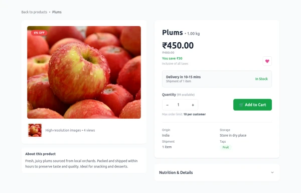 Product Details Page
This section will show all the information about a selected product, including its title, description, price, images, and specifications.
5 months ago1k -
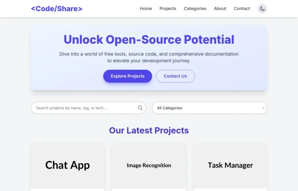 Modern website that provides software services
The website is a platform that offers software services to users, including access to open-source code, downloadable projects, and relevant documentation. The main objective is to support students, developers, and the open-source community by sharing free tools and source code examples.
8 months ago475 -
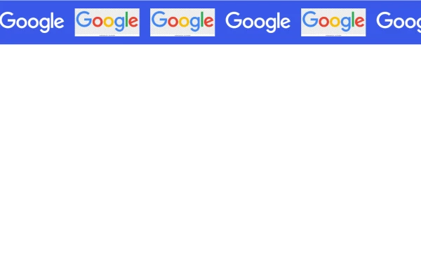 Marquee Slider of Client Logos – Smooth Scrolling Brand Showcase
Enhance your website's credibility with a sleek marquee slider displaying client logos. This continuously scrolling slider provides a dynamic and engaging way to showcase your trusted partnerships, ensuring a professional and visually appealing design. Perfect for businesses, portfolios, and service-based websites.
7 months ago529 -
 3 months ago479
 -
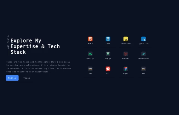 Reusable Skill Showcase Section With Pure Tailwind CSS
A fully responsive and modular "Skills & Tools" section, perfect for any developer portfolio. Built with static HTML and Tailwind CSS, this component can be easily integrated into any project and made dynamic using any frontend framework (Vue, React, Svelte, Angular) or vanilla JavaScript. Customize it to highlight your unique tech stack and create engaging portfolio pages.
10 months ago1.9k -
 cards
cardscards with background animation
2 years ago11.9k -
 1 year ago3.8k
 -
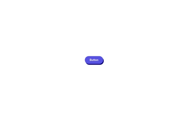 🔥 Sleek & Modern Button with Hover Effect – Tailwind CSS
A beautifully designed button using Tailwind CSS, featuring smooth transitions, a bold shadow effect, and a hover animation. Styled with custom colors, rounded edges, and a modern font, this button is perfect for call-to-action (CTA) elements in your website or app. 🚀
11 months ago856 -
 3 years ago13.2k


Explore components by Tags
Didn't find component you were looking for?
Search from 3000+ components