Todo List with Dark theme
Todo List with Dark theme
This tailwind example is contributed by Muzammil Riaz, on 28-May-2025. Component is made with Tailwind CSS v3. It is responsive. It supports dark mode. similar terms for this example is find

Author Muzammil Riaz
Related Examples
-
 2 years ago9k
 -
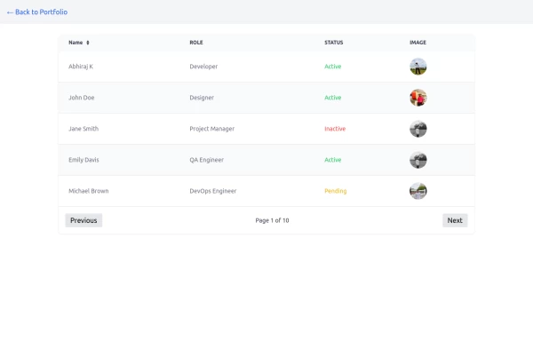 Table
TableTable with image and status with pagination buttons
1 year ago2.6k -
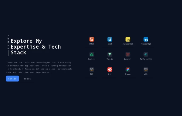 Reusable Skill Showcase Section With Pure Tailwind CSS
A fully responsive and modular "Skills & Tools" section, perfect for any developer portfolio. Built with static HTML and Tailwind CSS, this component can be easily integrated into any project and made dynamic using any frontend framework (Vue, React, Svelte, Angular) or vanilla JavaScript. Customize it to highlight your unique tech stack and create engaging portfolio pages.
1 year ago1.9k -
 Animated Ripple Avatar
Ripple Effect Avatar (Tailwind CSS Component) A visually striking animated component that displays a centered avatar or image surrounded by expanding ripple circles. Built with Tailwind CSS and custom animations, this effect simulates a pulsing or water ripple reaction, drawing attention to the central image. Ideal for user profile sections, hero banners, landing pages, or highlighted features in modern web interfaces. The ripples gradually fade and expand, creating a soft, calming motion that enhances interactivity and depth.
10 months ago1.3k -
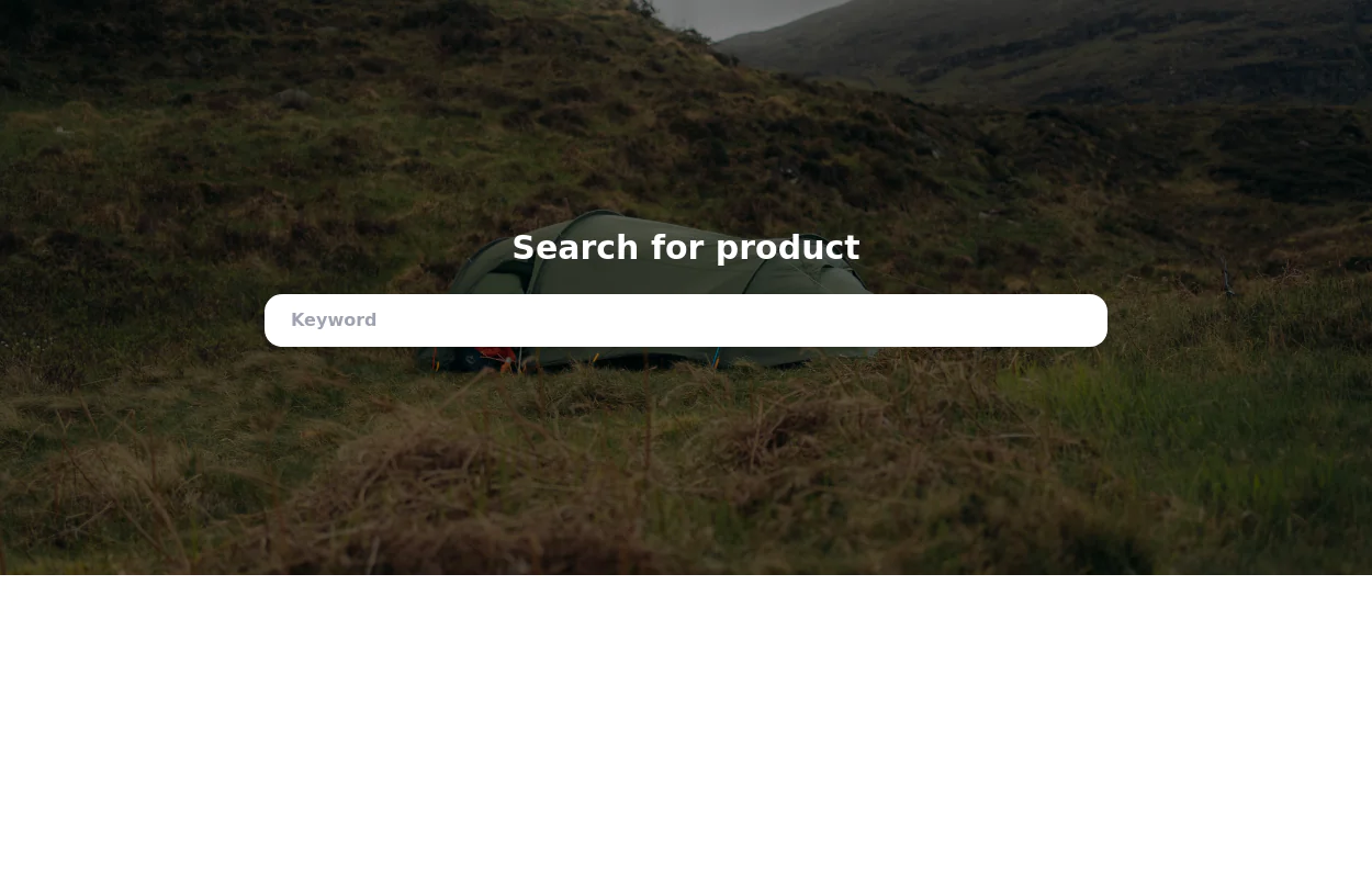
 Content Discovery Platform with Search & Filter
A modern, responsive web application built with Tailwind CSS that showcases content cards with search and filter functionality.
4 months ago330 -
 2 years ago12.2k
 -
 Items list
list in fieldset
3 years ago9.3k -
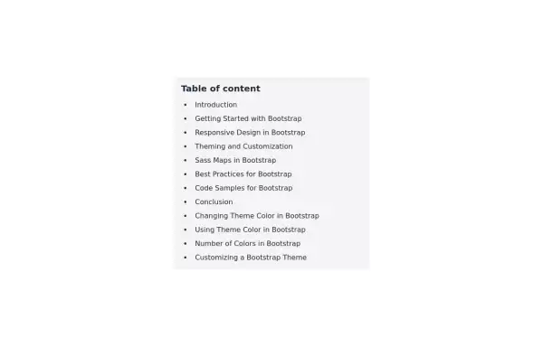 Table of content
Show list of Table of content
2 years ago5.9k -
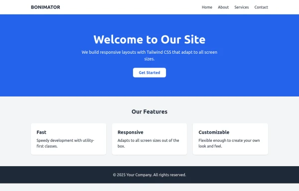 BONIMATOR Responsive Tailwind Starter Template
Responsive Tailwind Starter Template
9 months ago945 -
 9 months ago622
 -
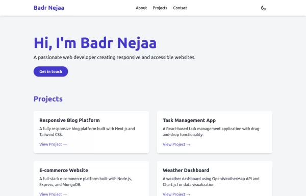 Portfolio
This responsive portfolio with dark mode support includes: 1. Fully responsive design that works on both desktop and mobile devices 2. Dark mode toggle with system preference detection and local storage persistence 3. Indigo-800 and Blue-900 color scheme for primary colors in light and dark modes 4. Beautiful animations and effects: 1. Fade-in and slide-up animations for sections using Intersection Observer 2. Hover effects on projects and buttons 3. Smooth scrolling for navigation 5. Mobile-friendly navigation with a toggle menu 6. Sections for About, Projects, and Contact 7. A contact form with styled inputs 8. Social media links in the footer 9. Accessibility considerations (proper heading structure, color contrast, focus styles, ARIA labels) Key features: - The color scheme uses Indigo-800 for light mode and orange-400 for dark mode as primary colors - Dark mode toggle in the header with a sun/moon icon - Sections fade in and slide up as they enter the viewport - Project cards have a hover effect with scaling and increased shadow - The contact form has animated focus states - Social media icons change color on hover - The layout is responsive, with a hamburger menu for mobile screens - Smooth scrolling behavior for navigation links - Dark mode preference is saved in local storage and syncs with system preference This implementation provides a visually appealing, accessible, and functional responsive portfolio with dark mode support, using HTML, Tailwind CSS, and vanilla JavaScript for the
1 year ago3.3k -
 Modern Testimonial
A simple and easy to use component for reviews and testimonials.
1 year ago1.1k


Explore components by Tags
Didn't find component you were looking for?
Search from 3000+ components