Muhammad Umair Arshad - Frontend Developer Resume | React, TypeScript, Tailwind CSS
Professional resume of Muhammad Umair Arshad, a skilled Frontend Developer specializing in React, TypeScript, and Tailwind CSS. I build high-performance web applications with responsive UI design.
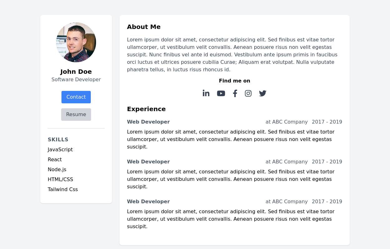
This tailwind example is contributed by Muhammad Umair Arshad, on 11-Apr-2025. Component is made with Tailwind CSS v3. It is responsive. similar terms for this example are Author box, User information,Social media links,,CV template

Author Muhammad Umair Arshad
Related Examples
-
 3 years ago25.6k
 -
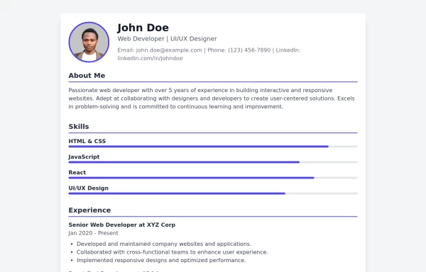
 Basic Resume template
simple and clean layout that provides a professional look.
3 years ago27.7k -
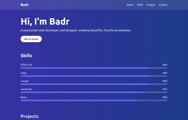
 Modern resume template
modern resume template with data
2 years ago22.6k -
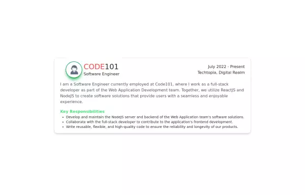 Experience Card
Experience card section you can use for portfolio or other profiles.
2 years ago4.1k -
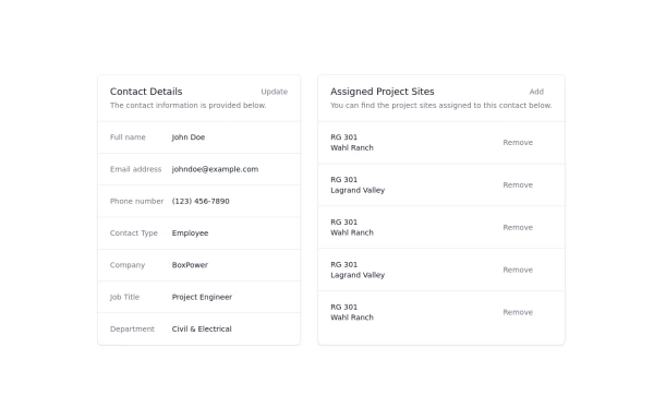 Updated customer details page
Customer details page
1 year ago3.8k -
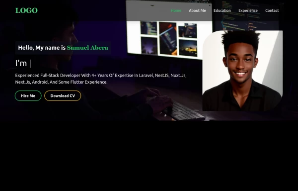 Portfolio Hero Section 2
visually stunning and captivating hero section component for your portfolio website.
1 year ago5.6k -
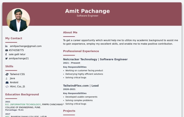
 Modern CV Template - Stylish HTML and Tailwind CSS Design for Professionals
Download this modern CV template crafted with HTML and Tailwind CSS. Featuring a clean, stylish design and easy customization, this CV template is perfect for professionals looking to make a strong impression. Showcase your skills, experience, and education with a visually appealing and responsive layout.
1 year ago3.2k -
 Tailwind CSS Blog sharing buttons with blog details
Introducing our Blog Sharing Buttons with Blog Details component, designed to enhance the social sharing experience on your blog posts.
1 year ago2.1k -
 portfolio
This portfolio page for Claire includes: 1. Responsive design that works on both desktop and mobile 2. Indigo-800 and Blue-900 color scheme for the background 3. Dark mode support (the design is already dark-themed) 4. Beautiful animations and effects: 1. Fade-in and slide-up animations for sections 2. Animated skill bars 3. Hover effects on projects and buttons 4. Smooth scrolling for navigation 5. Mobile-friendly navigation with a toggle menu 6. Sections for About, Skills, Projects, and Contact 7. A contact form with styled inputs 8. Social media links in the footer 9. Accessibility considerations (proper heading structure, color contrast, focus styles) Key features: - The background uses a gradient from Indigo-800 to Blue-900 - The header and footer have a frosted glass effect using backdrop filters - Text is white for high contrast against the dark background - Sections fade in and slide up as they enter the viewport - Skill bars animate when the skills section is in view - Project cards have a hover effect with scaling and increased opacity - The contact form has animated focus states - Social media icons change color on hover - The layout is responsive, with a hamburger menu for mobile screens This implementation provides a visually appealing and functional portfolio page for Claire, using HTML, Tailwind CSS, and vanilla JavaScript for the interactions and animations.
1 year ago2.8k -
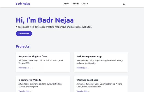 Portfolio
This responsive portfolio with dark mode support includes: 1. Fully responsive design that works on both desktop and mobile devices 2. Dark mode toggle with system preference detection and local storage persistence 3. Indigo-800 and Blue-900 color scheme for primary colors in light and dark modes 4. Beautiful animations and effects: 1. Fade-in and slide-up animations for sections using Intersection Observer 2. Hover effects on projects and buttons 3. Smooth scrolling for navigation 5. Mobile-friendly navigation with a toggle menu 6. Sections for About, Projects, and Contact 7. A contact form with styled inputs 8. Social media links in the footer 9. Accessibility considerations (proper heading structure, color contrast, focus styles, ARIA labels) Key features: - The color scheme uses Indigo-800 for light mode and orange-400 for dark mode as primary colors - Dark mode toggle in the header with a sun/moon icon - Sections fade in and slide up as they enter the viewport - Project cards have a hover effect with scaling and increased shadow - The contact form has animated focus states - Social media icons change color on hover - The layout is responsive, with a hamburger menu for mobile screens - Smooth scrolling behavior for navigation links - Dark mode preference is saved in local storage and syncs with system preference This implementation provides a visually appealing, accessible, and functional responsive portfolio with dark mode support, using HTML, Tailwind CSS, and vanilla JavaScript for the
1 year ago3.3k -
 1 year ago4.1k
 -
 1 year ago1.6k


Explore components by Tags
Didn't find component you were looking for?
Search from 3000+ components