Our features
Our features
This tailwind example is contributed by Tanvir Hasan Bappy (Tanvir), on 03-Dec-2024. Component is made with Tailwind CSS v3. It is responsive. It supports dark mode.

Author Tanvir Hasan Bappy (Tanvir)
Related Examples
-
 Product cards
Product cards for eCommerce
4 months ago483 -
 Lots of button examples
tailwind button examples
10 months ago603 -
 Swiss-Grid Dark Pricing
A brutally minimalist pricing section that relies on strict grid architecture and typographic hierarchy instead of decorative elements. Features responsive border collapsing, monospaced technical accents, and high-performance CSS-only hover states. Designed for high-end SaaS, dev-tools, or agency portfolios that prioritize data clarity and structural rhythm.
2 months ago178 -
 machine
tell you how your MAC pc work
3 months ago336 -
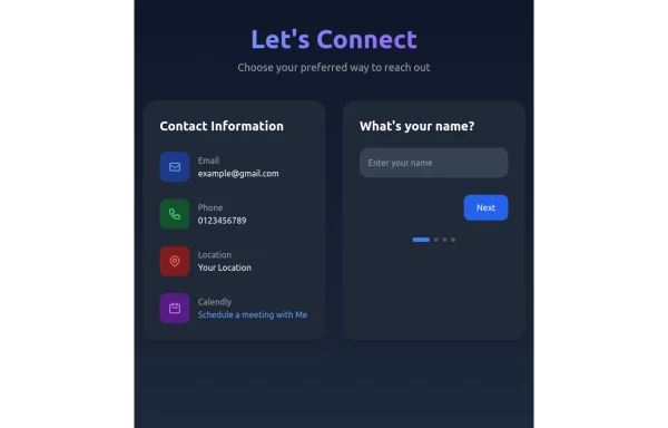 Contact Form Component
A multi-step, responsive contact form with a modern dark-themed design. The form includes four steps: name, email, phone number, and message. It features a side panel with contact information and a sleek, gradient-styled interface using Tailwind CSS.
11 months ago1.2k -
 1 year ago2.7k
 -
-
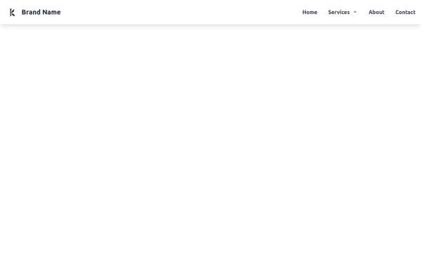 Tailwind CSS Navbar
Logo on the left. Main menu with a mega menu under "Services". Responsive design with a hamburger menu for mobile devices. Mega menu appears on hover for desktop and toggles on click for mobile.
8 months ago1.2k -
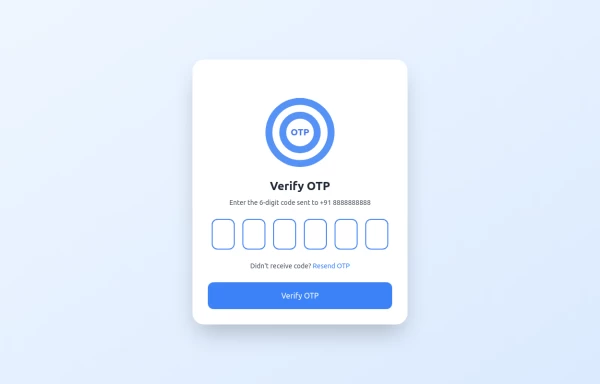 OTP Verification Page
A responsive and interactive OTP verification page built with Tailwind CSS. The page features a gradient background, hover effects, and animations to enhance user experience. It includes input fields for the OTP, a resend OTP link, and a verify button. The design is optimized for both light and dark modes.
1 year ago2.7k -
 4 days ago11
 -
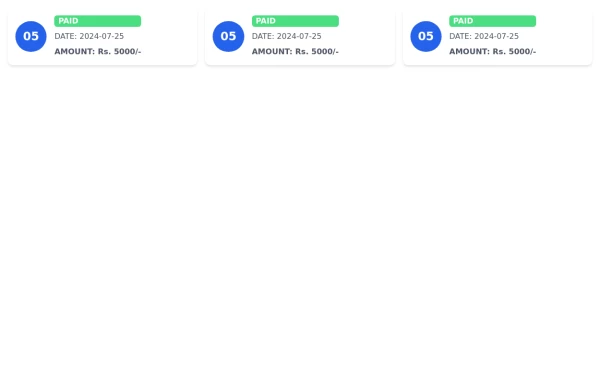
 Invoice Generator
Invoice Generator
2 months ago151 -
 Clean Component Sharing Hub (Landing State)
A minimalist, "before-talking" landing screen designed for a code or design component sharing platform. Features a welcoming header, three distinct action cards for sharing/browsing/exporting code, and a floating input bar, all styled with soft shadows and ample white space mimicking modern design tools.
2 months ago157


Explore components by Tags
Didn't find component you were looking for?
Search from 3000+ components