Flex and Flex-Col
วิธีการใช้ Flex และ Flex-Col
This tailwind example is contributed by rawitsara.tr, on 17-Aug-2025. Component is made with Tailwind CSS v3. It is responsive. It supports dark mode.

Author rawitsara.tr
Related Examples
-
 admindashboard
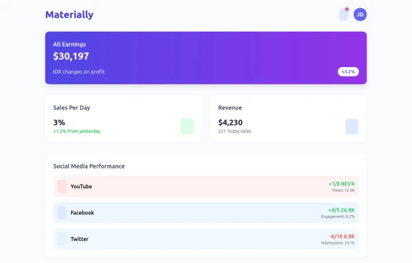
creates a responsive, interactive admin dashboard using Tailwind CSS, Font Awesome, Chart.js, and custom JavaScript animations. It's called "Materially Dashboard" and is designed for presenting key statistics and analytics data in a visually appealing manner.
10 months ago871 -
 9 months ago996
 -
 Todo List
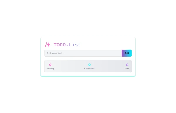
A simple tool to track tasks: add, edit, complete, or delete items to stay organized daily.
9 months ago1.1k -
 Floating "Go to Top" Button with Tailwind CSS
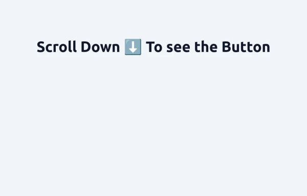
🚀 Boost your website’s user experience with a sleek floating "Go to Top" button! This easy-to-implement solution uses Tailwind CSS for styling. ✔️ Smooth scroll to top ✔️ Clean and modern design ✔️ Responsive and animated effects Perfect for any website or portfolio! Add it today and make navigation effortless! 🔝💻
11 months ago1k -
 Lifetime Access (iOS 26 Style)
Lifetime Access (iOS 26 Style)
2 months ago41 -
3 years ago21.8k
-
 Question & Answer
questions and answers
2 years ago8.9k -
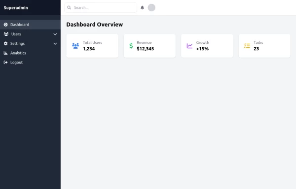 super admin
super admin
11 months ago1.2k -
 4 months ago297
 -
 Atlas AI Analyst Workspace
A premium, document-centric AI chat interface that moves beyond standard bubbles into a professional "editor" layout. Designed for power users, it features a floating glassmorphic command bar, a dedicated "Memory & Context" sidebar with interactive widgets, and rich data visualization blocks. The aesthetic combines a deep charcoal base with luxury bronze/orange accents, making it ideal for high-end SaaS tools, financial analysis dashboards, or enterprise AI assistants.
2 months ago131 -
 10 months ago717
 -
 10 months ago1.5k


Explore components by Tags
Didn't find component you were looking for?
Search from 3000+ components