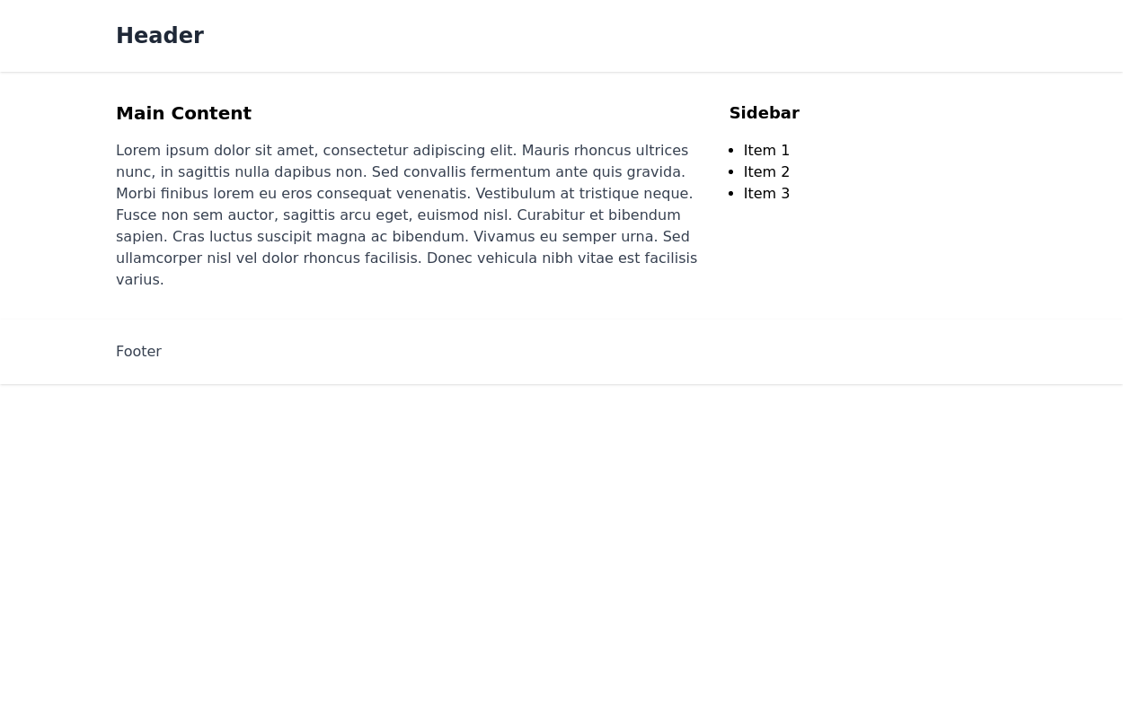
Responsive layout with header, main body, aside (sidebar) and footer
This tailwind example is contributed by Ahmed Malik, on 04-Apr-2023. Component is made with Tailwind CSS v3. It is responsive.

Author Ahmed Malik
Related Examples
-
 3 years ago9.7k
 -
background animation
background animation
2 years ago51k -
 Skill showcase section for resume / porfolio website
show skill progression
2 years ago14k -
 2 years ago14k
 -
 10 months ago1.5k
 -
 1 year ago1.6k
 -
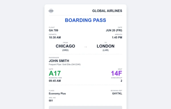 Boarding Pass Design
Testing out a layout and design for a digital boarding pass
9 months ago771 -
 Clean AI Chat UI with Tailwind CSS – ChatGPT-Style Interface
A polished and responsive AI chat interface built using modern Web Components and Tailwind CSS. This UI replicates the smooth, minimal experience of ChatGPT with a clean layout, floating input bar, animated scrollable message feed, and mock AI responses. Ideal for SaaS dashboards, AI assistants, or frontend prototypes. Designed with professional spacing, accessible colors, and reusable components. Key features: Responsive layout with mobile support Floating input bar with auto-expanding textarea Tailwind-powered message bubbles with clear sender roles Modern dark theme with subtle gradients and shadows Easily extendable to real AI APIs (e.g., OpenAI)
10 months ago2k -
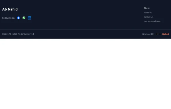 Footer
Elevate your website design with this sleek and minimalist light mode footer component by AB NAHID AGENCY. Crafted for clean UI experiences, it’s perfect for modern web apps, blogs, and business platforms. Easy to integrate, fully responsive, and built with scalability in mind—designed to blend seamlessly with any light-themed layout.
8 months ago722 -
 10 months ago1.5k
 -
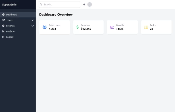 super admin
super admin
11 months ago1.2k -
 6 months ago518


Explore components by Tags
Didn't find component you were looking for?
Search from 3000+ components