Table Content
Dashboard Table Content, with Sidebar
Reusable for any window
This tailwind example is contributed by Ameth Galarcio, on 12-Feb-2025. Component is made with Tailwind CSS v3. similar terms for this example is drawer

Author Ameth Galarcio
Related Examples
-
 Responsive navbar with alpinejs
A mix of Penguin navbar with PineUI Slide-Over
1 year ago3.5k -
 Sidebar
This is the sidebar that I use in my projects, I use grid to be able to manage the space issue a little better, it seems like a clean and modern design, it is more than anything for the dashboards that you want to create
1 year ago4k -
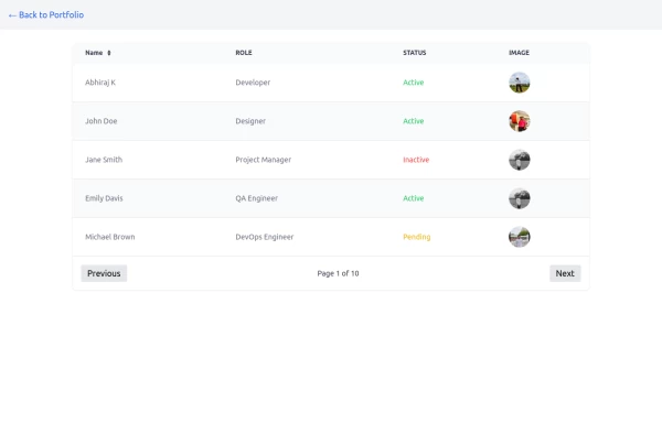 Table
TableTable with image and status with pagination buttons
1 year ago2.6k -
 Table CRUD
CRUD TABLE DESIGN
1 year ago3.7k -
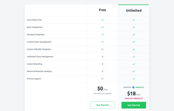 Comparison Pricing Table Component
A responsive pricing table built with HTML and Tailwind CSS, comparing two plans (Free and Unlimited) with a clear feature checklist. Includes distinct styling for the premium plan and a toggle for monthly/annual pricing display.
11 months ago1.5k -
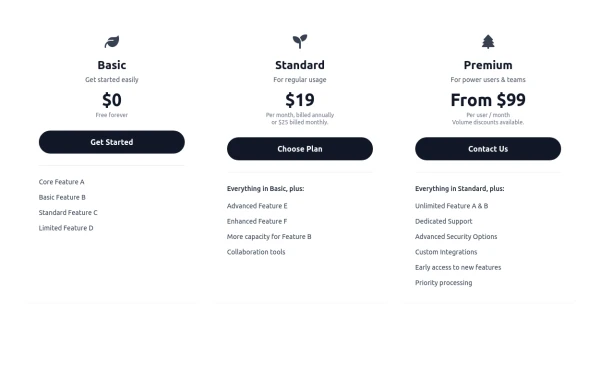 Responsive 3-Tier Pricing Card Section
A clean and responsive pricing table component featuring three distinct tiers (e.g., Basic, Standard, Premium) presented in a card layout. Built with HTML and Tailwind CSS, it stacks vertically on small screens and transitions to a side-by-side view on medium screens (md breakpoint - 768px) and up. Each plan card includes a placeholder icon, title, description, price details, a call-to-action button, and a bulleted list of features with checkmarks. The generic content makes it easy to adapt for various websites or applications needing a clear pricing comparison structure.
11 months ago711 -
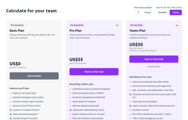 Configurable 3-Tier Responsive Pricing Table
A modern, responsive pricing table component inspired by SaaS layouts, built with HTML and Tailwind CSS. Features three distinct pricing tiers displayed in cards, stacking vertically on smaller screens and transitioning to a 3-column grid on large screens (lg breakpoint). Includes interactive top controls for selecting the number of users and toggling between monthly/yearly billing cycles. Each card uses placeholder content for icons, titles, descriptions, features (with checkmarks/info icons), and distinct call-to-action buttons, making it easily adaptable. Styled with subtle background colors and clear typography for excellent readability.
11 months ago874 -
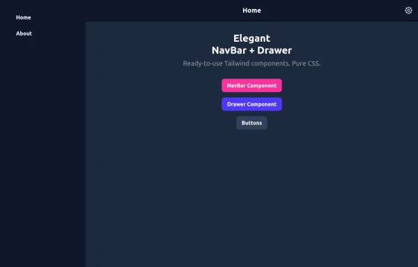 Elegant NavBar + Drawer
A NavBar, a responsive drawer/sidebar, and other useful Tailwind components to get started creating an app. Pure CSS, no JavaScript needed (although this example uses a bit of JS).
10 months ago1.4k -
 8 months ago1.2k
 -
 Taskify Premium Task Management FREE
Website Task management modern and responsif
1 month ago179 -
 Reader AI – Your AI-Powered Knowledge & Thinking System
Reader AI helps you read, think, and remember better. Upload books, highlight insights, chat with AI, and build a personal knowledge system that evolves with you.
3 days ago28 -
Typewriter effect
using javascript
3 years ago42.8k


Explore components by Tags
Didn't find component you were looking for?
Search from 3000+ components