Profile Card
Show more details on hover
This tailwind example is contributed by Tamani Phiri, on 12-Aug-2023. Component is made with Tailwind CSS v3. It is responsive. It supports dark mode. similar terms for this example are Author box, User information

Author Tamani Phiri
Related Examples
-
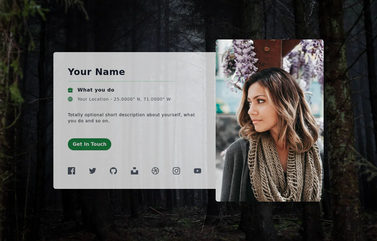
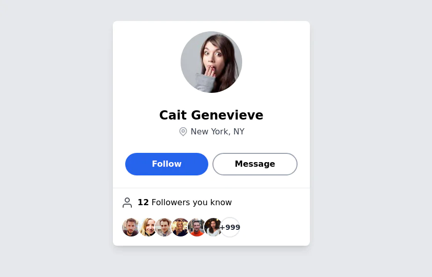 User Profile Card
The card features a user's profile picture, name, location, and options for interactions. It has a clean and modern design with rounded edges and icons for user engagement. It also has support for dark mod:
3 years ago64.5k -
 3 years ago32.8k
 -
 3 years ago11.8k
 -
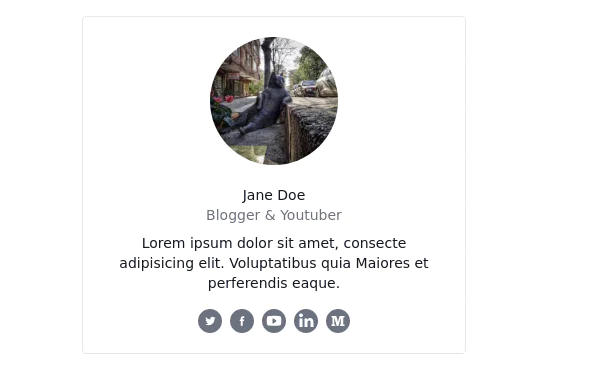
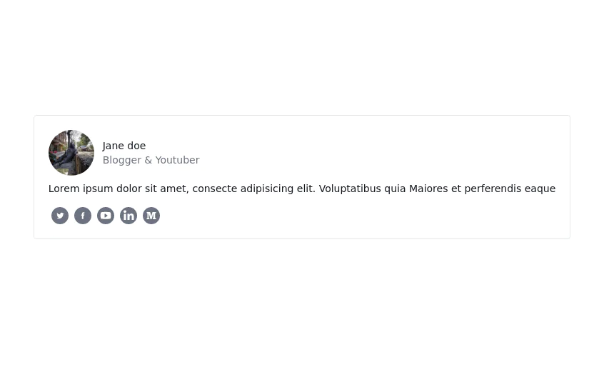
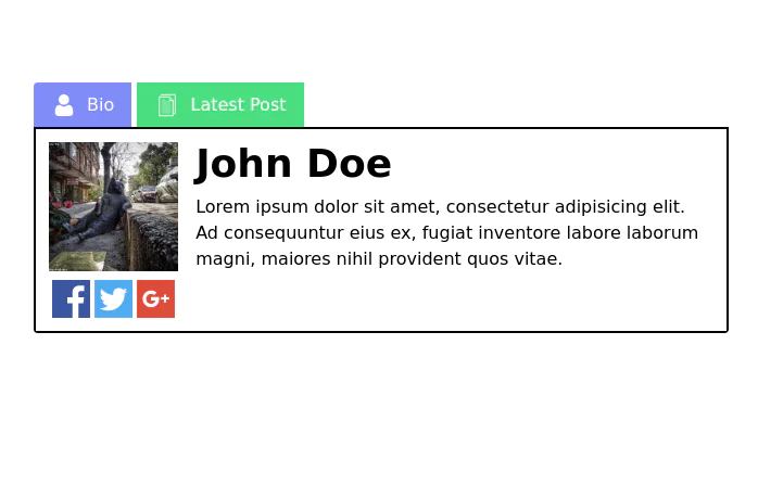
 Profile card
Profile card with social icons
3 years ago13.3k -
 2 years ago10.2k
 -
 3 years ago12.9k
 -
 3 years ago9.6k
 -
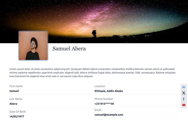
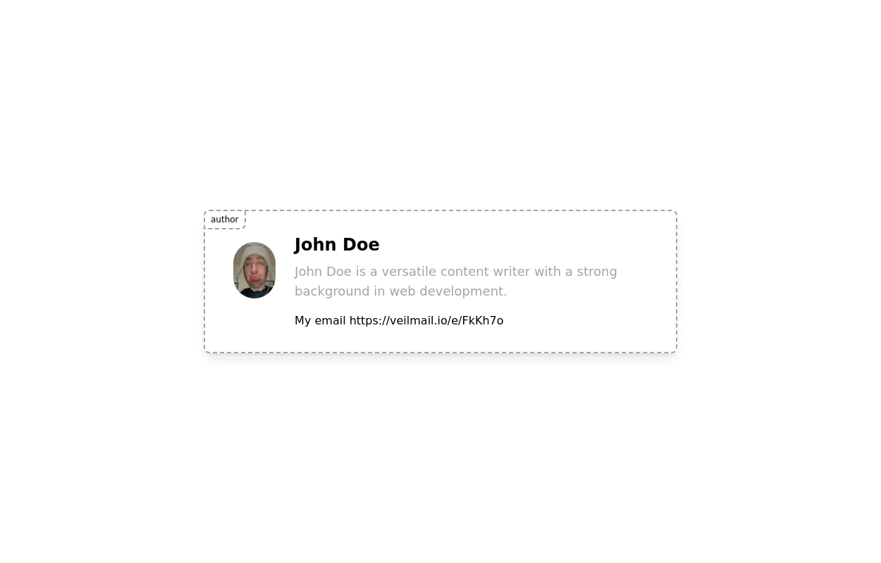 User Profile contact form
User profile card for giving credit to the author of the Blog/Article. It has social media icons and user image
2 years ago5.3k -
 User Profile Card
Full-page Profile card
3 years ago19.5k -
 User Profile
User Profile
2 years ago8.6k -
 Products card grid
Example of product card grid with product image and pricing
3 years ago24.2k -
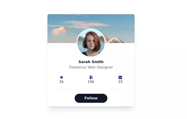
 User Profile Card
Useful for testimonials and reviews section
3 years ago10.9k -
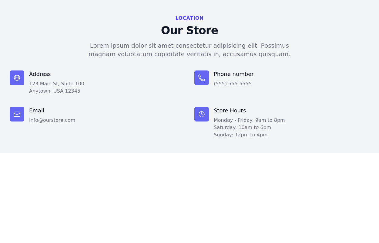 Contact information section
Display Location, email, address, and phone number
3 years ago13.2k -
 3 years ago12.2k
 -
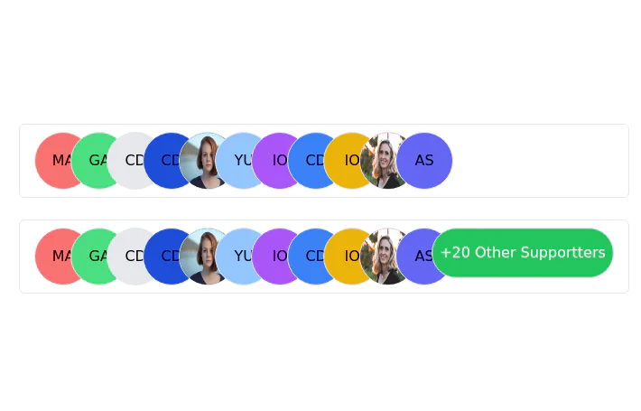 Stacked Profile
Stacked profile images
2 years ago7.6k -
 Responsive Card Grid
Tailwind CSS responsive grid for feature listing. The cards have a teal background, rounded corners, and a concise display of feature titles, descriptions, and a "Learn More" link.
3 years ago52.4k -
 2 years ago10.6k
 -
 3 years ago11.5k


Explore components by Tags
Didn't find component you were looking for?
Search from 3000+ components