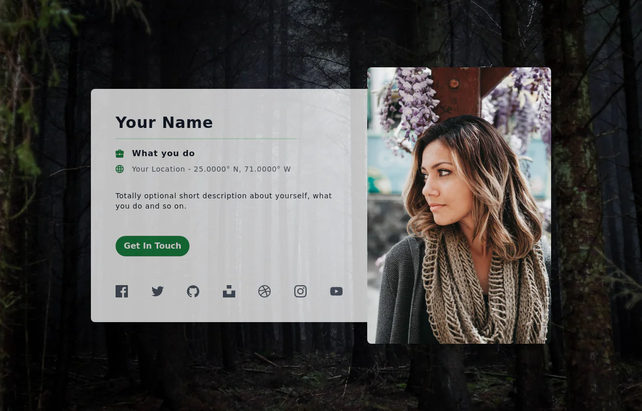
User Profile
User Profile
This tailwind example is contributed by $@(\/)(\/)¥, on 16-Mar-2024. Component is made with Tailwind CSS v3. It is responsive. It supports dark mode. similar terms for this example are Author box, User information

Author $@(\/)(\/)¥
Related Examples
-
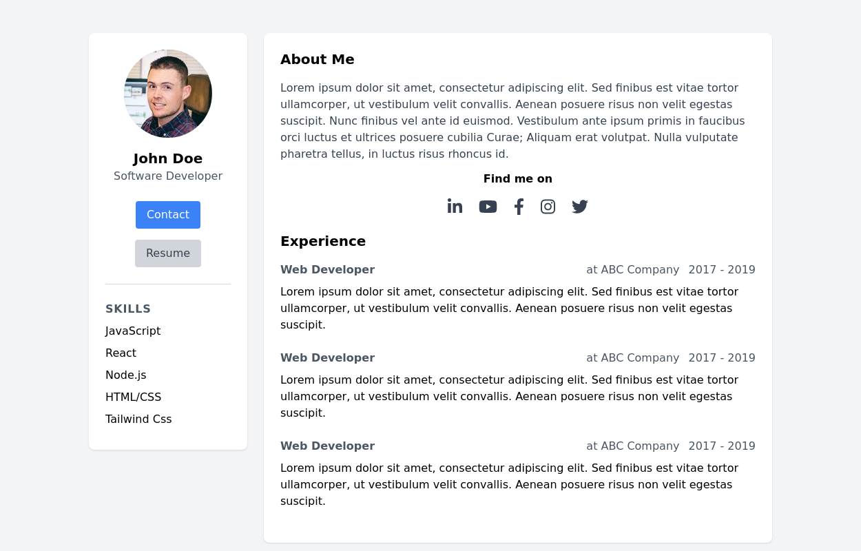 Basic Resume template
simple and clean layout that provides a professional look.
3 years ago27.7k -
 User Profile
User Profile
2 years ago5.7k -
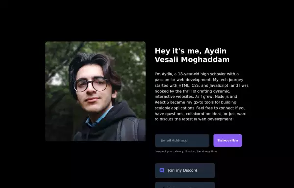 My Personal Landing page
This HTML document showcases Aydin Vesali Moghaddam's personal portfolio, highlighting his journey in web development. The page features a responsive design that adapts to various screen sizes, ensuring a seamless user experience across devices. It includes a personal introduction, a brief overview of Aydin's tech journey, and a contact form for visitors to subscribe to updates. Additionally, the page provides links to Aydin's Discord, website, and Twitter, offering multiple avenues for connecting and staying updated on his projects.
2 years ago6.2k -
 Profile Form
Enhanced User Profile Form with Stunning Profile and Cover Image Fields
1 year ago10.2k -
Profile Card
Show more details on hover
2 years ago14.7k -
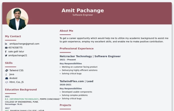 Modern resume template
modern resume template with data
2 years ago22.6k -
 User Profile Card
Full-page Profile card
3 years ago19.5k -
 3 years ago25.6k
 -
 1 year ago2.1k
 -
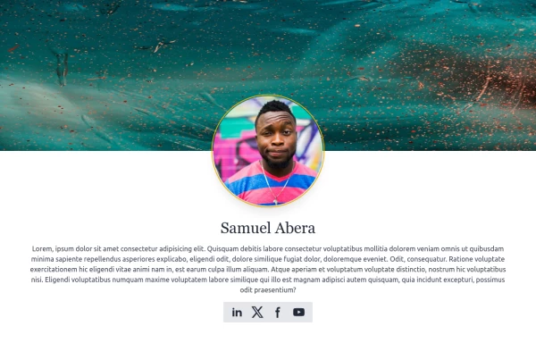
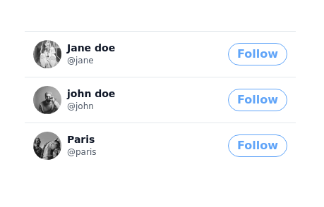
 Profile, Team or Testimonial
Profile, Team or Testimonial
1 year ago3.9k -
 3 years ago12.2k
 -
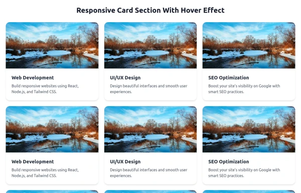 Responsive Card Section With Hover Effect
added more cards with ui friendly
7 months ago628


Explore components by Tags
Didn't find component you were looking for?
Search from 3000+ components