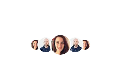
Basic user avatar box with text
This tailwind example is contributed by Shakti, on 12-May-2023. Component is made with Tailwind CSS v3. It is responsive.

Author Shakti
Related Examples
-
 3 years ago11.7k
 -
 3 years ago9.6k
 -
Profile Card
Show more details on hover
2 years ago14.7k -
 2 years ago8k
 -
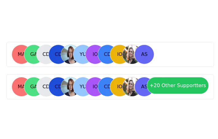 Stacked Profile
Stacked profile images
2 years ago7.6k -
 1 year ago2.1k
 -
 Clean AI Chat UI with Tailwind CSS – ChatGPT-Style Interface
A polished and responsive AI chat interface built using modern Web Components and Tailwind CSS. This UI replicates the smooth, minimal experience of ChatGPT with a clean layout, floating input bar, animated scrollable message feed, and mock AI responses. Ideal for SaaS dashboards, AI assistants, or frontend prototypes. Designed with professional spacing, accessible colors, and reusable components. Key features: Responsive layout with mobile support Floating input bar with auto-expanding textarea Tailwind-powered message bubbles with clear sender roles Modern dark theme with subtle gradients and shadows Easily extendable to real AI APIs (e.g., OpenAI)
10 months ago2k -
 DailyDev Card
Card -based card used in the Dailydev Card, this is created to be modified to taste of each user
1 year ago1.9k -
 8 months ago425
 -
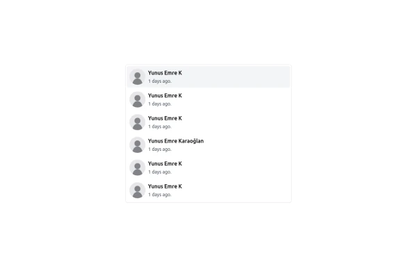 User list
User list
9 months ago477 -
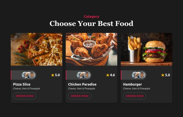
 Taskify Premium Task Management FREE
Website Task management modern and responsif
1 month ago179 -
 3 years ago9.8k


Explore components by Tags
Didn't find component you were looking for?
Search from 3000+ components