Minimal Profile card
This tailwind example is contributed by Abhijit Sen, on 13-Jan-2023. Component is made with Tailwind v3.4. It is responsive. similar terms for this example are Author box, User information

Related Examples
-
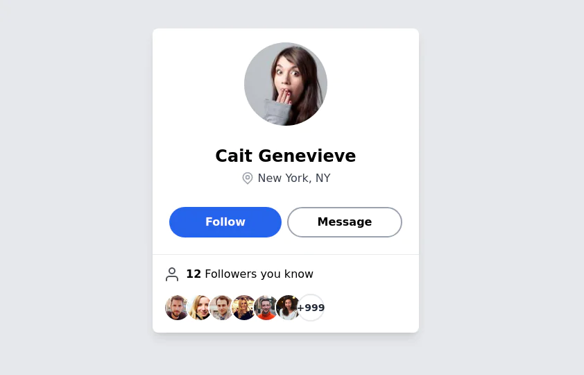 User Profile Card
The card features a user's profile picture, name, location, and options for interactions. It has a clean and modern design with rounded edges and icons for user engagement. It also has support for dark mod:
65.6k -
 Responsive Card Grid
Tailwind CSS responsive grid for feature listing. The cards have a teal background, rounded corners, and a concise display of feature titles, descriptions, and a "Learn More" link.
53.9k -
Profile Card
Show more details on hover
15.2k -
-

-
 User Profile Card
Useful for testimonials and reviews section
11.2k -
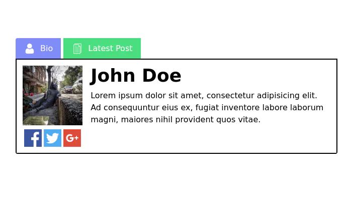
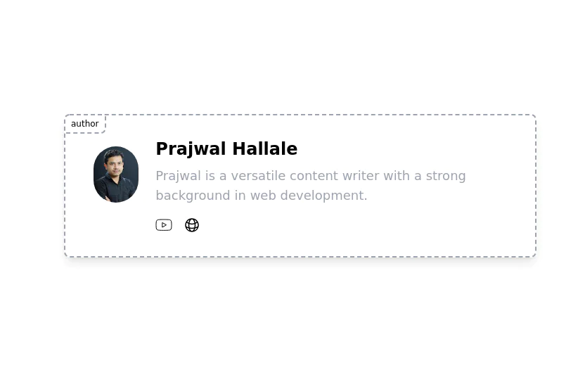 Author card
Author card for giving credit to the author of the Blog/Article. It has social media icons and user image
7.6k -
 12.5k
12.5k -
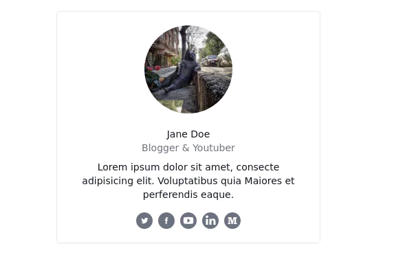
 Profile card
Profile card with social icons
13.8k -
 13.4k
13.4k -

-
-
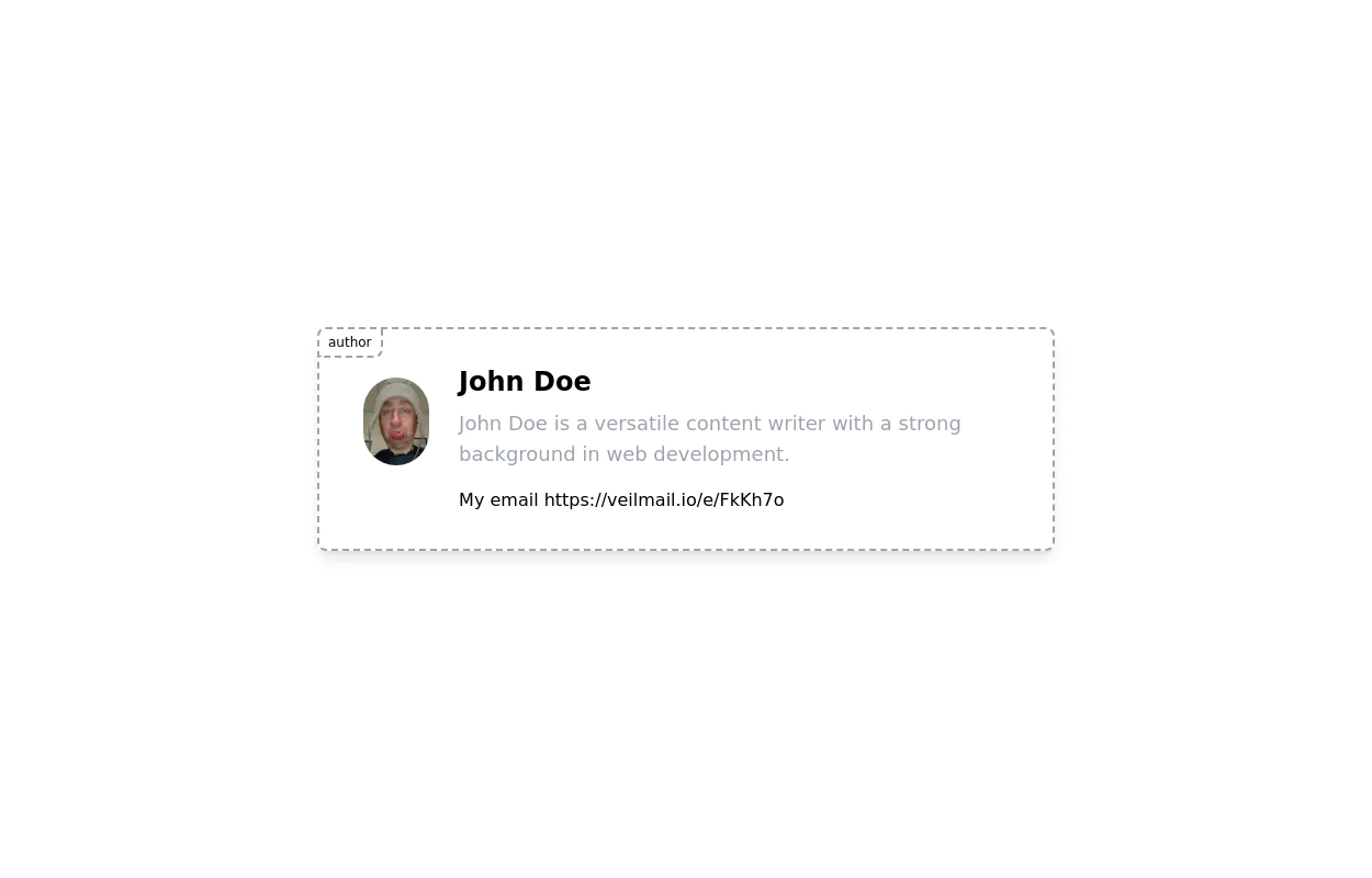 User Profile contact form
User profile card for giving credit to the author of the Blog/Article. It has social media icons and user image
5.3k






Browse by topic
Explore components by Tags
Jump straight to the UI pattern you need.
Can't find it?
Didn't find the component you were looking for?
Search across 3,000+ community-built components and grab the code in seconds.