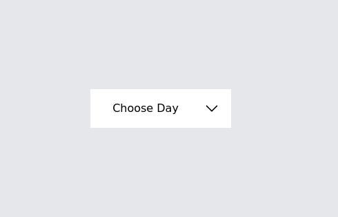
Drop Down
This component is a Select Input Or Dropdown UI & Dark mode Supported Component
This tailwind example is contributed by Shariar Hasan, on 15-Feb-2024. Component is made with Tailwind CSS v3. It is responsive. It supports dark mode.

Author Shariar Hasan
Related Examples
-
 Dropdown select on hover
this example does not uses javascript
2 years ago30.6k -
 3 years ago25.6k
 -
Dropdown menu without using javascript
Open the dropdown menu on hover
2 years ago20k -
 3 years ago14.5k
 -
 Onhover Dropdown
Open dropdown on hover
3 years ago18.6k -
 Nested dropdown
Nested dropdown without using javascript. It uses details and summary HTML tags for interactivity.
2 years ago15.2k -
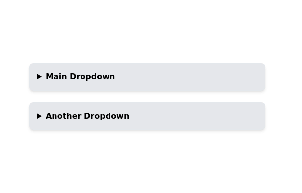
Dropdown menu list
Dropdown menu list without using javascript. This example takes advantage of native HTML's <details> and <summary> tags
3 years ago20.3k -
 Dropdown select on hover
this example does not uses javascript
1 year ago2.7k -
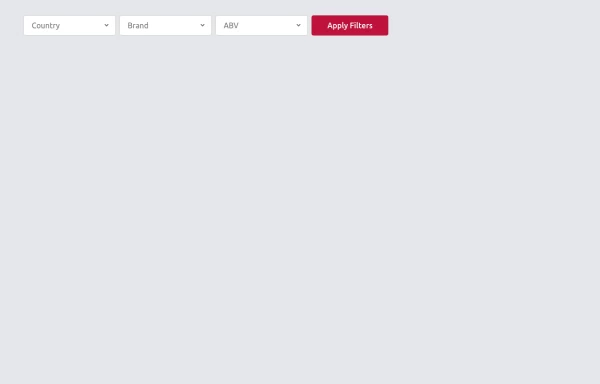
 Multi-Select Dropdown Filter with search
Interactive filtering component built with Alpine.js and Tailwind CSS, featuring searchable multi-select dropdowns with dynamic URL parameters. The system includes responsive design, real-time search functionality, and visual feedback through selected item tags that can be easily removed.
1 year ago5.4k -
 Multi-Select Dropdown Filter with search
Interactive filtering component built with Alpine.js and Tailwind CSS, featuring searchable multi-select dropdowns with dynamic URL parameters. The system includes responsive design, real-time search functionality, and visual feedback through selected item tags that can be easily removed.
1 year ago2k -
 Multi-Select Dropdown Filter with search
Interactive filtering component built with Alpine.js and Tailwind CSS, featuring searchable multi-select dropdowns with dynamic URL parameters. The system includes responsive design, real-time search functionality, and visual feedback through selected item tags that can be easily removed.
1 year ago1.4k -
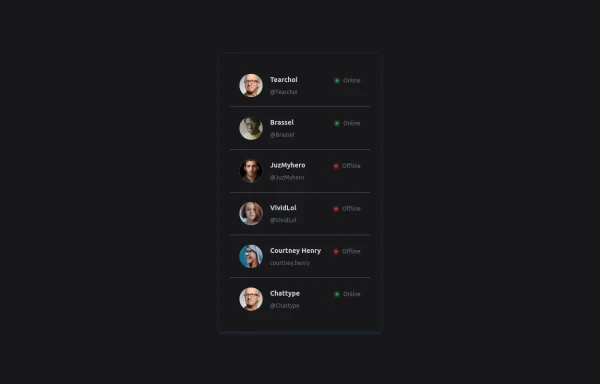 User List
List of users
10 months ago1.4k


Explore components by Tags
Didn't find component you were looking for?
Search from 3000+ components