Select input
This tailwind example is contributed by Sophia Baker, on 20-Jan-2023. Component is made with Tailwind CSS v3.

Author Sophia Baker
Related Examples
-
 Onhover Dropdown
Open dropdown on hover
3 years ago18.6k -
 3 years ago25.6k
 -
Google like input field
with Floating Label. The input placeholder floats towards the upside as the input field is in focus.
3 years ago18.1k -
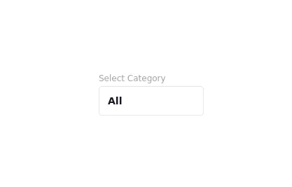 Drop Down
This component is a Select Input Or Dropdown UI & Dark mode Supported Component
2 years ago6.5k -
 Radio Buttons
Users can click anywhere on the input field to select the radio option
3 years ago17k -
 3 years ago23.1k
 -
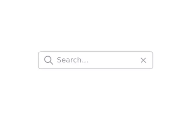
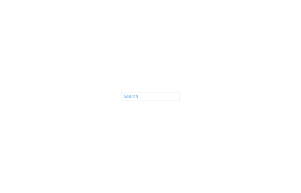 Search input asasasas
sasasasasas
1 year ago1.6k -
 Cart with alpinejs and tailwind css
How to add items to your cart with Tailwind CSS and Alpinejs
1 year ago3.7k -
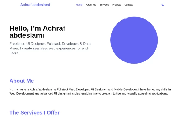 Responsive portfolio with dark mode
responsive and support dark mode .portfolio website
1 year ago3.9k -
 User List
List of users
10 months ago1.4k -
 Contact us form
Contact us form
2 years ago6.5k -
 3 years ago15.4k


Explore components by Tags
Didn't find component you were looking for?
Search from 3000+ components