Multi-Select Dropdown Filter with search
Interactive filtering component built with Alpine.js and Tailwind CSS, featuring searchable multi-select dropdowns with dynamic URL parameters. The system includes responsive design, real-time search functionality, and visual feedback through selected item tags that can be easily removed.
This tailwind example is contributed by Anonymous, on 10-Mar-2025. Component is made with Tailwind v3.4. It is responsive.

Related Examples
-
 Dropdown select on hover
this example does not uses javascript
31.4k -
 Drop Down
This component is a Select Input Or Dropdown UI & Dark mode Supported Component
7.1k -
 Dropdown select on hover
this example does not uses javascript
3.3k -
 Multi-Select Dropdown Filter with search
Interactive filtering component built with Alpine.js and Tailwind CSS, featuring searchable multi-select dropdowns with dynamic URL parameters. The system includes responsive design, real-time search functionality, and visual feedback through selected item tags that can be easily removed.
7.1k -
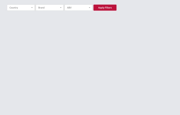 Multi-Select Dropdown Filter with search
Interactive filtering component built with Alpine.js and Tailwind CSS, featuring searchable multi-select dropdowns with dynamic URL parameters. The system includes responsive design, real-time search functionality, and visual feedback through selected item tags that can be easily removed.
2.4k -
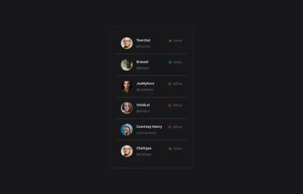 User List
List of users
-
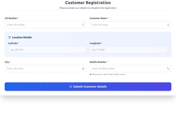 Multi-Select Dropdown Filter with search
Interactive filtering component built with Alpine.js and Tailwind CSS, featuring searchable multi-select dropdowns with dynamic URL parameters. The system includes responsive design, real-time search functionality, and visual feedback through selected item tags that can be easily removed.
2.3k -
 Multiple select input with alpine js
select input where you can select multiple items
7k -
-
 Responsive list
Horizontal list of items
10.9k -
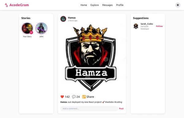 Acode master
Welcome to Hamza's official portfolio — a creative developer blending modern design with powerful code. Explore animations, projects, and innovations crafted with HTML, Tailwind CSS, and passion.
-
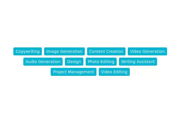 Category tags
Monocolor tag cloud
11.4k





Browse by topic
Explore components by Tags
Jump straight to the UI pattern you need.
Can't find it?
Didn't find the component you were looking for?
Search across 3,000+ community-built components and grab the code in seconds.