Onhover Dropdown
Open dropdown on hover
This tailwind example is contributed by Akshay, on 02-Aug-2022. Component is made with Tailwind v3.4. It is responsive. It supports dark mode.

Related Examples
-
 Dropdown select on hover
this example does not uses javascript
31.4k -
Dropdown menu without using javascript
Open the dropdown menu on hover
20.3k -
Dropdown menu list
Dropdown menu list without using javascript. This example takes advantage of native HTML's <details> and <summary> tags
20.5k -
 15.1k
15.1k -
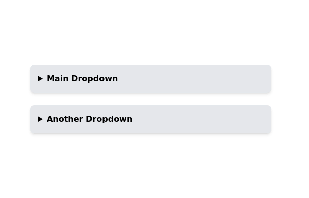 Nested dropdown
Nested dropdown without using javascript. It uses details and summary HTML tags for interactivity.
15.8k -

-
 Image input with preview
Show you a preview of the selected image.
27.9k -
Google like input field
with Floating Label. The input placeholder floats towards the upside as the input field is in focus.
18.7k -
 Radio Buttons
Users can click anywhere on the input field to select the radio option
17.1k -

-
 Drop Down
This component is a Select Input Or Dropdown UI & Dark mode Supported Component
7.1k -
 Responsive registration form
form with social login buttons
46.8k -

-
 14.6k
14.6k -
 14.6k
14.6k -
 Simple Login Form
Very basic responsive login form. The form is centered within a white card with a shadow, featuring input fields for username and password. The design is clean and user-friendly.
50.6k -
 Profile Form
Profile form for taking user inputs
15.4k -




Browse by topic
Explore components by Tags
Jump straight to the UI pattern you need.
Can't find it?
Didn't find the component you were looking for?
Search across 3,000+ community-built components and grab the code in seconds.