Snake Game tailwind
snake game
This tailwind example is contributed by QQ-VVN, on 11-May-2025. Component is made with Tailwind CSS v3. It is responsive. It supports dark mode.

Author QQ-VVN
Related Examples
-
 2 years ago8.9k
 -
 Testimonial Section
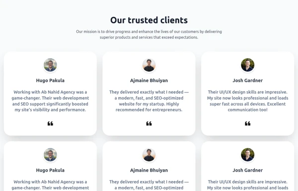
A responsive, SEO-friendly testimonial section for Ab Nahid Agency clients
6 months ago563 -
background animation
background animation
2 years ago50.3k -
 Password Generator
This is a simple and responsive Password Generator built with HTML, Vanilla JavaScript, and Tailwind CSS. It allows users to create secure passwords by selecting custom options such as length, uppercase letters, lowercase letters, numbers, and symbols. Ideal for developers or users looking for a fast and customizable password tool.
6 months ago520 -
 OTP Verification Page
A responsive and interactive OTP verification page built with Tailwind CSS. The page features a gradient background, hover effects, and animations to enhance user experience. It includes input fields for the OTP, a resend OTP link, and a verify button. The design is optimized for both light and dark modes.
9 months ago685 -
 Heading
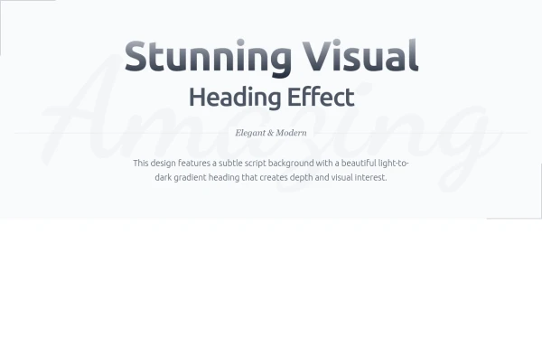
Subtle Script Background - Large, very light script font in the background ("Amazing") Light-to-Dark Gradient Heading - Main heading fades from light gray to dark gray Layered Typography - Secondary heading in medium weight for contrast Elegant Divider - With centered italic text Minimalist Border Accents - Thin borders in corners for sophistication Responsive Design - Scales beautifully on all devices
7 months ago635 -
 Reusable Skill Showcase Section With Pure Tailwind CSS
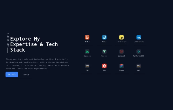
A fully responsive and modular "Skills & Tools" section, perfect for any developer portfolio. Built with static HTML and Tailwind CSS, this component can be easily integrated into any project and made dynamic using any frontend framework (Vue, React, Svelte, Angular) or vanilla JavaScript. Customize it to highlight your unique tech stack and create engaging portfolio pages.
9 months ago1.8k -
 Responsive About Section with Tailwind CSS
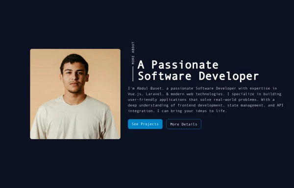
Built a sleek and fully responsive About Section for my portfolio using Tailwind CSS! 🚀 Designed for smooth adaptability across all screen sizes with a modern and minimal aesthetic. Perfect for showcasing skills, experience, and a personal touch!
9 months ago1.5k -
 Midnight Lava Lamp
Inspired by Steam's old "Big Picture" ambiance. Based on anonymous/background-animation-2
8 months ago1.1k -
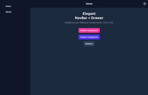 Elegant NavBar + Drawer
A NavBar, a responsive drawer/sidebar, and other useful Tailwind components to get started creating an app. Pure CSS, no JavaScript needed (although this example uses a bit of JS).
8 months ago1.3k -
 Clean AI Chat UI with Tailwind CSS – ChatGPT-Style Interface
A polished and responsive AI chat interface built using modern Web Components and Tailwind CSS. This UI replicates the smooth, minimal experience of ChatGPT with a clean layout, floating input bar, animated scrollable message feed, and mock AI responses. Ideal for SaaS dashboards, AI assistants, or frontend prototypes. Designed with professional spacing, accessible colors, and reusable components. Key features: Responsive layout with mobile support Floating input bar with auto-expanding textarea Tailwind-powered message bubbles with clear sender roles Modern dark theme with subtle gradients and shadows Easily extendable to real AI APIs (e.g., OpenAI)
8 months ago1.6k -
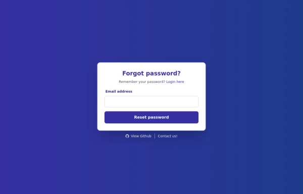 Forgot Password Form
1. Color Updates: 1. Changed background to gradient `from-indigo-800 to-blue-900` 2. Updated text colors to match the new theme 3. Changed button colors to `bg-indigo-800` with `hover:bg-blue-900` 4. Updated focus rings to use indigo colors 5. Made footer links white with indigo hover states 2. Enhanced Styling: 1. Added gradient background 2. Improved border radius to `rounded-xl` 3. Enhanced shadow with `shadow-2xl` 4. Added hover scale effects 5. Added fade-in animation 3. Dark Mode Improvements: 1. Enhanced dark mode colors 2. Added system preference detection 3. Improved dark mode contrast 4. Updated dark mode focus rings 4. Added Functionality: 1. Added form validation 2. Added success message 3. Added form reset after submission 4. Added smooth transitions 5. Accessibility Improvements: 1. Maintained ARIA attributes 2. Enhanced focus states 3. Improved color contrast 4. Added transition animations for better UX 6. Added Interactions: 1. Hover effects on all interactive elements 2. Scale animation on card and button hover 3. Smooth color transitions 4. Form validation feedback The form now matches the Indigo-800 and Blue-900 color scheme while maintaining dark mode support and adding enhanced animations and interactions.
1 year ago1.6k


Explore components by Tags
Didn't find component you were looking for?
Search from 3000+ components