Heading
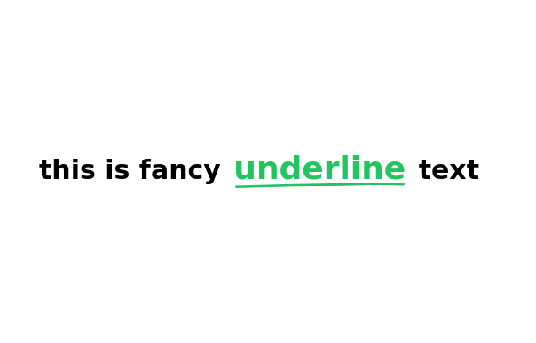
Subtle Script Background - Large, very light script font in the background ("Amazing")
Light-to-Dark Gradient Heading - Main heading fades from light gray to dark gray
Layered Typography - Secondary heading in medium weight for contrast
Elegant Divider - With centered italic text
Minimalist Border Accents - Thin borders in corners for sophistication
Responsive Design - Scales beautifully on all devices
This tailwind example is contributed by KULDEEP, on 22-Jun-2025. Component is made with Tailwind CSS v3. It is responsive. similar terms for this example are Typography, Title, h1, h2, h3

Author KULDEEP
Related Examples
-
 3 years ago12.5k
 -
 Career Page
This is a career page component built in tailwind
1 year ago1.1k -
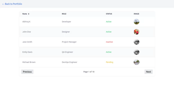 Table
TableTable with image and status with pagination buttons
1 year ago2.5k -
 Ai clone, chat ui
Chat interface for ai builder, dont toomuch focused on designing responsive
1 year ago2.1k -
 DailyDev Card
Card -based card used in the Dailydev Card, this is created to be modified to taste of each user
1 year ago1.8k -
 A Code Master Academy
A Code Master Academy – Empowering the Next Generation of Tech Leaders in Rwanda 👨💻 I'm Acode Master, the founder of A Code Master Academy, a practical and inclusive coding school based in Rubavu, Rwanda. The academy is dedicated to transforming lives by equipping unemployed youth and passionate learners with job-ready skills in modern software development.
8 months ago1.2k -
 8 months ago508
 -
 8 months ago962
 -
 7 months ago1k
 -
 7 months ago1.3k
 -
 1 year ago2k
 -
 Aurora Spinner
Aurora Spinner using tailwindcss
1 year ago1.4k


Explore components by Tags
Didn't find component you were looking for?
Search from 3000+ components