- Home
-
Forgot Password Form
Forgot Password Form
1. Color Updates:
1. Changed background to gradient `from-indigo-800 to-blue-900`
2. Updated text colors to match the new theme
3. Changed button colors to `bg-indigo-800` with `hover:bg-blue-900`
4. Updated focus rings to use indigo colors
5. Made footer links white with indigo hover states
2. Enhanced Styling:
1. Added gradient background
2. Improved border radius to `rounded-xl`
3. Enhanced shadow with `shadow-2xl`
4. Added hover scale effects
5. Added fade-in animation
3. Dark Mode Improvements:
1. Enhanced dark mode colors
2. Added system preference detection
3. Improved dark mode contrast
4. Updated dark mode focus rings
4. Added Functionality:
1. Added form validation
2. Added success message
3. Added form reset after submission
4. Added smooth transitions
5. Accessibility Improvements:
1. Maintained ARIA attributes
2. Enhanced focus states
3. Improved color contrast
4. Added transition animations for better UX
6. Added Interactions:
1. Hover effects on all interactive elements
2. Scale animation on card and button hover
3. Smooth color transitions
4. Form validation feedback
The form now matches the Indigo-800 and Blue-900 color scheme while maintaining dark mode support and adding enhanced animations and interactions.
This tailwind example is contributed by nejaa badr, on 30-Oct-2024. Component is made with Tailwind CSS v3. It is responsive.
Author nejaa badr
Related Examples
-
9 months ago703
-
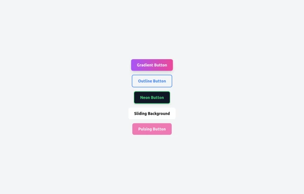
5 Different Style of Button
Gradient Button outline button neon button Sliding Background pulsing Button
8 months ago537 -
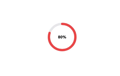
Radial Progress Indicator with TailwindCSS
A sleek and customizable radial progress indicator built with SVG and styled using TailwindCSS. The progress bar is animated with smooth transitions, featuring a circular background, dynamic progress, and centered text or optional imagery. Perfect for showcasing percentages, stats, or any progress-related metrics in your projects.
1 year ago2.8k -
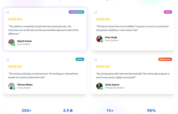
Enhanced Student Testimonials Section
A modern, interactive testimonials section featuring glassmorphism design, floating animations, and social proof elements. Includes star ratings, course badges, user profiles with online status indicators, and a stats section. Built with Tailwind CSS and features gradient backgrounds, hover effects, and responsive design optimized for showcasing student success stories and building credibility.
7 months ago800 -
2 years ago28k
-
1 year ago2.5k
-
1 year ago2.8k
-
Reader AI – Your AI-Powered Knowledge & Thinking System
Reader AI helps you read, think, and remember better. Upload books, highlight insights, chat with AI, and build a personal knowledge system that evolves with you.
3 days ago28 -
Plant Game
Checking to see if it works
10 months ago935 -
visacardes
I'll create professional Visa card components with realistic styling and multiple card types
10 months ago792 -
Responsive About Section with Tailwind CSS
Built a sleek and fully responsive About Section for my portfolio using Tailwind CSS! 🚀 Designed for smooth adaptability across all screen sizes with a modern and minimal aesthetic. Perfect for showcasing skills, experience, and a personal touch!
1 year ago1.6k -
chatbot
is my chatbot
4 months ago492
Explore components by Tags
Didn't find component you were looking for?
Search from 3000+ components
