32+ Free Progress Bar examples in Tailwind CSS
A progress bar is a user interface element that is used to visualize the progression of an operation, such as a download or file transfer. It typically consists of a horizontal bar that is filled in as the operation progresses, with the percentage or amount of the operation completed displayed on top of the bar.
Progress bars can be used to give users a sense of how far along an operation is, and how much longer they will have to wait for it to complete. They can also be used to indicate the status of a task, such as whether it is in progress, completed, or failed. Progress bars are often used in conjunction with other UI elements, such as buttons and spinners, to provide users with a clear and concise way to monitor the progress of an operation.
-
 1 year ago1.3k
 -
-
 1 year ago1.1k
 -
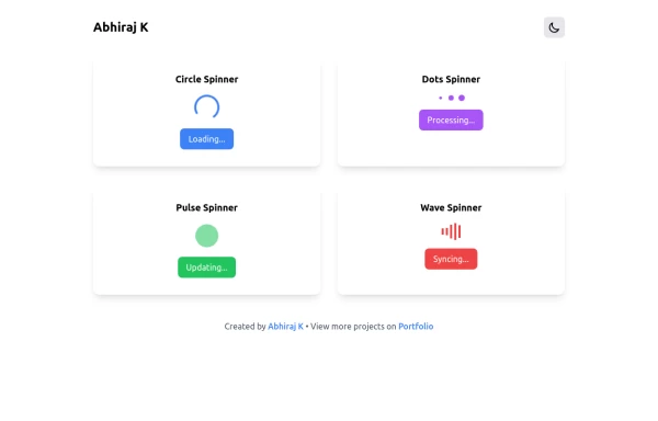 Spinner
The Spinner is a simple and visually appealing component that indicates ongoing processes like loading or data fetching. It's a great way to improve user engagement and reduce frustration during wait times. Different styles and animations (circular, dots, pulsating). Customizable size, color, and speed. Easy to integrate with loading states in any app. Lightweight and responsive.
1 year ago2.2k -
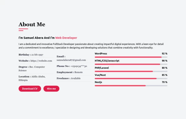
 Progress Bar
A progress bar is a UI element that visually represents the completion status of a task or process. It helps users understand how much of a task has been completed and how much remains. Commonly used in forms, file uploads, loading screens, or multi-step processes, it enhances the user experience by providing clear feedback.
1 year ago1k -
 1 year ago2.4k
 -
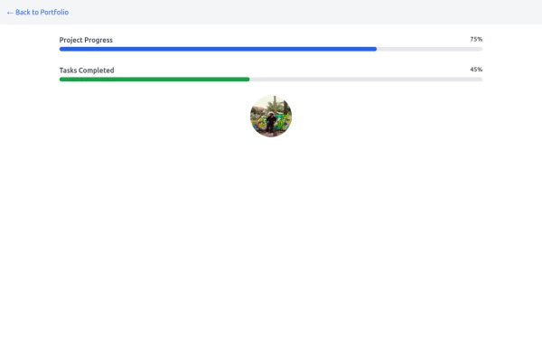
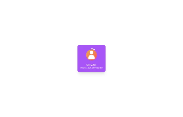 Animated Profile Card
Animated profile card with profile completion circle
1 year ago1.7k -
 Multi-Step Form with Progress Indicator
reusable "Multi-Step Form with Progress Indicator" component built with HTML, CSS, and Tailwind CSS. It’s a practical component for forms like signups, surveys, or checkout processes.
1 year ago2.1k -
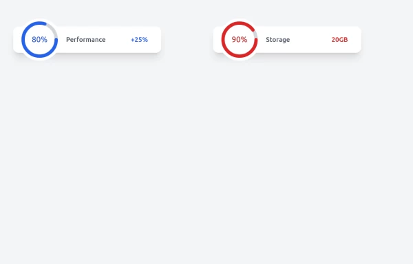
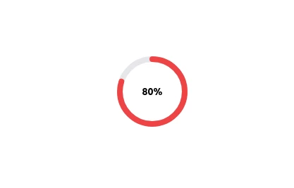 Radial Progress Indicator with TailwindCSS
A sleek and customizable radial progress indicator built with SVG and styled using TailwindCSS. The progress bar is animated with smooth transitions, featuring a circular background, dynamic progress, and centered text or optional imagery. Perfect for showcasing percentages, stats, or any progress-related metrics in your projects.
1 year ago2.7k -
 1 year ago1.2k
 -
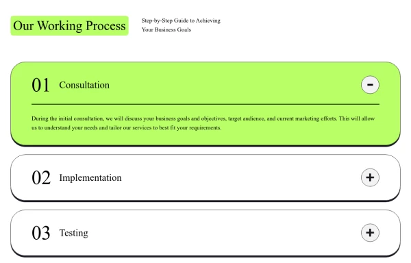 Responsive Working Process Section
This modern and responsive "Our Working Process" section adapts seamlessly to all screen sizes, ensuring a smooth user experience. The design follows a structured step-by-step layout with clear typography, bold colors, and interactive elements, making it perfect for showcasing business processes or workflows.
11 months ago1k -
 Gradient progress bar
A progress bar with gradient
10 months ago578 -
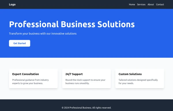 PrimeCorp | Professional Business Solutions
We deliver cutting-edge business solutions through strategic consulting, tailored services, and continuous support. Partner with us to optimize operations, drive growth, and achieve sustainable success in today's competitive market.
9 months ago950 -
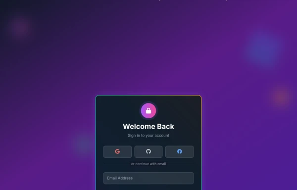 Amazing 3D Login and Registiration Aniamation Form
create a stunning 3D animated background with floating geometric shapes, particle effects, and interactive elements using React, Three.js, and Tailwind CSS. This will be fully responsive and visually captivating.
9 months ago1.1k -
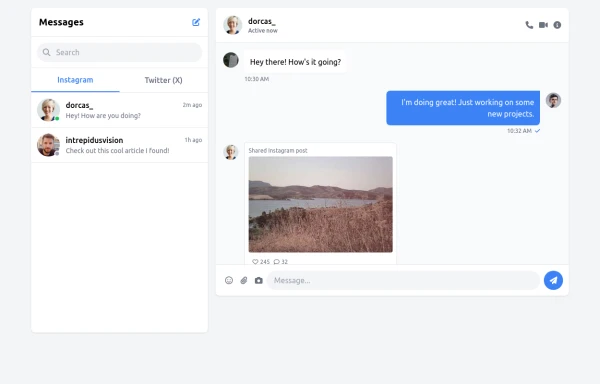 chat bar
live chat
9 months ago1.3k


Didn't find component you were looking for?
Search from 3000+ components