Progress Bar
A progress bar is a UI element that visually represents the completion status of a task or process. It helps users understand how much of a task has been completed and how much remains. Commonly used in forms, file uploads, loading screens, or multi-step processes, it enhances the user experience by providing clear feedback.
This tailwind example is contributed by Abhiraj, on 11-Jan-2025. Component is made with Tailwind CSS v3. It is responsive. It supports dark mode. similar terms for this example are Info, Show info, Statistics

Author Abhiraj
Related Examples
-
 2 years ago10.1k
 -
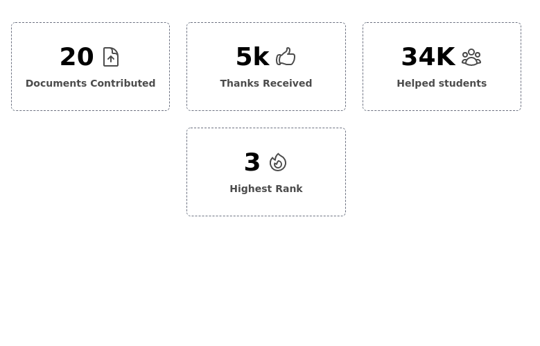
 Stats card with icons
Improved Code quality and added support for dark mode
1 year ago1.7k -
 6 months ago901
 -
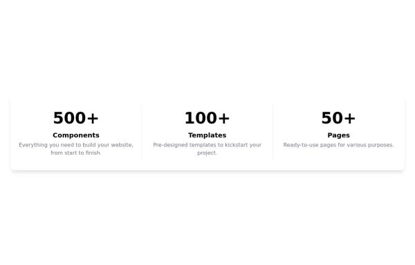
 Feature overview cards
The component is designed to be responsive, featuring a title, a brief description, and a set of cards presenting key metrics.
1 year ago5.3k -
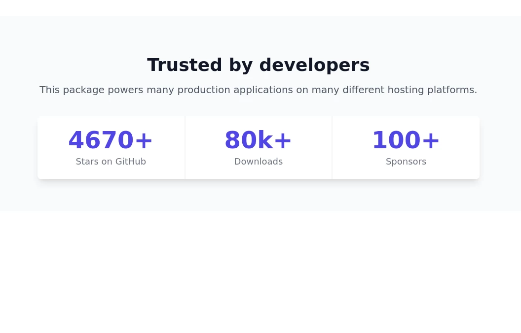
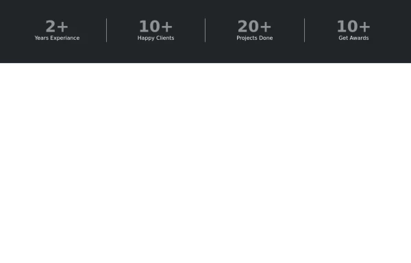 Stats or Metrics Overview
Highlight your achievements with our Stats Section, featuring key metrics such as years of experience, happy clients, completed projects, and awards. This visually engaging component effectively communicates your expertise and success at a glance
1 year ago1.3k -
 2 years ago11.6k
 -
 3 years ago19.8k
 -
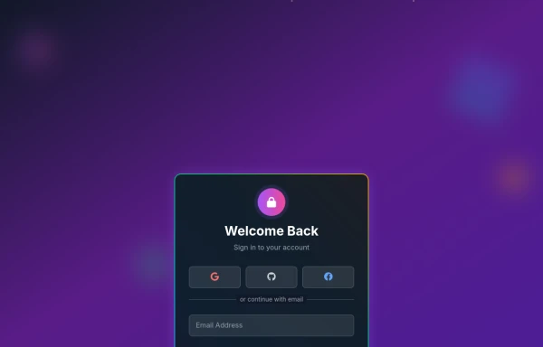 Amazing 3D Login and Registiration Aniamation Form
create a stunning 3D animated background with floating geometric shapes, particle effects, and interactive elements using React, Three.js, and Tailwind CSS. This will be fully responsive and visually captivating.
7 months ago881 -
 Stats section with animated counter
Display important stats of your product
2 years ago11.1k -
 Beautiful info cards
Responsive and minimal design
2 years ago10.5k -
 Stats - Big and Bold
display stats of your product
1 year ago1.9k -
 Info cards grid with icons
Evenly-sized cards for showing various stats on the user/admin dashboard.
2 years ago7.9k


Explore components by Tags
Didn't find component you were looking for?
Search from 3000+ components