progress bar
This tailwind example is contributed by Md. Tofayel islam, on 28-Dec-2024. Component is made with Tailwind CSS v3. It is responsive. similar terms for this example are Article Card, Blog page card, Article card

Author Md. Tofayel islam
Related Examples
-
 2 years ago7.6k
 -
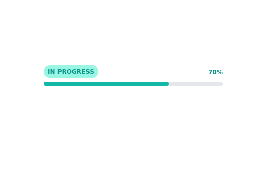
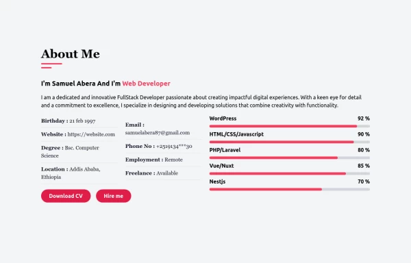
 Progress Bar
Simple Progress bar
2 years ago5.7k -
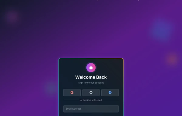 Amazing 3D Login and Registiration Aniamation Form
create a stunning 3D animated background with floating geometric shapes, particle effects, and interactive elements using React, Three.js, and Tailwind CSS. This will be fully responsive and visually captivating.
8 months ago1.1k -
 3 years ago22.9k
 -
 Blog post cards
responsive blog post cards
3 years ago12.8k -
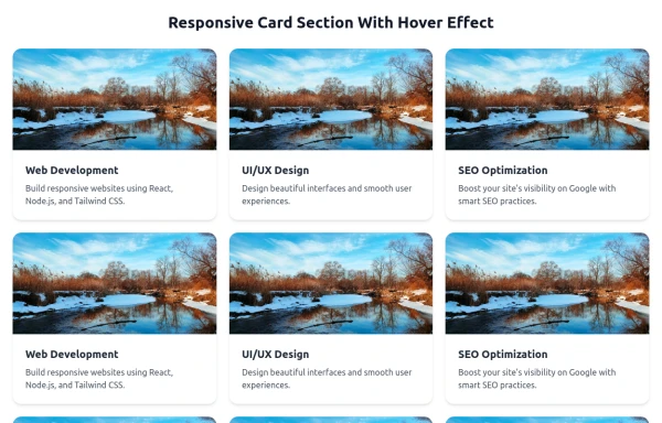 Responsive Card Section With Hover Effect
added more cards with ui friendly
6 months ago608 -
 Responsive card grid
responsive card grid for articles
3 years ago15.9k -
 E-Learning Course Card with Badge and Level Indicator
An HTML and Tailwind CSS component mockup for displaying course information. Features include a placeholder image area with an overlaid certificate badge, a distinct level indicator banner below the image, category text, a course title, key details (like duration and learner count placeholders), and primary/secondary action buttons. Designed for e-learning platforms or course listings.
10 months ago1k -
 7 months ago1k
 -
 Gradient progress bar
A progress bar with gradient
10 months ago574 -
 1 year ago2.4k
 -
 card design
card design
1 month ago150


Explore components by Tags
Didn't find component you were looking for?
Search from 3000+ components