28 Search results for scroll
para poner que a llegado al final de la pagina


use-scroll-effect


pile carde scroll

Beautiful lineat brand scrolling partner with hover effect

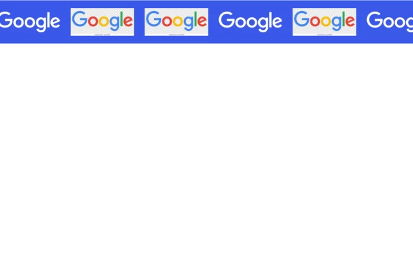
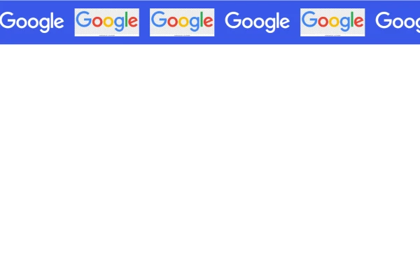
Enhance your website's credibility with a sleek marquee slider displaying client logos. This continuously scrolling slider provides a dynamic and engaging way to showcase your trusted partnerships, ensuring a professional and visually appealing design. Perfect for businesses, portfolios, and service-based websites.

Enhance your website's credibility with a sleek marquee slider displaying client logos. This continuously scrolling slider provides a dynamic and engaging way to showcase your trusted partnerships, ensuring a professional and visually appealing design. Perfect for businesses, portfolios, and service-based websites.


The "Scroll to top" button becomes visible when the user starts to scroll the page Clicking on that button takes you back to the top of the page. This is a great feature to have on any website especially if your content is long.


An enhanced scroll interaction that combines a vertical slide with a subtle scaling effect. As elements enter the viewport, they smoothly float up and scale to their full size, creating a polished, modern depth effect without complex libraries.

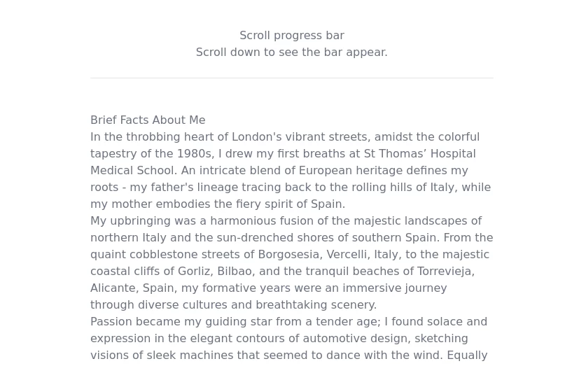
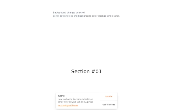
How to a create a scroll progress bar with Tailwind CSS and Javascript
show how much of the page has been scrolled


To transform a standard timeline into an engaging, scroll-driven narrative experience.


This is a sample content area. Scroll down to see the fixed header in action.


A hero with 2 images alternating each other every 7 seconds, zoom on scroll

🚀 Boost your website’s user experience with a sleek floating "Go to Top" button! This easy-to-implement solution uses Tailwind CSS for styling. ✔️ Smooth scroll to top ✔️ Clean and modern design ✔️ Responsive and animated effects Perfect for any website or portfolio! Add it today and make navigation effortless! 🔝💻


A modern "About Us" section built with Tailwind CSS and Alpine.js, designed to highlight your company’s story, achievements, and values through a clean and animated layout. This component features smooth scroll animations, responsive design, and a balanced two-column layout — one for text content and one for an image with company stats. It’s perfect for corporate websites, SaaS platforms, or startup landing pages that want to showcase professionalism and credibility. ✨ Key Features Elegant fade-in and slide-up animations using Alpine.js Responsive grid layout optimized for all screen sizes Dark mode support built-in Dynamic stats display (years, team size, countries served) Clean Tailwind CSS design with easy customization


Designed with clarity and purpose, each section of our website is crafted to guide users effortlessly from engaging visuals to structured content that highlights our values and builds trust at every scroll. abnahid.com

It is at a 20s interval for testing purposes. Go to the <style> and change the .content-scroll class from 20s to 35s for a production ready slower animation.


A polished and responsive AI chat interface built using modern Web Components and Tailwind CSS. This UI replicates the smooth, minimal experience of ChatGPT with a clean layout, floating input bar, animated scrollable message feed, and mock AI responses. Ideal for SaaS dashboards, AI assistants, or frontend prototypes. Designed with professional spacing, accessible colors, and reusable components. Key features: Responsive layout with mobile support Floating input bar with auto-expanding textarea Tailwind-powered message bubbles with clear sender roles Modern dark theme with subtle gradients and shadows Easily extendable to real AI APIs (e.g., OpenAI)


Overview: A fixed, right-aligned sidebar component designed to display social media links (Facebook, Instagram, WhatsApp). It remains visible while scrolling and features an interactive "drawer-like" expansion effect on hover. Key Features: Sticky Positioning: Fixed vertically centered on the right edge of the viewport (fixed top-1/2 right-0). Isolated Hover Effect: When a user hovers over an icon, only that specific item expands to reveal the text and changes to its brand color. Stable Layout: Uses items-end flex alignment to ensure non-active icons remain perfectly stationary while one expands, preventing layout shifting. Smooth Transitions: Includes CSS transitions for width, background color, and text opacity. Tech Stack: Framework: Tailwind CSS (Utility classes). Icons: Inline SVGs. Interactivity: Pure CSS (hover states), no JavaScript required. Usage: Place this code block directly before the closing </body> tag to ensure it sits on top of all other content (z-50).
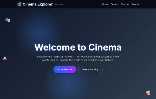
The design captures the magic and glamour of cinema with a modern, interactive interface that would definitely make users stop scrolling and say "whoa!" The color scheme uses cinematic blacks and golds with vibrant accent colors, while the animations bring the interface to life without overwhelming the content

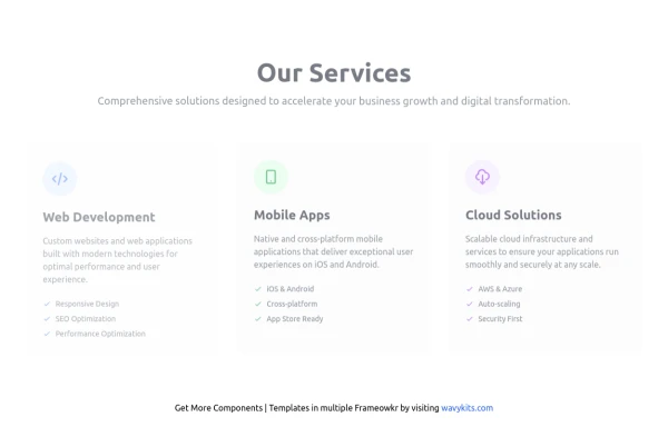
A modern and dynamic “Services” section built with Tailwind CSS and Alpine.js, designed to showcase your company’s main offerings with clean visuals and engaging animations. This component uses smooth fade and slide animations to reveal each service card as it comes into view. Each card highlights a core business area — Web Development, Mobile Apps, and Cloud Solutions — with beautiful hover effects, icons, and descriptive lists. Perfect for SaaS websites, agencies, and startups looking to present their services in a visually appealing, professional, and responsive layout. Key Features Smooth scroll-triggered animations with Alpine.js Responsive grid layout (mobile → desktop ready) Built with Tailwind CSS for fast customization Dark mode support included Interactive hover effects for each service card Ideal for corporate, SaaS, or portfolio websites 💡 Services Included 🌐 Web Development (Responsive, SEO-friendly, Optimized) 📱 Mobile Apps (Cross-platform, iOS & Android) ☁️ Cloud Solutions (AWS, Azure, Auto-scaling, Security)
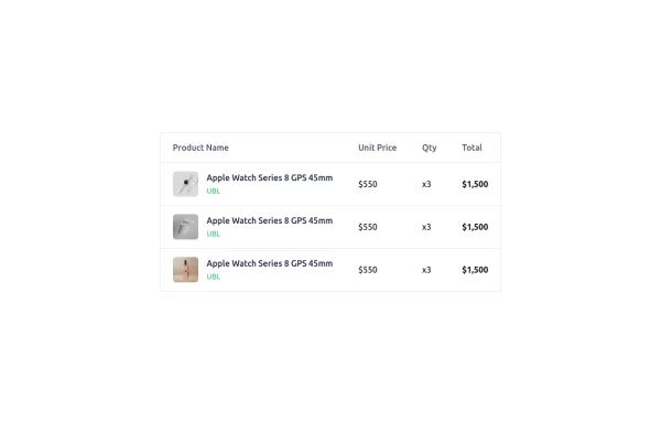
This is a clean and responsive product listing table built with HTML and TailwindCSS. The table displays product images, names, unit prices, quantities, and total costs in a structured format. It adapts to different screen sizes by enabling horizontal scrolling on smaller devices. The design is minimal yet functional, making it ideal for e-commerce websites, order summaries, and invoice pages. Let me know if you need any refinements!

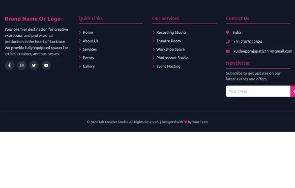
A footer is a critical part of any professional website. A footer ensures your website is complete, professional, user-friendly, and legally compliant. It's where users go for answers when they're done scrolling.

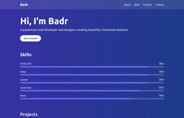
This portfolio page for Claire includes: 1. Responsive design that works on both desktop and mobile 2. Indigo-800 and Blue-900 color scheme for the background 3. Dark mode support (the design is already dark-themed) 4. Beautiful animations and effects: 1. Fade-in and slide-up animations for sections 2. Animated skill bars 3. Hover effects on projects and buttons 4. Smooth scrolling for navigation 5. Mobile-friendly navigation with a toggle menu 6. Sections for About, Skills, Projects, and Contact 7. A contact form with styled inputs 8. Social media links in the footer 9. Accessibility considerations (proper heading structure, color contrast, focus styles) Key features: - The background uses a gradient from Indigo-800 to Blue-900 - The header and footer have a frosted glass effect using backdrop filters - Text is white for high contrast against the dark background - Sections fade in and slide up as they enter the viewport - Skill bars animate when the skills section is in view - Project cards have a hover effect with scaling and increased opacity - The contact form has animated focus states - Social media icons change color on hover - The layout is responsive, with a hamburger menu for mobile screens This implementation provides a visually appealing and functional portfolio page for Claire, using HTML, Tailwind CSS, and vanilla JavaScript for the interactions and animations.

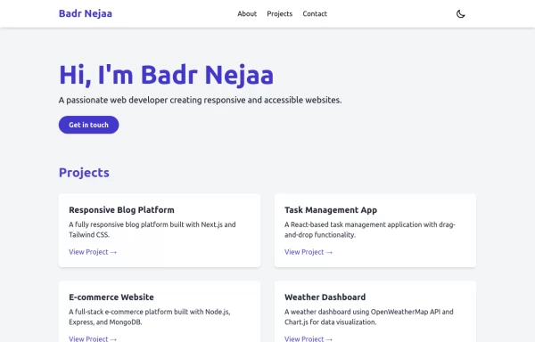
This responsive portfolio with dark mode support includes: 1. Fully responsive design that works on both desktop and mobile devices 2. Dark mode toggle with system preference detection and local storage persistence 3. Indigo-800 and Blue-900 color scheme for primary colors in light and dark modes 4. Beautiful animations and effects: 1. Fade-in and slide-up animations for sections using Intersection Observer 2. Hover effects on projects and buttons 3. Smooth scrolling for navigation 5. Mobile-friendly navigation with a toggle menu 6. Sections for About, Projects, and Contact 7. A contact form with styled inputs 8. Social media links in the footer 9. Accessibility considerations (proper heading structure, color contrast, focus styles, ARIA labels) Key features: - The color scheme uses Indigo-800 for light mode and orange-400 for dark mode as primary colors - Dark mode toggle in the header with a sun/moon icon - Sections fade in and slide up as they enter the viewport - Project cards have a hover effect with scaling and increased shadow - The contact form has animated focus states - Social media icons change color on hover - The layout is responsive, with a hamburger menu for mobile screens - Smooth scrolling behavior for navigation links - Dark mode preference is saved in local storage and syncs with system preference This implementation provides a visually appealing, accessible, and functional responsive portfolio with dark mode support, using HTML, Tailwind CSS, and vanilla JavaScript for the

How it Works: Off-Canvas Sidebar Component This component uses HTML5, Tailwind CSS, and Vanilla JavaScript to create a smooth, performant sidebar navigation. The Trigger Mechanism: The Menu Button uses an onclick="toggleSidebar()" event to trigger the opening sequence. We use a semantic <button> tag for accessibility. The UI Structure (HTML & Tailwind): Overlay (#sidebar-overlay): A fixed inset-0 div covers the entire screen with a semi-transparent black background (bg-black/50). It starts hidden and transparent (opacity-0 hidden) to prevent interaction when closed. Sidebar Panel (#sidebar-panel): Positioned with fixed top-0 left-0 h-full, it occupies the full height of the screen. Animation State: We use transform -translate-x-full to hide the panel completely off-screen to the left by default. The transition-transform duration-300 class ensures the sliding movement is smooth. The Logic (JavaScript): The toggleSidebar() function handles the state: Opening: It removes the -translate-x-full class (sliding the panel into view) and removes hidden/opacity-0 from the overlay (fading it in). Closing: It adds the classes back to reverse the animation. Crucially, it uses setTimeout(..., 300) when closing. This delays the hidden class application by 300ms, allowing the CSS fade-out animation to complete fully before the element is removed from the flow. Flexbox Layout: The panel uses flex flex-col to vertically stack the Header, Content, and Footer. The middle section has flex-1 overflow-y-auto, ensuring that if the menu items exceed the screen height, only that area scrolls while the header and footer stay pinned.